
*** The following is my post from a different site, please visit hockeyconceptideas.blogspot.com for the article. ***
Friday: Happy Birthday, Indeed
As I am getting ready for day two of the Spalding Hoophall Classic, I am enjoying a quiet birthday to get away from the chaos of this tournament. And on Sunday, as I have the day off, I will be continuing my job as the official PA announcer for my college's club hockey team. Then classes start on Tuesday as MLK Day is the last day of Hoophall. Elsewhere, I am submitting a concept in my recently started retro-modern series and hope you will enjoy it, one of three currently completed.
-Ricky
As I am getting ready for day two of the Spalding Hoophall Classic, I am enjoying a quiet birthday to get away from the chaos of this tournament. And on Sunday, as I have the day off, I will be continuing my job as the official PA announcer for my college's club hockey team. Then classes start on Tuesday as MLK Day is the last day of Hoophall. Elsewhere, I am submitting a concept in my recently started retro-modern series and hope you will enjoy it, one of three currently completed.
AHL vs. Färjestad BK
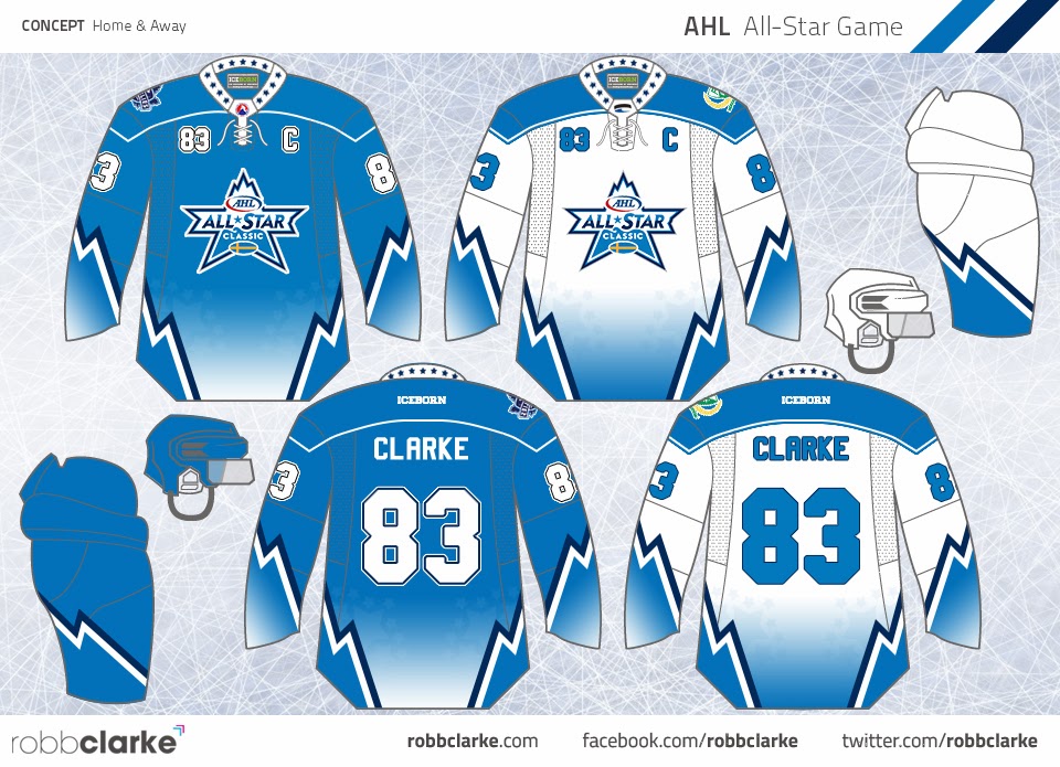 |
| Submitted by: Robb Clarke |
Oh my goodness I'm in love with this concept, I want to suggest it to my good colleague Dave Andrews! Yes, remember him, the one whose class I took - who is the CEO and President of the AHL? Yes him. Almost everything makes sense. Not knowing which jerseys will be worn by the visitors, having a back-up jersey is always a good idea. I like gradient not because it is semi-pro hockey, but because it is an special event match not a season competition. The only thing I'd like to know is why solid numbers sans outline are featured on the white uniform. But Robb pretty much nailed this one.
Colorado Avalanche
 |
| Submitted by: K14 Koncepts |
I really like this set from K14 as well, but it's too eerily similar to a pair of familiar jersey sets: St. Louis and Anaheim - both of the 90s. There isn't enough distinction in the striping despite an additional stripe and the hem color not being extended on the sleeves. To make the striping look original, turn it int a jagged set of lines to create a mountainous looking terrain like the old jerseys, but with the same angles used here instead. The silver help create a fake metallic feel to it as well, and is what it should be doing as an accent color.
Retro-modern: Burger King
 |
| Submitted by: Ricky (Me) |
With this one, I wanted to be both original and authentic at the same time. I took what I liked from the original Burger King jersey and added others not from it. of course, I am also making sure the jerseys actually have a different color from what they originally were. I would really like to see the purple come back as well as the crest logo I used.
Well, it's going to be a busy rest of the day and I am going to finish preparing for it. And with the upcoming events, it will be very interesting for sure. Enjoy your weekend!
-Ricky

No comments:
Post a Comment