
By now, long removed from the days in which he owned the then-Florida Marlins, entrepreneur Wayne Huizinga is long gone - and his successor Jeffrey Loria not too far behind. With the Derek Jeter-era look of the now-Miami Marlins come mixed reviews. The extension of the Clevelander (or whatever it's supposed to be) in replacement of that ugly home run gimmick is a double bonus. The new identity though is middle of the road. Love the logo, not so much the color scheme. This was the scheme originally up for consideration during the expansion phase for the club in 1991. It was hip then. Now hardly although it is appropriate along the "modern" theme a lot of businesses are going for these days. I tried the look on both of the previous color swatches while fiddling around the green with the original teal black and orange.

 I do like how the Loria-era look worked here, but wasn't sure that it would translate nearly as easily. So off I went with the teal. Imagine how awesome this would look if it were the NFL's Dolphins logo. The Marlins have change the look from very detailed to abstract in 2011. They pulled a Dolphins by quasi-updating the logo for this year much the way the Dolphins did earlier in the decade instead of the Dolphins being a little more bold.

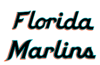


I reverted the name back to the Florida locale in the anticipation that Tampa Bay may leave the market given the situation at the Trop. I thus had to create the location script on the jersey from the current "Miami" and "Marlins" scripts.With minor alterations to the home and road, I am using the originals in both cases. I was always really disappointed in the club for not wearing their teal batting practice jerseys regularly and also for their lack of using the accent orange (a complaint I have of many teams who don't utilize all of their accents in some fashion). I did also create the template for this project myself, so that felt gratifying. But I am going to tinker with it to see if it can be improved.


I reverted the name back to the Florida locale in the anticipation that Tampa Bay may leave the market given the situation at the Trop. I thus had to create the location script on the jersey from the current "Miami" and "Marlins" scripts.With minor alterations to the home and road, I am using the originals in both cases. I was always really disappointed in the club for not wearing their teal batting practice jerseys regularly and also for their lack of using the accent orange (a complaint I have of many teams who don't utilize all of their accents in some fashion). I did also create the template for this project myself, so that felt gratifying. But I am going to tinker with it to see if it can be improved.

