Showing posts with label HCI. Show all posts

01 March 2014

HCI: Post XIV

*** The following is my post from a different site, please visit hockeyconceptideas.blogspot.com for the article. ***

Friday: The Stephen Scheffel Show

Little high, Little low HCI readers! It's another Friday with me and I have a good amount of stuff today. Glad to have more than one concept today as compared to the last little while. Also, today is our 200th post here at HCI! A new jersey came in for me but not before two concepts from the same artist. let's get to those now.

Denver Broncos
Submitted by: Stephen T. Scheffel

The first of our two concepts is based on the NFL's Denver Broncos. The first thing to discuss is the logo. It takes one of the current alternates added to a different colored "D" with an outline. On the white uniform, I don't like the phantom yoke, it definitely needs color. As for the Orange uniform, the blue and white need to switch positions everywhere - the sleeves, the yoke, the hem, and the blue on the collar. As for the alternate, just color in the cuffs, but kudos for originality there.

Colorado Rockies
Submitted by: Stephen T. Scheffel
This wouldn't be a complete Rockies concept without some form of pinstriping. Stephen has done that here. I would think that the stripes should all run the same direction on the white uniform. Either remove the ones from the sleeves or apply them to the whole jersey. As for the other one, The pinstripes in the numbers are a little daunting and take them from the numbers and move them across the logo if I had to guess. I would much prefer see something similar to their purple alternates though.

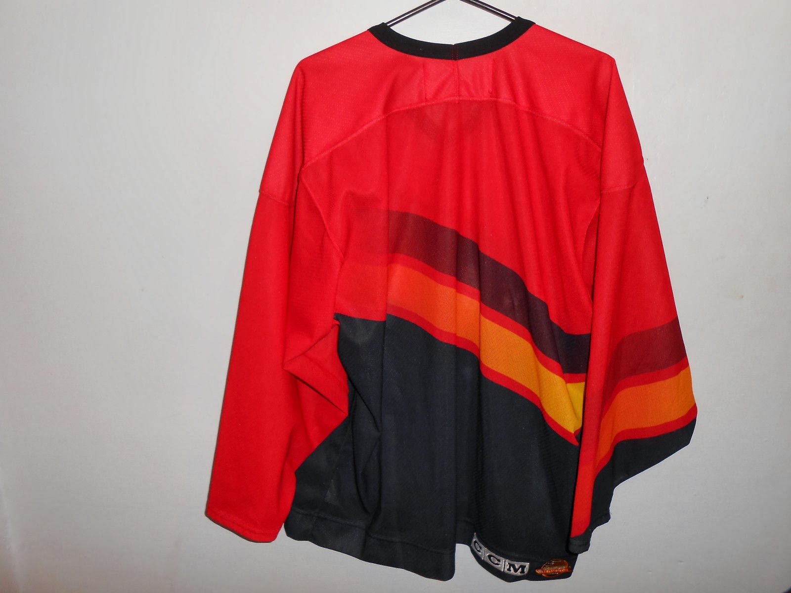
As I alluded to earlier, I made another jersey purchase last week and it just came in yesterday. That's because the Can Post takes a little longer than FedEx,UPS, or USPS. But that's okay, it still had a week just in case. But here it is, low and behold this Canucks jersey!

Photos courtesy of: Pro Sports Jerseys

I wen't a little out of my price range, but was still able to take it in for a profit. It was also the only one in my size and the only ones I had seen over the course of a good amount of time. In the mean time, my NBA leading Indian Pacers will be in town to take on the Celtics at TD Garden while the NHL's Bruins are away. The I managed free tickets to watch Hartford Hawks men's hoops against UMBC (coincidentally the same conference game I went to last year, go Terriers!)

As yet another weekend has come, enjoy your last day of February, that means Spring is around the corner. Or if you prefer, Spring started on Groundhog's Day. No matter, it will be a good weekend until the bad weather supposedly hits part of the Northeast into Monday morning. So make the most of the good weather.

-Ricky

22 February 2014

HCI: Post XIII

*** The following is my post from a different site, please visit hockeyconceptideas.blogspot.com for the article. ***

Friday: Heartbreak in Sochi

If anyone thinks I'm referring to the US and Canada women's ice hockey gold medal game, you're wrong. While that was heartbreaking, I'm moping over the Canadian women's curling rink winning the gold medal over Sweden. But since last we met, the Australian Football League preseason is now in full swing. More importantly, there are concepts to get to.

Irish Hockey League (fictional)
Submitted by: Nick Spiterri

This concept was based on having a league In the Republic of Ireland. The logos, themselves are from the rugby teams that represent said provinces. That is not uncommon in Europe, such as Barcelona in soccer and basketball. I like what was done to add some character to the uniforms. I'm not so sure as to the striping at the hem of the blue one, but the striping in general seems to be missing something. I am enjoying the originality of the idea though - that in itself is a much welcomed thought.

All in all, I'm disappointed in the fact that the content well is running a little dry. But all we need is you to fill it up again. Please, please, please, please send stuff in - we'd really appreciate it! It's a lot more fun for everyone that way too!


I still can't get over the Dion Phaneuf song from the other day, myself. In that regard, I put this up for you. It is a Parody of Adam Sandler's song made by WGR 550 Buffalo during the 2007 Finals run. That's it for me, see you in a week.

-Ricky

15 February 2014

HCI: Post XII

*** The following is my post from a different site, please visit hockeyconceptideas.blogspot.com for the article. ***

Friday: Valentines - Two in the Box

How would you feel if you had to spend time with a significant other in the penalty box? I don't know. The there's the good ol' box chant.


I myself have not missed a live session of Olympic curling (midnight, 5, and 10 Eastern), watched most of them in full, and caught at least the majority of one match. I have also been doing power rankings (pre round robin - m/w; after 36, and 9 sessions; after  round robins; and then the final rankings). All of this whereas Olympic hockey has begun for the men's competition. Man how 'bout 'dem Slovenians, puttin' up two against the hosts. And their uniforms kinda look like the Super Bowls XLVIII Champions. Anyway we do actually have a concept, so I'm gonna get to it.

Kingdom of Isles
Submitted by:  Caden Patafie
I'll tell you, the colored uniform doesn't exactly color me pink. It needs a lot more white, Also the back mesh should match the front mesh, though I'd prefer it match in the opposite (blue, not red). I find the whites much more fascinating. The logo looks like a resemblance Crystal Palace of the Premier League in England and Wales. I'm curious to the not so attractive sleeve striping, but it is but a minor concern.

Have fun with your weekend. I hope it involves making some concepts to send in to us! Please do, we'd love to showcase what you've got.

-Ricky

08 February 2014

HCI: Post XI

*** The following is my post from a different site, please visit hockeyconceptideas.blogspot.com for the article. ***

Friday: Lonely Before Sochi, Off to the MassMutual Center

Well the Olympics are upon us with the doubles ice dancing and some snowboarding events (the new ones) yesterday as well as the opening ceremony tonight (go Macedonia, not that they'll do very much if anything). And hockey starts soon, doesn't it? Of course it does, certainly something to look forward to - just like today's lone concept.


A pretty likeable Wings concept from K14 here. The logo itself is a staple, but the jerseys are getting stale. This doesn't get complicated, but brings something anew to the Motor City team. The striping patter is the more noticeable of the two changes the other is the location of the captain's emblem now on the side opposite the normal placement with a font overhaul to boot. Well done! Even though it is the only pic I had, I feel I would've given this my writer's pick nomination anyway.

That sums up another Friday with me here at HCI. The unusual thing is that there is only one concept today. That means we encourage you to (hopefully) submit in droves! We would be honored to review your work. In the meantime, I will be going to an AHL bout tonight with the first of a home-and-home here in Springfield, the Falcons will play the Crunch tonight then in Syracuse tomorrow for the only two meetings among them this season. I'll be rooting for the former Ducks affiliate though I don't hate the Falcons either, until later.

-Ricky

01 February 2014

HCI: Post X

*** The following is my post from a different site, please visit hockeyconceptideas.blogspot.com for the article. ***

Friday: 10 PM East Coast Hockey

You may be used to being up at 10 PM Eastern to watch a sports event in the Pacific Time Zone, but I will be for one last time this regular season behind the PA microphone at Smead Arena for Springfield College club hockey. In the Mean time, another jersey came in, but we'll get to that later. First, a pair of concepts.

Team Canada (The World Championships)
Submitted by: Alan John Herbert

Alan has distributed what I think are the best team Canada concept I have come across by a concept designer. While there are produced one I actually don't mind, this would look even better in real time! The gold accenture is absolutely classic. The black highlights are well placed and even the extra two leaves are a welcomed addition. The main white looks more sophisticated than using black, though I do miss the main black stripe a little. Maybe a black helmet will ail my sadness. Gotta chose this one for my writer's pick this week.

Michigan v. Michigan State (Outdoors)
Submitted by: Alan John Herbert

Alan is being very traditional "doing new things for new events" as we saw with the NHL when introducing the new uniform templates. this is much the same idea with logos inside of logos. Other than that these might make for everyday use. I'm not significantly impressed with these other than the yoke striping inside the Spartans jersey. Then again, college is simple compared to any professional team really. So I guess it makes sense after all.


Surprise! I haven't been able to get my pictures of it up, but this was from the original listing. I liked this version better solely because of the character of the hem stripe, which kept this jersey sane before Reebok took over jersey making. Still looking for more classics, but only the same ones from the other times that still elude me. 

Keep sending in your stuff, we love seeing it and want to see it sooner rather than later. Drop us a line with your content, just remember our guidelines. In no time, you'll see me back here in one weeks time. Until then, I bid you a good weekend!

-Ricky

25 January 2014

HCI: Post IX

*** The following is my post from a different site, please visit hockeyconceptideas.blogspot.com for the article. ***

 . . . And My Man J-Roney

You'll find this in Whoomp, There it is: "That's me, DC - and my man Steve Roney!" Well, not quite. I'm not DC and his name is Jeremy, not Steve. But our concepts are featured here today. One aspect of my posting over time is that I don't have a bias to any team other than the Ducks, however I do endearingly (as a hockey enthusiast) mock team nicknames (the Strangers, the Lames, etc . . .) so please don't take them as such. Elsewhere I'm getting really excited over that big win to get the Ducks back on good terms at home.

Playstation 4
Submitted by: Jeremy Roney

The new Playstation 4 was something I thought that Sony would not pursue a yet here we are. Considering it's a heavy part of the branding, I am somewhat surprised that more gradient isn't used here. The only thing that really irks me is the disproportionate number and name. As for the front number, bring it down and towards the center a little. But I am pleased with the result, it is certainly unique from anything I have seen.

Vancouver Canucks
Submitted by: Ricky (Me)

This was the first of the currently available and to be produced in my retro-modern series. A twist on an old classic. The classic being the gradient and tick just to the current color scheme and the twist being Johnny Canuck. Since his number had been recently retired by the Canuckleheads, I used Pavel Bure to "model" the jersey (if you will). Again, this series is to be accurate in some areas (application of design) while adding new elements (change of color and number layout {not font or logo necessarily}). Because it is a retro-modern series, every jersey will feature one thing that the originals did not have: lace-up collars. The Lace-up collars are intended to further imply the "retro-ness" of the jersey. As for the jaggedness of the tick lines, I have no idea how that happened because they were fine when I finished it.

Image courtesy of: Dave Roback (Springfield Republican)
Notice the gentleman in the orange tie next to ranked player #13 Paul White in the distance? That's me at the end of the Whitney Young bench liaisoning the team during their visit to campus. This is the same team that has the nation's #1 ranked high school player in the country, Jahlil Okafor (committed to Duke for next season). Jahlil is a very reserved individual but still a very polite young man. He is a cousin of Emeka, the NBA player of the Washington Wizards. This is my fourth year volunteering the tournament, third as team liaison. I usually get three or four teams per year, so I fortunately get to see a lot of good talent and many familiar coach. Duke coach Mike Krzyzewski is a regular and the occasional NBA coach arrives such as Doc Rivers when his son Austin played two years ago.

Back to hockey, I will have at least one other new jersey on the way soon. For surprise sake, I won't tell you until it arrives for next week's post. I don't generally want to nominate my own concepts on my posts, but this week I am making an exception - particularly as I have had nothing to show on HJC. Despite what I do like from today's other concept, it doesn't quite fit the bill for me (not that mine does). But I also would like to see what people think of mine thus I am nominating my Canucks jersey for writer's pick. The Ducks lost their first regulation game at home to the Jets earlier in the week, but the bulk of remaining games for the Ducks are at home, so this plays very well to their advantage and quite possibly the President's Trophy. Credit to the Jets for playing so well since the hiring of Paul Maurice as their head coach. On the even brighter side, I have the Stadium Series game to look forward to tomorrow! 

-Ricky

18 January 2014

HCI: Post VIII

*** The following is my post from a different site, please visit hockeyconceptideas.blogspot.com for the article. ***

Friday: Happy Birthday, Indeed

As I am getting ready for day two of the Spalding Hoophall Classic, I am enjoying a quiet birthday to get away from the chaos of this tournament. And on Sunday, as I have the day off, I will be continuing my job as the official PA announcer for my college's club hockey team. Then classes start on Tuesday as MLK Day is the last day of Hoophall. Elsewhere, I am submitting a concept in my recently started retro-modern series and hope you will enjoy it, one of three currently completed.

AHL vs. Färjestad BK
Submitted by: Robb Clarke

Oh my goodness I'm in love with this concept, I want to suggest it to my good colleague Dave Andrews! Yes, remember him, the one whose class I took - who is the CEO and President of the AHL? Yes him. Almost everything makes sense. Not knowing which jerseys  will be worn by the visitors, having a back-up jersey is always a good idea. I like gradient not because it is semi-pro hockey, but because it is an special event match not a season competition. The only thing I'd like to know is why solid numbers sans outline are featured on the white uniform. But Robb pretty much nailed this one.

Colorado Avalanche
Submitted by: K14 Koncepts
I really like this set from K14 as well, but it's too eerily similar to a pair of familiar jersey sets: St. Louis and Anaheim - both of the 90s. There isn't enough distinction in the striping despite an additional stripe and the hem color not being extended on the sleeves. To make the striping look original, turn it int a jagged set of lines to create a mountainous looking terrain like the old jerseys, but with the same angles used here instead. The silver help create a fake metallic feel to it as well, and is what it should be doing as an accent color.

Retro-modern: Burger King
Submitted by: Ricky (Me)
With this one, I wanted to be both original and authentic at the same time. I took what I liked from the original Burger King jersey and added others not from it. of course, I am also making sure the jerseys actually have a different color from what they originally were. I would really like to see the purple come back as well as the crest logo I used.

Well, it's going to be a busy rest of the day and I am going to finish preparing for it. And with the upcoming events, it will be very interesting for sure. Enjoy your weekend!

-Ricky

21 December 2013

HCI: Post IV

*** The following is my post from a different site, please visit hockeyconceptideas.blogspot.com for the article. ***

Friday: Deja Who?

For one thing, we know all of these artists as writers of the blog at some point in time. Another thing we know is that Jake88's concept was from a series he did a few months ago.

Creighton Comp entries due S-a-t-u-r-d-a-y night!

Tampereen Ilves
Submitted by: Jake88
This particular one I remember, but not whether it was one I reviewed at HJC. I think it was the day after one of them, but I'm not 100% certain. I like this idea, but I'm not exactly sure how the logo is supposed to look like a lynx . . . but it's passable I guess, definitely not on Jake88. As many of you may have figured out by now, I love when he is able to fill out his glove template in multi-color. Everything, and I mean everything matches. The only thing that I might do revolves around the pants and helmet switch the color of one of those items to black and I'll be okay. You can even do the helmet for one uniform and the pants for the other.

Edmonton Oilers
Submitted by: Caden Patafie

To be honest, I'm intrigued with this. While I don't like the lack of an accent color (on the logo for sure), I do like that the logo includes the traditional Oilers word-mark inside the oil drop. The font itself is okay, but I don't know if the Blues/Predators template is what I'd use for this. Definitely add at least one accent color like a white or even the copper and/or red from the Bettman era stripe days.The piping helps a lot here, but only because of the other placement of orange in the jersey. You can keep this template if it can be made look at least decent with a minimum of one accent color, then I'm cool with it. Otherwise, ditch it for maybe Philly's template.

Washington Capitals
Submitted by: Justin Sulpico

This says traditional black and gold Caps all over it. This uniform was only ever produced in black. The black was introduced as an alternate for 1997/98 and got promoted to full time road set in 2000/01 and switches to home for 2005/06 with the post-lockout era beginning. The idea and the execution are spot on. These have been slightly changed to Justin's liking compared to the jersey the black version of this replaced. I like the black numbers better than the white from the actual one, but as much as I like the hem striping and its spacing, I think that the white between the black and gold should be removed thus making the hem slightly shorter.

Creighton Comp entries due S-a-t-u-r-d-a-y night!

In the mean-time, I was in Philadelphia this past week for the NCAA Division I men's soccer championship. There I went to the Phillies team store - the only one of the three open. The last three days have recapped my trip and yesterday goes more in depth on the uniform apparel at the shop. But more importantly and in other news, Teemu Selanne is back on the score sheet! His first goal in I think 25 or so games. I leave you with this lovely holiday reminder from Sabres p-x-p man Rick Jeanneret: "'Tis the season, fa-la-la-la-la-la-LaFontaine!"

-Ricky

14 December 2013

HCI: Post III

*** The following is my post from a different site, please visit hockeyconceptideas.blogspot.com for the article. ***

Friday: Earn Your Stripes

With another Friday upon us, it appears as though I may have had my last opportunity to network with a Hockey professional for a while. I'll elaborate on that in a little while. In the meantime, Matt McElroy has a few things in store for us today. But that won't be before the following major announcement:

Indy Fuel voting closes S-a-t-u-r-d-a-y night!

Chicago Blackhawks
Submitted by: Matt McElroy

Generally I always favor where the color is. But in this case, the road white looks the better of the two (the vintage white both helps and is appropriate on both). That's primarily for one reason - numbering. As minor as it is, for me it seems to make a big difference under these circumstances switch the number outline on the home red to the jersey color and add black numbers. It seemingly would be dumb for the TV numbers to match them so make the outline white up there if you bring the black numbers. After that, remove the hem coloring on both in the set and your golden. While I'm not fond of the logo, most people wouldn't notice unless there was a press conference on the updated branding as there isn't much difference.

Columbus Blue Jackets
Submitted by: Matt McElroy

Gray is a color that the Jackets (among select others) could pull off (Though I can never see it happen in hockey ever!). This is somewhat of an example. While I get a sense of New York Strangers, well they are just that when they come to play in Columbus, there are still many Blue Jacket elements. Those are fairly obvious, thus no need to mention it. Adding some striping to the pants could help, at the same time I don't usually like plain paints when their main color is brighter. I do like the addition of red to help the case of making this logo a regular feature on a set and is much welcomed, despite the lack of shoulder patches.

Dave Andrews
Submitted by: Ricky (Me)

This was what I was alluding to earlier. I made a presentation before my final in his class Wednesday as a gesture of returning the favor for him providing me the one of the first freshly produced AHL media guides for the upcoming season (I was the only one to receive a copy) just before the season started. I had to research his jersey number, which wasn't a necessarily traditional goalie number. He never actually played a game with this team, he was pretty much their president. His real title was under legendary then Edmonton GM Glen Sather as Director of Minor League Operations. This is as historically accurate as possible to my ability, which I think is spot on. But I wanted to share this piece not necessarily for critique as I didn't come up with the idea, but rather as a timepiece to look back at a no longer existent  AHL team.

With that, I close out this installment of HCI. Want to see your concepts here? Simply email hockeyconceptideas@gmail.com and your concepts are up fairly quickly. That may change over time, but it won't happen until more concepts come in. So don't delay and send in your content today!

-Ricky

07 December 2013

HCI: Post II

*** The following is my post from a different site, please visit hockeyconceptideas.blogspot.com for the article. ***

Friday: Phoenix Revisited (Oh Goodness Me, Not That!)

A hearty high-ho to you this Friday! We've had a lot of outdoor jerseys unveiled within the past week or so and the Vancouver ones in particular are very appealing. I'm practically disappointed that Jake88 was literally spot on with his rendition of the Ducks Stadium Series uniform. It's for one reason: chrome. While I do like the chrome logo itself, it doesn't belong on a jersey.Remove the chrome and I'm 90% happy. But in my line of vision I see bright skies ahead in the use of two alternates for the Ducks.

INDY FUEL COMP ENTRIES DUE SATURDAY


INDY FUEL COMP ENTRIES DUE SATURDAY

And now, I am going to add my own personal touch to the Friday posts here on out. I will be introducing the Ricky Points system probably for next weeks post (they're kind of like brownie points) and have nothing to do with grading a concept. I'd share how it works, but I'm debating if they should have some sort of value or if it should be like Whose Line is It Anyway? "where the points don't matter" at all.


AK Bars Kazan
Submitted by: Jake88
 Typical Kazan name. FC Rubin Kazan of the Russian Premier League sounds way too similar. However, there also aren't too much different from the current uniforms, which uses a red-and-black era Sabres cut with some additional design. I also see that Alexander Burmistrov actually wears number 69 with them, but that means nothing in a concept. This is similar only in terms of color orientation. Speaking of color, it's well distributed. This is almost a complete Atlanta Thrashers template, it appears to be a mix of two different templates, but I could be mistaken. I'm glad that multicolored pants aren't an option here, otherwise we might end up with something for Australian football's Fremantle Dockers before they wen't purple haze looking. I would like to see a red version of this set so I can compare it to the green, but I think the green would be my preference since the red one is only in my imagination right now.

Bili Tygri Liberec
Submitted by: Jake88
Well the good start here is that there is striping across the crest. I'm (generally speaking) a fan of that. I don't mind it splitting at the numbers, but if you do that, I would prefer it to be flat and boxy - conformed to the numbers - as opposed to round and matching the crest logo. With double outlines on numbers the same thing, they generally work for me, this is no exception. This number style (with outline) reminds me of Tampa Bay/modern-day affiliate Syracuse Crunch except without the silver. It's distinctive enough that I don't think anyone might make a connection unless someone pointed it out as I just did.

Phoenix Coyotes
Me-Ricky Mazella

If it was done properly, I wanted to see a purple Coyotes sweater. While the 'Yotes haven't had this rather art deco branding for a decade now, I took the logos that I liked and stuck 'em onto a jersey. I'd imagine that it probably looks horrible to many if not all of you out there. The pattern of a hem stripe probably hurts it but I wanted to incorporate some sort of desert-ish pattern into the uniform. It would look better with the current branding, I reckon. I recolored the above alternates and (in the spirit of the "acid trip" jersey that everyone hate that I don't mind) I faded a random design that I used for the background with all the necessary colors.      Sooo . . . does this look like an alternate, the Coyotes would have produced with this branding? That sort of was the goal anyway. Obviously this template has never existed, but just like the state lottery, "hey, you never know."

That rounds out another edition of HCI Fridays, and remember that Ricky points will be awarded starting next week. Please, please, please, please send in concepts - it's what keeps you and me going! Share the wealth, what comes around goes around, and who doesn't like good recognition now and again? Another great weekend is in store for you!

-Ricky

30 November 2013

HCI: Post I

*** The following is my post from a different site, please visit hockeyconceptideas.blogspot.com for the article. ***

Friday: Blog Hopping

"Hello hockey fans, it's Ricky Mazella - the Voice of the Springfield College Pride" . . . well not quite. While what I just wrote was true, that's not what I'm here to talk about. I'm glad to be a part of the HCI family coming over from HJC. It was a privilege, but a better opportunity arose and it led me here, after parting ways by mutual consent. I'm really excited for my first post today! Though the only thing that could make it better is if the Ducks could start winning, as they're in a slump following a great start. Nonetheless, Caden and the gang have done a great job here and hopefully I can continue that strong tradition during my tenure here.

For those of you who aren't familiar of me or my work, I'm 21 (5/6) years old from suburban Buffalo, NY where I'm a fan of the Anaheim Ducks (before I saw any of the movie trilogy) and a fourth year sport management major at Springfield College in MA. I began my graphic design career after stumbling upon HJC (for the second time) and the old Icethetics (then the Tournament of Logos) in February of 2011. I then began my blog, Buffalo Nickel Graphics, on the 5th of May in 2012. My blog covers a variety of sports and templates. These include but aren't limited to curling and Australian football in sports as well as a transportation, dasher boards, and playing surfaces in templates. I encourage you to check those templates out and submit them here on HCI!

Enough about me, let's dig in!

NY Islanders {Caden}

As you can see, this is purely intended for the current contest at HJC to improve the "Gortons/Fishsticks" logo. Mine will be here soon, after it's up on HJC anyway. Pretty good for a paint job, I know. And it's simple. However, the rubric never lies. That's another thing - I hate grading concepts, so I have my own rubric to help me. In this case, it's not what I figured it would be, but that's why it's there. Upon further review, it is a 6 outta 10.

Calgary Flames {Steve Maurer}

Here is what I said when I had to review it on my final HJC post last week:

I feel that this could work with some minor changes. The striping could stay as is but a swap of colors may be an alternative.I'm surprised that the Cal-gary team hasn't done something similar just yet. Use solid red lettering for the NOB and the assistant's "A" as well. Then I'll be happy

What I know: The assistant's "A" was the primary in Atlanta.
What I learned: If using a red outline, larger is better and smaller should be solid in color.
What I want to know: why thin yellow jersey stripes separate the striping.
This one looks pretty good, but I'm on the fence of liking it or not; a 7.5 out of 10.

Nothing has changed in one week in this case.

Evansville Rivermen (Star Wars night) {Caden}

Caden has really gone promo with his HCIHL team. Using the most recent Montreal All-Star Game template, he finds a way to keep it up. My biggest issue is that he is issuing a player that is on my team and one that I have franchise tagged. Secondly, this is the prime example of a typical promo gone wrong jersey. That's bad because he doesn't break a trend and it looks atrocious to me. As he continues to lose brownie points, may I make a note that this is a promo that I would never support because the other teams that have done so fail to do it properly. No hard feelings but it's one that's gotta go back to the drawing board.  A 5 outta 10.

Speaking of my team, the Foxes of Skopje, they've had three guys who went on IR on the same day. The last is a co-captain who started the season there. After that, I don't have much to say other than we should have four wins so far and not three. In the mean time enjoy your weekend and happy hockey - a bientot.


-Ricky


*EDIT BY CADEN* I foud HCI on the Wayback machine. The site has improved so much since then. to see what the site looked like on September 16th 2013, click here.
Creative Commons License
This work is licensed under a Creative Commons Attribution-NonCommercial-NoDerivs 3.0 Unported License.