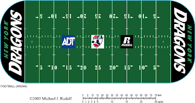
What if we got to see the New look of the New York Dragons in the Arena Football League? They got a makeover, but we never go to see it in action. Their old logo had a great score on my intimidation factor of the eligible scary-looking logos. But the change from black, yellow, and red to black and green looks nicer anyway to me. The floor at the NVMC in Uniondale would have gotten a makeover (sort of) and this would be the basic version.
Thought I'd give this a go . . . figuring out Friday's topic of conversation. See you then!
-Ricky
 |
| Design by: R Mazella (me) Template: by MJ Rudolf |
Thought I'd give this a go . . . figuring out Friday's topic of conversation. See you then!
-Ricky

No comments:
Post a Comment