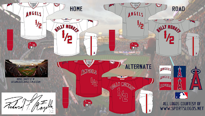
Well unfortunately the final cut of yesterday's main concept made the chopping block for the actual concept to be submitted for Round 1 of the HJC Open. At the same time, this may actually be good for the presentation of the concept. The Los Angeles Angels of Anaheim were given near complete replicas of their current set, with the necessary adaptions to accommodate the hockey aspect of the concept.
And voilà, there you have it! However, the bolding of the font on the alternate jersey could have been better. I do still have time to fix it, but I have to hurry if I do. That's gonna have to do for a quick fix today. I may revise this if and when I change the concept for the above reasons. You'll notice. Come back tomorrow to see what's next on tap!
-Ricky
 |
| Add caption |
And voilà, there you have it! However, the bolding of the font on the alternate jersey could have been better. I do still have time to fix it, but I have to hurry if I do. That's gonna have to do for a quick fix today. I may revise this if and when I change the concept for the above reasons. You'll notice. Come back tomorrow to see what's next on tap!
-Ricky

2 comments:
The home and away look really good. I like how you switched the location of the logos and tv numbers. The third is decent too but the red font doesn't work on a red jersey.
I was trying to create as close of a replica to the originals as possible while at the same time adding the necessary hockey elements. The font on the back could have used more time devoted to it, but that needed to be a little bit bolder on the white outline (which surrounds the navy blue outline). But these still turned out to be a decent set as a whole. I thought how I loved my favorite ball club's set of jerseys and that they might transition failry well. Glad you like it!
Post a Comment