30 June 2012

The Last of the June Bugs

I came up with these sometime last year in an attempt to do my first series with hockey jerseys.That neve really came to fruition. You can tell by the lack of font on this jersey set. but it was the best executed and most appealing of the teams of the Major Series Lacrosse (specifically the Ontario Lacrosse Association). Brampton, Six Nations, and Peterborough all were in the mix but they weren't to be first. A good amount of famous lacrosse players have played in this particular league. John Tavares (of the Buffalo Bandits and uncle of the hockey player) had won the 1992 and 1993 Mann Cup with Jim Veltman  for the Brampton Excelsiors and the two also got one in Victoria with the Shamrocks (Western Lacrosse Association, OLA counterpart) in separate years - 2002 and 2003 respectively.


When you talk OLA OR MSL, you typically don't have the Kodiak Bears come to mind. But this kinda gives you a feel for the LA Kings. The Kings give me a bad taste in my mouth as a Ducks fan. But I'm okay with them getting the ring this year because {one} we got our first ring before they did and in shorter time and {two} I hate the Devils more - especially since the dreaded '03 Cup Finals (at least Giguere got the Conn Smythe). But still this could work for the newly "crowned" NHL champs. But for either, this has some minor issues now that I notice. What was I thinking when I added a different color for the hem stripe and why did I color in the Spaces in the Reebok logo under the back of the collar? Oh well, it's still generally positive overall.

I'll leave you with that. Since I haven't had much time to myself this week, I won't have tomorrow pre-written and I won't be home until later in the day. We are going to my family's lakefront property in Chautauqua where I am going to pain my room and boy am I excited! The walls will be LAA Dark Red (according to Home Depot) we haven't bought the LAA Navy for the floor yet, the closet will be either silver or white (the closet has no doors), and the ceiling is wooden and won't be painted. I wan to free-hand stencil the Angels logo on the wall where the bed will go. You'll be seeing before, during, and after photos the next couple weekends and some may be labeled. I may also be naming our kayaks down there and stencil paint those. I best be off now.

-Ricky

29 June 2012

Small Talk

To be quite honest, I blanked on what to put up for your amusement today. I have sent my votes in for the HJC Open. I typically vote for myself when it comes to point voting, but this is a rare time we have been allowed to vote for our own concept in an exclusive tournament. I need the vote anyway. However this is one of the better concepts I have proposed (in my opinion). A lot of the other match-ups saw me chose the upset in at least each of the first three picks. This includes the first seed, our friend Stéphane Sinotte at Le Troisème Chandail. Even his concept didn't wow me enough - quite an atypical performance from him. All this coming after I e-mailed him saying I would vote for his concept (implying that he usually has a better concept than his opponent in these contests). Anyway, all I have for today is what's below.

Earn your stripes?

I wanted to see a red alternate for the Jets in Winnipeg, but that didn't happen. The latter two were just for speculation. Sorry if I'm boring, but I have a lot going for me right now. We'll be in touch.

-Ricky

28 June 2012

BNG in a New Sport

BNG takes a step in another direction as a basketball adaptation comes about. You may be able to tell this was done not only in MS Paint, but not at my home, I will fix this up and put the remastered versions into a GIF image for my portfolio.


Had to keep it simple for today. Today has taken so many twists and turns that I am kinda loosing it right now. I'll be back to you tomorrow, when I'm in a better state of mind.

-Ricky

27 June 2012

The Final Cut

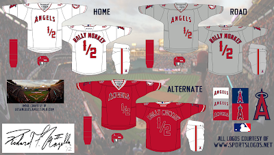
Well unfortunately the final cut of yesterday's main concept made the chopping block for the actual concept to be submitted for Round 1 of the HJC Open. At the same time, this may actually be good for the presentation of the concept. The Los Angeles Angels of Anaheim were given near complete replicas of their current set, with the necessary adaptions to accommodate the hockey aspect of the concept.

Add caption

And voilà, there you have it! However, the bolding of the font on the alternate jersey could have been better. I do still have time to fix it, but I have to hurry if I do. That's gonna have to do for a quick fix today. I may revise this if and when I change the concept for the above reasons. You'll notice. Come back tomorrow to see what's next on tap!


-Ricky

26 June 2012

Batting Practice, Anyone?

Assuming that I can't have a practice jersey on my HJC Open 1st Round concept even though it won't be worn for games, I've decided to show it to you. I have asked and am currently waiting for a response.


Batting practice.


A typical variation


A breathable variation

This should give you a pretty good idea for sure of what's going to be put up tomorrow! In  any event, I'm excited to get this tournament going. But until then, I'll be off . . .

-Ricky

25 June 2012

HJC Open: Round 1 Sneak Peek

I don't want to open the vault until no earlier than Thursday. I'm going to unveil part of what you might expect for HJC's current tournament. I am the tenth seed competing against seeds seven and twelve. I was seven last year as the first person picked out of a hat (everyone below and including me did not get any "Concept of the Week' nominations and/or wins). I still don't have any of those, by the way. So I'm not going to tell you what these are so you can have fun. I'm in the final editing stages so keep an eye out for the completed concept either here in the next few days or on HJC on Thursday.


There are four jerseys in total.


Let me get back to finishing those before Wednesday night's deadline. Ciao!

-Ricky

24 June 2012

Gambling for a new Franchise: The Seguarro and the Viper

I apologize to the five of you that read yesterday's post between it's first appearance and 9:45. The text was surrounded by a near white background that made it difficult to read. Didn't notice until five minutes before I had to leave for a relative's graduation party. I started to retype it from scratch with a copy of the original in Microsoft Word at five minutes to three. But I didn't finish until 9:45 last night.

Today, I have to go back to the vault for this post. This was a contest to add any NHL team in any non-NHL franchise metro area. Las Vegas was the winner. Round two was to design a logo. I had just gotten to Macedonia for the wedding we came for, in fact, It will be a year ago tomorrow that we came home. I had only Microsoft Paint to create the logo during this particular phase and it wasn't even on my own laptop. Heck I don't even remember if I brought it with me - I at least had the bag for it though.

The original Las Vegas concept.

The Vipers were the winning nickname,
the winning logo (and colors) may be seen in the top left corner

As you can see my idea lost. Both of these are definitely not my best work, at least in regard to the sleeve, which I had trouble on for both as I hadn't been comfortable with knowing how to create real stripes on a jersey. Round two and three were just the nickname and logo phase, and I submitted jerseys after round two anyway in case it didn't make it, which is what wound up happening. Round three was the most dull for me with the limited resources I had. The logo was awful and I still really love the cactus - actually, so did Ryan at HJC. That is among my best work in his perspective. Well, for yet another day I have to leave the past behind us. Until next time!

-Ricky

23 June 2012

A Giant Disappointment

Four years ago, when the New England Patriots and New York Giants met in the Super Bowl (2008), I correctly predicted the Giants to win. I also correctly predicted that gasoline (at least in Western New York) would reach four dollars per gallon during Memorial Day weekend. This past Super Bowl, I made the same prediction - and was correct. Then I made the same gasoline prediction on the same weekend except expanded to the WNY and greater Springfield, Massachusetts are. Again, I was right. The first of the two Super Bowls may have been called by some a fluke. This time, with a better Giants team and an aging but still favorite Patriots team (again) still couldn't get the job done.

As a Bills fan, it is always tough to watch any match-up between these two. But due to certain other teams that chould have made it to the big game (San Fransisco {a costly turnover} and more-so Baltimore {poor coaching staff play-calling}), I decided to boycott watching this particular year. Though a "Harbaugh Bowl" as it would have been dubbed would be highly anticipated after their regular season meeting, the two conference finalists got the wrong end of the scoreline and simply ran out of time. The Super Bowl in 2008 I probably wouldn't have watched had it : one - not been at that beautiful stadium in Arizona, and two - I had a Sports and Entertainment Marketing and Management class homework assignment to write down all of the ads and commercials and their specifics. Did I mention that was my sophomore year of high school?

Not only should the Patriots have won both, specifically the former of the two, I should not have had to differ hearing the bickering between fans on campus at my school - yeah, there are a good handful of Giants fans. On the bright side, I got to hear the silence of the Pats fans afterwards (with the exception of my broadcast partner, a true die-hard New England sports fan if I ever knew one).

More blue.

Slightly more blue

Slight addition of red.


I know that the NFL logo should be on each of these, but I don't know where it would go because the Nike uniforms didn't define that detail. I like the current reds and whites, but the blues need a little more color. So I decided to match the siding with the helmet and gave the sleeve cuffs some color. So there is another American football concept gone to the wayside. Furthermore, my idea list is very small compered to what it has been in the past. That means I have to go. So I'm going to make like a cat and scat.

-Ricky

22 June 2012

What Do the Buffalo Braves Got to Do With It?

     42 is an interesting number in sports, particularly baseball. Jackie Robinson, as the first African-American allowed to play in the MLB was also the first number to be retired by the entire league. If that's the case, then why is Mariano Rivera allowed to wear it? Mo has been wearing 42 with the Yankees since 1995, when he first entered the MLB, therefore, he beat out Robinson's number retirement almost two years in advance, on 15 April 1997. That wasn't an immediate qualifier though. While this had come about, Rivera had made sure it was in his contract that he would continue to be allowed to wear the number for any club in his career.

This coming NHL season will be the 42nd season of play for the Buffalo Sabres. Another team in Buffalo that's had it's fair share of glory days but couldn't bring the trophy home.

     But the number 42 has significance in basketball too (or at least this past season it did). Including a slight makeover, the Los Angeles Clippers finished 30th Season celebrations this season. But the club was started twelve years prior and two moves ago - 42 years ago. The Buffalo Braves were granted expansion the same season the aforementioned Sabres. Two new teams at the Buffalo Memorial Auditorium for the 1970/71 seaosn, it was sure to be a spectacular severl years as both teams saw immediate success on the platform in the old Aud.


Van Miller (Starting Lineups and tip) - Kareem Abdul-Jabbar(ATL Hawks) 19 Dec 1973

Van Miller (Starting Lineups and tip) - Wilt Chamberlain(MIL Bucks) 3 February 1973*
*This was Chamberlain's last NBA season before retiring. The he coached one season for the San Diego Conquistadors.

Courtesy of the "WBEN 1973" page on StaffAnnouncer.com


     Van Miller would not be able to do many more games after the 1973/74 season, by that point it was halftime in Buffalo who had their best three seasons during this span. Miller would wind up in his second stint as the play-by-play for the NFL's Buffalo Bills until being succeeded by then color analyst John Murphy in 2004. The end of the 1977/78 season came about and team owner John Y. Brown began talks with then Celtics owner Irv Levin in regards to the future of their teams. Funny these two were playoff rivals. I wondered if these two would make this year's NBA Finals. And guess who the broker for these negotiations was - yep, pre-commissioner era David Stern. The deal was that the two owners would swap franchises to allow Levin to send the Braves out west, something Brown couldn't do.

     When the deal was authorized, Levin immediately went to work and dealt the team off to a San Diego market that had two failures the aforementioned Conquistadors 1972-75 (the year after Chamberlain coached wouldn't you know it) and the team now known as the Houston Rockets, 1967-71. This San Diego team became the third, when Levin sold the team to Donald Stering, who then moved the team to Los Angeles. That Brings us to today, kinda.

Add caption

I always did like the orange jerseys, so I brought them back. For an unknown reason, I felt like adding side stripes for the home and roads. That's really it, I don't have a fancy description for this idea of mine. That's hard for me to do - not have descriptions that is.  Now what in the world will I have for tomorrow, back to work for me! See ya!

-Ricky


21 June 2012

A Storm is Brewing!

After the finish of the 2003 season, a second team moved out of New Jersey. The Saints left after two seasons in 1989 for the Island at the Nassau Veterans Memorial Coliseum. The Storm left after the completion of the 2003 NLL season by relocating to Anaheim, CA becoming the second team to move west of the Mississippi River. This was following the Albany Attack moving shortly beforehand. Owned by infamous NBA star Jayson Williams, the team struggled as he was acquitted of manslaughter charges against him mid-season in 2004. The expenses from the court case may have been the cause for Williams to suspend financial operations after the following season. The team still has not returned to the league.

Could these work for the Tampa Bay Lightening or Tampa Bay Storm?

I personally have only seen the lighter blue colored (road?) jerseys when they were in New Jersey hand hadn't yet switched to the darker blue . . . they were okay jerseys. The blue jerseys here might be the best in the set. The font is actually what Ryan at HJC arbitrarily chose as the font for his blog's jerseys. but the way I added the number to the front helps give the set a little bit of character. Notice that Casey Powell's first initial is above and not adjacent to his last name, this was an effort to bring more originality and/or uniqueness to the concept. That wraps up this series, which will be soon posted as a GIF file on the Portfolio page. That goes for any of the other series. This change is being made to accommodate for more space to display images. Well that's it for now, come back tomorrow!

-Ricky

20 June 2012

Rave Reviews for a Ravens Return

The Vancouver Ravens suspended operations following the end of the 2004 NLL season. They were then approved for a conditional return for the 2008 season if they sealed a lease with (then) General Motors Place and sold a minimum of 2,500 season ticket sales. The former was a go, but the latter was a bust. Then, just this past April Fools Day, a rumor went around from some of the league's players (including Jeff Zywicki) said that Vancouver would be granted expansion for the 2013 season - that too turned out not to be. As a result, the Vancouver Ravens have not returned to this day.

The "Flying V" set.

Vancouver didn't need a completely new look when they played, but the font was awful and the white jerseys were too plain. Here we are, a decade later, and I have given them a new look. Yes, I stole some more to help better this concept. I use the font from the Winnipeg Jets tenure as the Atlanta Thrashers. The yellow jersey may seem out of place as the main logo is not used for the crest, but I wanted a lighter color as the home jersey and too many teams in the league today have too many red and/or black jerseys. The V at the bottom is just stretched to give it a symmetrical figure. I think that covers everything for this concept. We round out the order with the Anaheim Storm tomorrow! Hasta la vista . . .


-Ricky

19 June 2012

Remember the Titans

Will the Orlando Titans come back to the NLL? It doesn't seem likely. I would have to agree with that. But I thought it would be fun to give them a look with the new jersey template anyway. If they played this season, I would give them a third jersey since my other concepts have one, but I haven't even come close to figuring one out for this team. Although I will have one for tomorrow with the Vancouver Ravens.

A conditional return for the Titans?

For traditional and sentimental reasons as a jersey enthusiast, I kept the New York skyline at the bottom. I also decided that the logo belongs on the sleeves too. I had a team based in New York in my fictional roller hockey league, which featured half a globe on the white home and blue road as well as the front of a shuttle on the orange alternate. This team was created before the Titans were ever in New York (only beat 'em by a month before the Titans were announced as an expansion team for the NLL). Finally, I did use ("steal") the font from the NHL's Nashville Predators, but I made it work for this concept. Since I have to be the center referee today, I will now be playing FIFA '12 as I do before any match I play or referee (if not watching a game). Speaking of which, maybe I can catch the end of one of the EURO 2012 matches in Group C today (though I doubt it). SO to that I bid you adieu!

-Ricky

18 June 2012

The (New) Boston Blazers

Although there is no official word on the status of the conditional return of the (second) Boston Blazers, I couldn't stay away from the NLL. This is the first of a four part series of the NLL teams currently on the inactive list. The league has not expanded once under commissioner George Daniel  and has seen the loss of three teams Boston (below, suspended for 2012), the Orlando Titans (suspended 2011, inactive), and the Portland Lumberjax (2006-2009, folded).

The Blazers are back?

Notice the arm stripes, resembling the original Boston Blazers. I realize these may be plain, but they are certainly an improvement for the only set they have known. yeah it's colored shoulders and additional color on the sleeve, but with a bad jersey logo (used for the shoulders here) it's hard to work with that.

Well I can tell you that Orlando will be tomorrow as we move from east to west. That means Anaheim will follow and Vancouver the day after. See you on the flip-side of the night!

-Ricky

17 June 2012

Father's Day and the Summer Wind

Happy Father's Day (to which of you readers it may apply)! This afternoon, my family and I had a three hour lunch cruise by Summer Wind on Lake Chautauqua in Celoron, NY. So I come today with a few things. First of all, I made my own GIF image, like the two flags from three days ago. They are my sports affiliations.

As described on the about BNG page.

Also I go back to the BNG Vault again to put on today's display. This one isn't a favorite, but I would like to give it another go (or two). I tried to take the unused Nords logo but it just didn't work the way I thought it would. But yet you can see this is an earlier work in my collection.

The new Quebec Nordiques.

I wonder if I could "borrow" a jersey design fo this set . . .

Anyway, catch you later.

-Ricky

16 June 2012

Archie St. Louis

Yes the title for today was a made up name. As I continue to mourn over Poland losing to the Czechs in the group stages of Euro 2012 earlier today, I still haven't finalized a decent idea for your eyes.

Below I have posted a rink template if you want to give your favorite team's home a new look.
Ice rink layout.

A mock of my actual concept - I've thought about having it actually custom made.

The above is an idea I had based on one of my previous concepts, during a St. Louis Blues re-design contest. It wasn't too shabby. Though I can definitely say it was one of my favorite contests! If you look below, you'll see why.

My STL re-design entry for HJC.
I re-colored the outline to create this version of Ross Taylor's logo from yellow to red. This was done to be accommodated as shoulder patches for the home and road sweaters. Anyway, it's time to go again. In that case, I'll be back!

-Ricky

15 June 2012

Crazy End to the Weekdays

As Nik Wallenda has begun his trek over Niagara Falls, I prefer to (finally) post today's article. Once again, I dig into the archives as I am planning a few projects for the Hopefully near future to be completed. In the meantime,  I have this little diddy to share with you.

Two Colorado Rockies, same era?
Coming fresh off from s series sweep by my favorite Los Angeles Angels of Anaheim, I coincidentally chose this concept for display. Quite frankly, I don't remember which HJC contest it was for. But as far as the baseball Rockies are concerned, they have always been consistent with uniforms - until this season. Between the home and road kits, the road grays are now a solid jersey instead of striped, compared to their modernized white home counterparts which have been used since the 2000 season (the homes were always striped). In addition, there are three alternates used two originating in 2000 (Rockies blue) and the other in 2005 (black).

Well, I'm out of things to say for this concept so we'll move on tomorrow. Bye for now!

-Ricky

14 June 2012

In Memoriam!

Sorry for the tardiness today, I had fallen asleep around mid-day and awoke right before I had somewhere to be.


I know, I am very much patriotic. Moving on, I am presenting another item from the past.

Semi replicas of the original adapted to a hockey jersey.

I wanted to give a go at my first attempt to cross-brand sports teams. It was simple compared to what I could have done, yet I was trying to be a little conservative in relation to that. But I am pleased with the result for what it's worth. With that I say farewell for the day!

-Ricky

13 June 2012

Lord Stanley, Lord Stanley, Bring Me the Brandy (and Get Me Motivated)!

before I get to the Main purpose of today's post, I would like to presentt you with a gift-wrapped version of my Stanley Cup Concept as visible below.

Cleaned-up logos are the highlight of the concept.
Anyway, yesterday was an all day (nine hour) "business" seminar by the name of Get Motivated. They traveled to the First Niagara Center in Buffalo, New York. each venue the seminar goes to, different guests are invited to speak. Names like Gen. Colin Powell, Mayor Rudy Giuliani, and others (many from three years ago returned to yesterday's showing. Among the original line-up for yesterday was - in no order - Stephen MR Covey (returnee), Bill Cosby, Joe Montana (returnee), Steve Forbes (returnee), Randi Zuckerberg, Steve Wozniak, Marv Levy, Krish Dhanam (returnee), and Marcus Luttrell. Bill O'Reilly of FOX News' "The O'Reilly Factor" was added after the initial line-up was announced.

Joe Montana on Excellence

Marv Levy on Teamwork


The line-up eventually wound up being Stephen MR Covey on success (NY Times best-selling author), Joe Montana on excellence (NFL MVP and Super Bowl winner), Steve Forbes on business strategy (billionaire media mogul), Krish Dhanam (top sales training expert) on sales and negotiation, Phil Town on investment strategy (returnee/late addition), Marcus Luttrell on perseverance (Navy SEAL), Bill Cosby on motivation (comedian and public figure), James Smith on finance (returnee/late addition), Steve Wozniak on innovation (co-founder of Apple), Adam Markel on empowerment (entrepreneur and attorney), and Marv Levy on teamwork (professional football coach).

Randi Zuckerberg did not show and due to weather conditions in New York City, Bill O'Reilly could not give his talk on communication. he did however have this to say:

Bye for now, everyone!

-Ricky

12 June 2012

Kings of the World (or At Least the NHL)

I was rushed out of the house to "Get Motivated" at the seminar of the same name this morning (8AM-5PM local). Greats such as the likes of Joe Montana, Steve Forbes, Bill Cosby, and Marv Levy spoke. I had to center referee a match immediately following.

Who would have thought that the Stanley Cup would be decided by a sloppy check for a penalty. Certainly not me. AS much as I despise the Kings, Jersey jumped ahead of them because of the 2003 Finals, and how unfairly they won (despite JS Giguere winning the Conn Smythe).  Besides, it took us way shorter to win our first cup in franchise history.Speaking of the Kings and Ducks, all hail Dustin Penner - King of the Freeway. I gave him this title since he's won the cup for both teams and obviously the only one to do so.

 The  concepts below are the home and roads I propose for the Kings and Devils. For LA, I blended new colors with old and took a great third logo then modifying it briefly.


A novel idea for a home jersey? A royal one at least.

Literally, kings of the road!

The Devils have a little something different from the current look. I add the green back, but keep the black too. teh logo also has more spacing (the circle outline isn't connected anymore).


The stripes make this jersey.

The green shows up better here, in a bland version of the home sweater.

Tomorrow, I will post pictures and videos I took from Get Motivated on the above seminar. I will prepare them until then, so aloha!

-Ricky

11 June 2012

Back to the Scrapbook

This was a contest for the ages from last year. HJC wanted us to re-brand for the OHL, QMJHL, and/or the WHL. Of the three, this was my best executed, whereas the other two didn't fare as well. I didn't get individual title for WHL or overall either, but the other two were well intended. At one point I will try to revive the other two and clean them up, but I will show the originals tomorrow.

The T-birds from Seattle.
After all I'm having difficult mobility from being kissed by the sun a little too much when I underestimated the need for sunscreen yesterday during the match I worked after a rainy day before. As a result you would naturally feel that I would be doing more concept-wise, which I am. However I am still tinkering with them. As for now, I'll be off to a game in a little bit. Sorry for today's tardiness on posting and I will write you all tomorrow.

-Ricky

10 June 2012

Black Kats Makeover

Yesterday, I mentioned Jeff who e-mailed HJC to find a potential suitor to help re-identify his athletic program. I finished the jerseys accordingly to yesterday's post.

Home with new logo

Road with new logo.

Alternate with new script.


I'd provide more stuff today, but I just biked back from my first soccer match from today after two yesterday. I also have to bike back right now. Then I have to bike home and leave for a game that needs to be driven to. I'm a very busy soccer official today. With that, I'll be off!

-Ricky

P.S. - I replaced the originals I posted with this post due to a typographical error (type-o). which also gave me a chance to add TV numbers which I originally thought would be unnecessary, they add a little character. -Ricky (9:15 PM EDT)

09 June 2012

New Look Black Kats

This is earlier in the regular time period, not since it's the weekend, but since I have to referee a soccer match at 4PM EDT. This means I need to be at the field by 3:30. Anyway, The Black Kats, not the "Black Cats" of Sunderland FC, are getting a requested makeover. A man by the name of Jeff contacted HJC in request for possible new identity ideas and hockey jerseys he is athletic director and hockey coach for the Frederickton HS Black Kats. SO this logo is re-colored off an image from 123RF.

Main Logo

With location script.

With nickname script.

Without script.


That's it from me, Jerseys will be displayed tomorrow . . . and maybe Stanley Cup jerseys? Until then.

-Ricky

08 June 2012

Euro 2012 is Upon Us!

As a person of Polish decent, I have decided to help the inaugural of the two hosts receive a makeover. Although their current set isn't half bad. I was busy watching that game as Poland drew Greece 1-1 from the National Stadium in Warsaw. The set was created following the match.

The Home Kit

The Road Kit

The 'Keeper's Kit

The 'Keeper's Alternate Kit
There you have it, a hosting national team ready to present all of Europe with their new look to help the scenic view of the Euro 2012. The Ukraine gets their duds tomorrow. In the mean time I'll be seeing you!

-Ricky

07 June 2012

A Recap of the AFL Re-Brand Series


An old concept returns today. This is one of my absolute favorites that I have ever done. I plan on cleaning it up and using it for HJC's Canada/USA competition, along with a team Canada concept I never finished. You'll have to look for it in the mean time.


ADEL - The front of the jumper adds character, only real change to current.
BL         - I like the current jumpers better, but superimposing logos has always been favorable to me.
CARL - Adds more color to otherwise plain jumpers.
COLL - Inspired by clash jumpers worn in recent memory.
ESS   - Used wings instead of a sash with a superimposed logo.
FRE  - I like the new jumpers, but the old jersey design with the solid purple
GEEL - Added extra shade of blue. Duplicated cat in the stripes.
GCFC - Sun on horizon in the skyline, with wings for clouds.
GWS - "G" in V-neck instead of stripe.
HAW - Old logo, with wings.
MELB - Monogram with stripes.
NMFC - Superimposed logo.
PORT - Based on depiction of 11-year-old used in 2004 season.
RICH - Superimposed new logo.
STK  - A checkered version of the logo on a jumper.
SYD     - "Swan in a V-neck."
WCE - Full logo with stripes.
WB        - Original 'Dogs outline with stripes.

That's all she wrote! Until next time.

-Ricky

06 June 2012

Lest We Forget!

Today marks the tenth anniversary of the concrete sidewalk being put in at my granparents' place. Anyway, it's been removed with the rest of the concrete from the sidewalk, driveway, and garage. This is what it looked like before it got removed on Monday. Yesterday it was replaced and is currently being sealed.


Provided that the LA Kings win the Satanley Cup tonight, I will have a Kings and Devils concept up tomorrow. Otherwise, they will not be up until the series is over. However, I will tomorrow provide a recap of this AFL Re-brand set regardless, they hockey stuff will only be in addition.

Crowing with passion!

A Giant opportunity . . .

Eyes like a Hawk.

I know that the Xblades logo os still in light green, yet the logo extended into the wing design and couldn't find an appropriate replacement color. Anyway, I'm done for now. Do widzenia!

-Ricky
Creative Commons License
This work is licensed under a Creative Commons Attribution-NonCommercial-NoDerivs 3.0 Unported License.