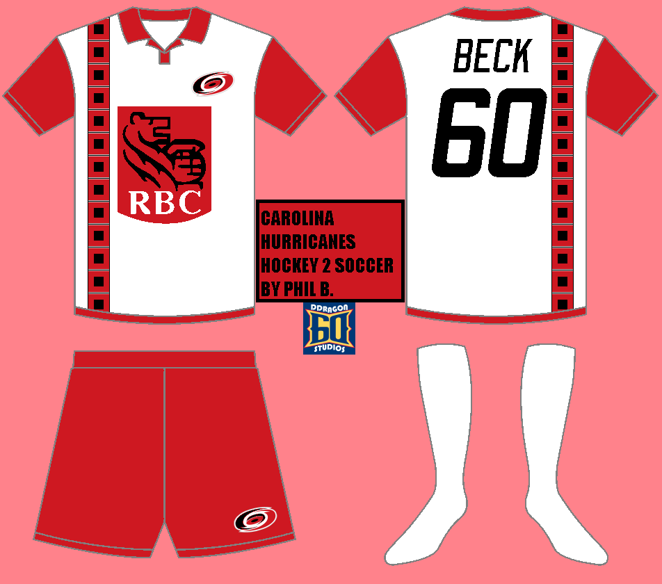
Hail, Nickelonians! Another BNG edition up and at 'em this fine Sunday. Just a reminder that the Stanley Cup Finals schedule has been released, which mean's that you need to mark your calendars for June 18 to find out which jersey will be inducted into the (NHL Third Jersey Hall of Fame here at BNG). Notice I said jersey indicating that only one qualified for induction this year. While we're on the subject of nominees, go to the Halls of Fame tab and fill out a nomination form for the BNG Logo Hall of Fame, which the deadline is on October 26 and the selection being on Halloween. Until either of those, Phil B. has introduced me to a new series of his that will start today, beginning with my two favorites!
Well, Phil has a good understanding of what goes into a soccer jersey, and the same goes for transitioning in most cases. The only major criticism i have is that the beloved flag warning pattern should be a somewhat larger, about double in size. The kit sponsor logo and numbers are slightly over-sized but not substantially. I personally would like to see the flag warning at it's current size to be used as the striping pattern on the socks. Overall, it is a very solid work, but definitely embraces its team's character.
Here much the same thing with embracing team identity. My biggest concern is that the logo on the shorts doesn't stand out enough. use the full logo with all the colors. As far as the name and numbers, do not be afraid to go over the jersey design. It is okay to have it bleed in a little as long as it isn't overdone and has a good enough outline. But usually, jerseys like this do not have the striping carry onto the back which in this case would actually be solid red. I do like the effort in going a little outside the box though.
This is a good start, particularly for the interpretive part of the crossover. I look forward to getting this thing kicked off even more tomorrow!
-Ricky


2 comments:
Kicked off.... Sonofagun
Naturally
Post a Comment