
All spokes are pegs, but not all pegs are spokes (so they say); and that is evident with (in particular) electrical outlets and the wide variety of them. But all of them can give us the power surge for today's post. Another pair from Phil today and do not be fooled about the title.
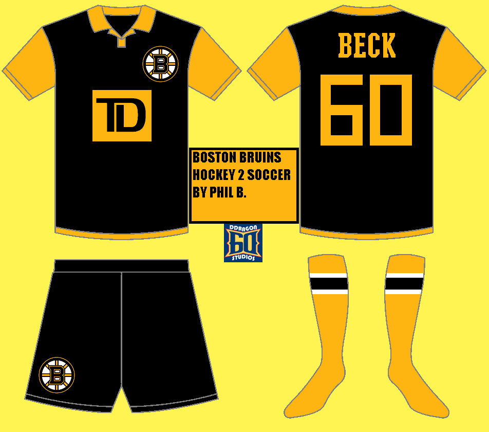
This Bruins concept appears to be fairly traditional, but with atypical Boston furnishings. The numbers for instance appear to be more Columbus-y. Now that I've had several days, I think it's a good move. The other being the hem of the shirt in that while not necessary, I would add the yellow elsewhere on it not at the hem. Back to my sponsor logo thing, white will work fine (and put more need for yellow on the front). Nonetheless a rather entertaining kit.

Now Winnipeg is another story. Phil compromises with those in favor of an alternate uniform,, more-so those wanting to see a red uniform in coloring the pants and collar. The sponsor logo size is somewhat ironic given that the MTS Center is soon to become the league's smallest arena in capacity. Red cuffs wouldn't hurt this concept but given considerable amount of red already present is fine, most often I am not cool with white socks of any kind - this is one of those times. Go match the jersey and I think we can compromise. Now we're good to go.
Back to the drawing board (for me). I'm preparing HJC Open content (though entry isn't open yet) as well as HJC's NHA competition. So until the next post, happy concocting!
-Ricky
This Bruins concept appears to be fairly traditional, but with atypical Boston furnishings. The numbers for instance appear to be more Columbus-y. Now that I've had several days, I think it's a good move. The other being the hem of the shirt in that while not necessary, I would add the yellow elsewhere on it not at the hem. Back to my sponsor logo thing, white will work fine (and put more need for yellow on the front). Nonetheless a rather entertaining kit.
Now Winnipeg is another story. Phil compromises with those in favor of an alternate uniform,, more-so those wanting to see a red uniform in coloring the pants and collar. The sponsor logo size is somewhat ironic given that the MTS Center is soon to become the league's smallest arena in capacity. Red cuffs wouldn't hurt this concept but given considerable amount of red already present is fine, most often I am not cool with white socks of any kind - this is one of those times. Go match the jersey and I think we can compromise. Now we're good to go.
Back to the drawing board (for me). I'm preparing HJC Open content (though entry isn't open yet) as well as HJC's NHA competition. So until the next post, happy concocting!
-Ricky

No comments:
Post a Comment