
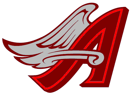
I went simple today, I took the LA Angels of Anaheim third (hockey version) replica and replaced the script with a recolored logo from the Disney/periwinkle era. I'll tell you what, this logo definately looks better in this current color scheme. I played around with it almost a year ago and printed and posted it on my dorm room door, that's how much I loved it in the double red.


The logo placement may be a bit high, but it would otherwise be too close to the numbering. As much as you see recoloring of other logos from different eras in a franchise, I took my stab at it with baseball. I plan on exploring with that for basketball and pigskin football being transferred to a hockey uniform.But I still have templates I have to work on and I have a large stack of unfinished concepts. my works in progress have too many possibilities for variation, I think. But anyway, it will keep me busy the last month before school. For now . .
-Ricky

No comments:
Post a Comment