30 June 2014

Bosna i Hercegovina

Who likes contests?! We aren't having one yet, but Jake88 sent this in for one over at CCSLC and wished to share it with us. He was given Bosnia in which he had to create a kit for them to "use" throughout the World Cup.


This one is quite elaborate. The history is well included from it's independence to even it's pre-Yugoslavia days. The primary shirt features yellow, a new introduction to Bosnian football.  Also, some inspiration of woven fabrics and textiles was certainly a nice touch. As for the secondary shirt, Jake wasn't sure how to refer to the "straightened sash" and straight sash is exactly what it is called on an Aussie rules jumper, so in theory Jake correctly guessed. Which further compliments the textile patterns and pairing. Well done!

-Ricky


29 June 2014

Supremacy!

We're still in the soccer craze and with the US advancing to a game on Tuesday against Belgium, the forthcoming concept includes an excluded member of the the host nation's roster Fred, whose club team is in the Ukrainian First League.


Jake tells me that he want's to differentiate Šahtar Doñečk from The Premier League's Hull (City AFC). Šahtar Is generally the Ukrainian team that represents the domestic league in the (UEFA) Champions League. Let me make this clear before I dissect the concept, my spelling is the correct phonetic spelling in Latin characters while Jake's is correct in the English language, thus both are acceptable. I really like the primary kit design (which Jake claims as a happy accident - just like the one I had with Adelaide a few days ago).

It looks very appropriate for an Eastern European and Slavic-speaking team. The road design has ben adjusted to correlate with the mountainous backdrop on which the country lies, pretty clever, no? It works for me, I feel that this would be a team that would welcome such a change to their kits, hopefully that is the case. We'll also see more of Jake's work tomorrow!

-Ricky

28 June 2014

We're the Only Team Old Carlton Knows

Salaam, readers! Today completes the other half of the Carlton jerseys. This series has been shaping up well so far. But there won't be too many as easy as this one.I'm just going to stick with it for now and see where it takes us.


As I have displayed here, This is very similar to the normal Carlton clash jumpers. Of course the laces are different and appear again for their 150th season. Typically, the side panel of the jumper is colored in navy, but I don't know if it would continue to the top panel, given I have never seen or found the long sleeved version. 

27 June 2014

We're the Team That Never Let's You Down

Before I begin today, big news out of the Ducks offices prior to tonight's NHL Draft in Philadelphia. Ryan Kesler has been traded from Vancouver for Luca Sbisa, Nick Bonino, and a 1st & 3rd round pick this year, Ducks will also get this year's third rounder from the Canucks. Now, onto business.

Contrary to the title, Carlton have been doing a lot of letting down this season. But that's what they sing when they win. Their main kit may seem boring, but it's been like that for decades. They take the "if it ain't broke don't fix it" approach. Given their philosophy, I added laces here - the team is 150 seasons  old after all.


But let's think a sec. That's all there really was to do. The only other thing of not is the AFL logo in the collar insert above the aforementioned laces. When they play bad soccer, fans chant for "boring, boring Arsenal." I'm saying boring, boring Carlton. Even a hem stripe would suffice. At least you'll see more variety with the clash sweater tomorrow.

-Ricky

26 June 2014

More Good Grades in Adelaide

Today is going to hopefully set the tone for a series in this capacity fairly soon. As for yesterday, there are other parodies to the Crows such as Simon and Garfunkel's Song of Silence just to name one. But back to the concept circuit is the other half of the kit for said team in Adelaide, South Australia, Australia.


While I did decide to keep the logo for a crest, I added the now familiar murder of crows from the clash jumper. But the striping looks a little cleaner and more relevant as an almost identical pattern was used in the previous clash jumper. Here you still get the famous blue, yellow, red pattern in the striping but still get the white.While the piping may not have been necessary or used on the primary sweater, here it is very important as the actual jumper indicates  that it does not start right from the side of the jumper. I'm working on tomorrow at the moment, so expect anything!

-Ricky

25 June 2014

Bird Pies: A Parody?

They YouTube version of what you are about to witness did not show up in the Blogger search, so I had to do it the hard way. In any event, here it is!


Remember the other half of the full concept comes tomorrow. Today I will be going to Say goodbye to Fourteen Holy Helpers school as I did at Our Lady of the Sacred Heart on Saturday. Other than that, still a rather abnormal day. Enjoy it!

-Ricky

24 June 2014

A Good Grade in Adelaide!

Hiya, folks! Today, we've got a happy accident concept. I was trying to put together a concept based on how I wanted the team to look and existing leads from places such as Icethetics for the St. Louis Blues. While that was happening, I came to an a-ha moment (as opposed to an epiphany, aka of a lesser magnitude - as defined by me). The way I put together the jersey template worked for the Adelaide Crows of the AFL (Australian). This gave me the next push to finally get that AFL hockey series I keep telling myself I have to figure out.


Thursday I will show you the clash version which has already been finished. Tomorrow, the Patrick Dangerfield Song will make an appearance at BNG - the same gentleman whose number is shown above. But first today, the primary sweater. While this looks like a typical hockey sweater along the breastplate, It still manages to capture the identity of the team's footy jumpers. While the stripes are not much on the front , they as you would see on a long sleeve jumper aren't lacking. Despite the front, the back looks more normal to the jumper, which usually allows such blank space for the numbers. For further information about the Crows, please visit our friend of the blog Rob "Mero" Meredith. See you all tomorrow.

-Ricky

23 June 2014

Fernando Palomo - Check That, Fernando Moreno

Palomo is the king of Latin-American soccer broadcasting, and HJC contributor Fernando Moreno (S2dio Designs) made his own template that everyone else has been asking for. I myself wanted to try it, but never put in a formal public statement. Anyway, Jena Béliveau was the first thing that came to mind and decided to go Montreal with my first concept on this template.


It was a little easier than I figured, at least in Paint.Net . . . I also got a chance to download Photoshop CS2 (my first use in over four years in high school) and Illustrator CS2 (new to me near the completion of my undergrad). Notice the background - double-seamed glass block panes and a good accidental discovery. Today was very productive! Now on to tomorrow.

-Ricky

22 June 2014

"Et tu, Brute?"

The finale of Phil's wonderful series comes to a close. It has had its ups and downs, but nevertheless - good for discussion. As we come to a close with the series, comment and see which of Phil's were your favorite(s). You will see revised versions over at HJC sometime soon.


My only real confusion is why use that curvy thing. It makes no fashion sens to me andat least a thin white stripe would help it some. The name, numbers, and sleeves really set this apart from the rest of the questionable decisions like the white shorts and socks, which I still can't figure out if they could be switched. I'm leaning towards no for at least the shorts - thus white would be the best option.


This one isn't bad. I don't like this claw mark pattern and never have, however it can be moved to the socks. We've seen crazy patterns on non-sport socks before, so why not give it a try. The numbers may be a little plain, but it could be a lot worse whereas this doesn't hurt at all. With a hint of yellow accenture for the cuffs, that would seal the deal along with yellow replacing the outer red of the roundel (at least on the shorts).

We actually finished? That seemed rather fast to be quite honest. This series is not something that we haven't seen before, but it is also something we don't see too often. In any event, it was very enjoyable to accumulate theses hocker(?), soccey(?), shocker(?) concepts. I give up, but I'm sure that there's more of where that creativity and inspiration came from.

-Ricky

21 June 2014

Go Tiger-Hawks!

I don't have a concept, but I do have a layout to substitute. Upon my visit to Fourteen Holy Helpers (14HH; 14), I discovered that I actually did know staff and faculty that were still there despite not being on the website listing. All of them were the teachers in the younger grades - that was all that was left from my days some fourteen years ago now (coincidence?). My first grade teacher (now secretary) was my tour guide as per policy that any guest needed accompaniment. This was the layout of the floor plan.


While there were changes since my departure, they were necessary (in adulthood acknowledgement) paint jobs and technology upgrades but nothing drastic. Our Lady of the Sacred Heard (OLSH)  followed later that day. Much more was recognizable as it has been nearly half the time I left OLSH eight years ago. I took not of both gymnasiums - both having been photographed but 14HH was set up for exams and OLSH for  last nights 22nd annual sports banquet. The most peculiar thing is that the OLSH gym is connected to their school but not at 14. Some of my 14 memories came back once I had gotten to high school where former classmates there went to school with me again but all grown up. I will be attending the respective alumni events within the next few days.


Fourteen Holy Helpers                          Our Lady of the Sacred Heart
Tigers                                                                                     Hawks

Stage End

Center Court

Scoreboard End

At least one of my elementary schools is still around and in good hands. Given the continuing popularity of charter schools in Western New York, it won't be going anywhere anytime soon. And I still have a high school and college to look forward to. All is not lost, at least I can say I can remember some things from my then simple life.

-Ricky

20 June 2014

Twenty-Eight Down, Two to Go

The end of this series is almost upon us. I hope that throughout the past three weeks that Phil's work has been able to inspire your designs. None of the designs have been completely negative, today included. That at least signifies that Phil's intuition is not quite in the best spot, but at least in the right direction.


It's time the burning C logo is put to rest, but of course, it should be done subtly by gradually decreasing it's use. Only the red version of the logo looks decent at best and is actually quite dull. The team could do better than that (and they have with the alternate, which Phil used). I do like the uniqueness of the logo being used along the hem. to add even more style to the collar add a yellow stripe at the collar's edge. As for the socks, they match for the out-of-the-box idea, but not specifically gradient which would pertain more to some form of Vancouver, LA, and/or Pittsburgh.


Phil tries to revisit the old style Stars kit. He does so by forming the star to the shape of the current logo. About that: it's not as good as the original. Go back to that. I do like that the font is slanted, but here it looks like the name and number are unaligned because Phil's surname is so short. While I'd like to see black sleeves or cuffs, the lack of it doesn't hinder this concept. Sandwiching the black between the top of the jersey and the socks is a very good decision to boot.


Today is a sad day. It will be the last time I will roam the halls of the two Catholic elementary schools I went to (details tomorrow). All that will be left is a charter school (between the two) followed by high school and college. I went to my first school, Fourteen Holy Helpers, this morning; it will be closing after 106 years. Our Lady of the Sacred Heart (OLSH) meanwhile was open for around fifty years (give or take). Both schools eighth grade graduation will be next week. A lot of memories that have developed my career path and my personality in some fashion are credited to these and cannot be revisited in person anymore. Another piece of me may have died, but it will still be forever vibrant through their affiliated churches.

I will be refereeing a four on four tournament in Kenmore (alone) four for games from open (9 AM) to 11:30 as a total of four games finishing just as tomorrow's post gets up and another (normal rules) game over the hill from me at 2 PM for the state Thruway league. Then OLSH is having an alumni reception at the same time followed by 4:30 mass and 5:30 open reception. Working hard, and remembering hard - it's going to be a hard day, but at least in the area a beautiful weather weekend. Hope you get that nice weather too.

-Ricky

19 June 2014

Howling on the Phone

Once again there's only another day before Friday arrives, but the first of this calendar year with a new member in the 3rd Jersey Hall of Fame. Imagine if that were on a soccer jersey . . . or not. Either way, Phil's series has been fairly enjoyable as it is a less-traveled road. Let's see some of what's left of it!


This one is . . . unusual. While it has mostly traditional elements, some seem out of place. That most notably being the sleeve stripes - they probably shouldn't serve as a continuation of the chest. I would stick with blue cuffs to replace the sleeve striping. The number font needs to change and then be raised into the striping. The sponsor here is rather large and is what does the striping an injustice. Definitely potential in this one, just a touch up will be necessary.


This concept makes (soon to be) Arizona too similar to Detroit who also only have two colors and bad (or) no striping. The black would help this concept but would have to be done very strategically. I'm not a fan of bi-color logos as we discussed the other day, accent-less doesn't cut it for me. Also, I don't like the numbers (again) but it is what the 'Yotes have always had with the current branding and I still have yet to find the old font. I don't mind the white, but it needs a lot of help. The brick red would hide most of the problems (blandness of a white jersey for this particular team).

We're only a handful of concepts from finishing up Phil's series. Two of the "final four" if you will are what I would give as the equivalent of start of the NHL third sweater program in a soccer capacity. We'll see where it takes us, but for now it's a rest period.

-Ricky

18 June 2014

Grizzly or Not Grizzly - The Question!

The time has arrived! We mentioned that only one nominee was selected for induction. it was a difficult decision by the committee but a result was reached. You may remember some of the past nominees, including last year's lone nominee the skate-in-a-circle gradient alternate from the 1996 series that kicked off the craze. This one is in the same group of those except that it outlasted all of the other (if you will) "Original Six" jerseys. Only the "Robo-Penguin" of the inaugural class - 2006 - came close however the "Robo-Penguin" was actually used as the road jersey between 1997/98 - 1999/2000 for a span of three seasons. We proudly present this year's Hockey 3rd Jersey Hall of Fame, The infamous "Winnie the Pooh" jersey of the Boston Bruins.


We have also been in deliberation over nominations . . . to be clear, jerseys may be from any level of professional hockey and must have been worn at least three games. Special single-game uniforms will not be eligible for at least five years (or by special rulings). Therefore, there shall be a separate wing of the Hall if such a jersey is ever inducted. The recently retired Tampa Bay uniform is now eligible to be nominated for the Hall.

-Ricky

17 June 2014

El Diabólico Pingüino

We're winding down Phil's NHL soccer series and boy has it been a lot of fun. Baseball would go really well for the NHL. They actually have a line out and I've seen a Ducks one on Ebay and a Sabres one live today at one of my favorite card shops - Dave and Adam's! Switch the colors and logos of the Sabres one and rotate it 45 degrees right and voilá - the first of today's two concepts.


The striping choice is the most interesting of all here . . . I like it a lot. The name is a bit large, but not bothersome and the numbers are fine without the devil horns added to them. I wonder what this concept would look like with some green, but that is for now wishful thinking. Thickening the sock stripes slightly and I'm ready to send this to the production line.


This concept somewhat reminds me of Arsenal's away kit for the 125th anniversary season. except the gold does not continue on the same side the sleeve is colored. Generally, I like my stripes thicker on jerseys, but not too thick. The font appears small, but it is not objectionable whereas the number font is well not like what the team has now. In fact, I think it is what makes the jersey. I find intrigue in the use of the roundel logo.

Brazil and Mexico are about to start so sticking with the soccer theme, lets watch it! I'll be back.

-Ricky

16 June 2014

Weagling Your Way Out?

Our soccer continues and what a game we had already today! Iran and Nigeria are up in a half hour, but what a surprise for the US if they win later against Ghana. With two injuries and a suspension for Portugal, the US can beat them on Sunday. They've already lost to Germany 4-0 thanks to the red card for the head butt that lead to the send-off and suspension. But what about hockey fusion? Fear not -  Phil's series continues this week.


I am really very appreciative of including all team colors here. I'm not sold on the bi-panel, but it isn't bad or hate-able.the only issue is that the number font seems both too generic and too large. The socks can remain stripe-less. However, I can see somebody wanting it to have a north and south half to match the kit (thank goodness it isn't).


Interesting position for the sponsor. It appears to be inspired by several Bundesliga kits of old. But I don't feel it necessary to include two logos along the front. Furthermore, the Weagle appears on both the shirt and the pants.  keep it on the pants, but use the one on the shirt - the red doesn't do the logo justice, demote the wordmark to the crest logo and bring the sponsor to the front (even though I like where it is now). The only reason i'm okay with the miscolored sponsor is because I believe it appears that way in the arena.

Well, that's a wrap for today and go USA! I'm looking forward to other games such as Mexico and Brazil tomorrow as well as the Netherlands and Australia. Have fun with the World Cup now that the Kings have won the Stanley Cup.

-Ricky

15 June 2014

Fashionably Football

Soccer actually is a term that was used to shorten "association  football" by an-ex Sheff Wednesday player from the UK (presumably England). That slang got used so much that it stuck when English immigrants to the US used it and the Americans picked up on it  when the sport arrived with them. Already the World Cup has seen many interesting matches so far. But what about the uniforms? I found a site that shows the history of what each team that qualified for Brazil has worn every time they have participated ion a World Cup. In the mean time, a schedule for today and tomorrow are readily available.

SUNDAY, JUNE 15
12 pm ET | Switzerland vs. Ecuador | Brasília | TV: ABC/Univision (USA), CBC (Canada)
3 pm ET | France vs. Honduras | Porto Alegre | TV: ABC/Univision (USA), CBC (Canada)
6 pm ET | Argentina vs. Bosnia-Herzegovina | Rio de Janeiro | TV: ESPN/Univision (USA), CBC (Canada)
MONDAY, JUNE 16
12 pm ET | Germany vs. Portugal | Salvador | TV: ESPN/Univision (USA), CBC (Canada)
3 pm ET | Iran vs. Nigeria | Curitiba | TV: ESPN/Univision (USA), CBC (Canada)
6 pm ET | Ghana vs. USA | Natal | TV: ESPN/Univision (USA), CBC (Canada)
For more regarding the schedule, the MLS has it readily available. I am very interested to see if there will be a good place around town that is not Mes Que on Hertel Ave. in Buffalo. I will go there for one of the other two USA games and (if their doing so) Conlon's Bar and Grill on Abbott Rd. in South Buffalo for the remaining of the three. Enjoy this tournament while it's around . . .

-Ricky

14 June 2014

Robin vanPersie: "No Kings, No!"

At the moment, I am probably refereeing a tournament for rec soccer with a  former high school colleague. But in the meantime, I have something else. Twitter had this last night for us just after the Kings won the cup:

"   @NYRangers gave @LAKings means 2 their own defeat - the eagle was struck by the feather of 1 of it's own plumes: @MGaborik10. Unfortunately.   "
-BNG Twitter Handle

Yesterday also gave us this from the biggest surprise of the day:


I picked the right team, but by much fewer goals than we saw. I will explain more of the story tomorrow - including a similar goal from a couple years ago. This goal show above is an example of why I praise his ability as a soccer player.

-Ricky

13 June 2014

I Wonder as I Wander (On Friday XIII)

We have about a weekday's worth of paired concepts in Phil's series, which will resume. In accordance with my custom, I am posting my entries for HJC's NHA contest (in which we could submit a set for each individual team) prior to their [first] appearance on HJC. We also had the option to use a new logo/colorscheme or use the pre-existing one (except the Canadiens and we couldn't use one from the current unrelated Ottawa franchise for it's predecessor). Let's have at 'em!


This was the first one I completed. Notice that I created a new logo - but what is it you may ask. This logo is actually inspired by Tecumseh's own wampum belt, which I was surprised it was really that simple.The clash colors are the original, but the wampum belt was white with the design in purple - the opposite of the main jersey in its current state.


Quebec got somewhat of a re-branding effort. While the main scrip and stripe swapped color positions, the clash is quite radical. I wanted a unique color combo and used Paint.Net's color inversion tool. Originally the chest stripe was almost a copycat of the main sweater, but then I remembered part o f a logo used by Australian Football's then Footscray Football Club.


While this one was finished last due to logo decision chaotics and perplexions, it was third in creation. Ultimately I created this logo too. While the main shirt seems like a typical concept for the Senators, the clash is far from it. I decided that even more simple was the way to go. The double diagonal stripe has been use by many teams (mostly throughout European soccer).


Here was another logo debate, I stayed in favor and this became the result. Looks a tad like Celtic but still very distinct. This was probably my favorite one just because, it was the only concept that a team has a completely different color from the rest.


Purple again? This was actually courtesy of more help Tecumseh, who loaned  it to the Wanderers. In creating this logo, I wanted to accomplish two things: scatter the letters (sort of) and ditch the ugly shield. While the letters are arranged atypically for alignment, they are legible across and down. 


My final submission was for the Cobalt Silver Kings. I wanted to rake in the silver but there wasn't a way for me to cleverly include it for this team.I was thinking, they copied the Canadiens, but I tried my best to differentiate the two.

Now that that is taken care of, we can be at peace. I'm hoping that I am the only one, that has three or more concepts and one of the only two who have two. Fingers crossed, I just doubled the submission pool (that's before any other concepts that are sent in if any).

-Ricky

12 June 2014

Primary Colors

Only teams that are using primary colors will be today's focus from Phil's series. I have been officiating a lot of soccer games and matter of fact, i will have four on Saturday alone, so not only am I in the mood for this series (great timing, Phil!) but also for the start of the World Cup today. I'm gonna start the next two because I'm getting a little antsy just talking about it.


All I can say is hmmm . . . not in a bad way, it's just the composition of the concept. Like the Bruins yesterday, I like what i see now that I've had some time to "sleep on it." The striping was what really caused that. I guess this is the same as Winnipeg (also from yesterday) but with red stripes on the sleeves (and blue cuffs) and blue socks with a striping pattern - as they're appropriate to the team. A-okay here.


I don't think I recall ever seeing a shirt that has the arch used here inspired from their current template. While I do like the number format, I don't know that it works here necessarily. Teams and leagues are geting a little more detailed with their numbers, but they look like they belong where they came from - hockey jerseys. My sponsor logo pet peeve thing applies here as well. I'm a little surprised but glad the "guitar strings" were omitted from the socks I'd like to see a different collar, preferably gold possibly with matching cuffs. Now we should be set to continue.


The World Cup has arrived and Around the Horn is "on a  479 1/2 hour break" as of 5:30 PM EDT that means I'll be in front of the tub at some bar or another to watch at least one game and the rest from home. Don't worry, I don't drink (it will hinder my ability to maintain this site). Adieu!

-Ricky

11 June 2014

'Peg in the Spoke

All spokes are pegs, but not all pegs are spokes (so they say); and that is evident with (in particular) electrical outlets and the wide variety of them. But all of them can give us the power surge for today's post. Another pair from Phil today and do not be fooled about the title.


This Bruins concept appears to be fairly traditional, but with atypical Boston furnishings. The numbers for instance appear to be more Columbus-y. Now that I've had several days, I think it's a good move. The other being the hem of the shirt in that while not necessary, I would add the yellow elsewhere on it not at the hem. Back to my sponsor logo thing, white will work fine (and put more need for yellow on the front). Nonetheless a rather entertaining kit.


Now Winnipeg is another story. Phil compromises with those in favor of an alternate uniform,, more-so those wanting to see a red uniform in coloring the pants and collar. The sponsor logo size is somewhat ironic given that the MTS Center is soon to become the league's smallest arena in capacity. Red cuffs wouldn't hurt this concept but given considerable amount of red already present is fine, most often I am not cool with white socks of any kind - this is one of those times. Go match the jersey and I think we can compromise. Now we're good to go.

Back to the drawing board (for me). I'm preparing HJC Open content (though entry isn't open yet) as well as HJC's NHA competition. So until the next post, happy concocting!

-Ricky

10 June 2014

The Flying Orca

If you had told me at any point between the Rangers winning game five of the Eastern Conference Final to before last night, I wouldn't have believed you if you thought the Kings would win the first three games of the Stanley Cup Final. A yet here we are. The only two reasons that I'm with New York are for Lundqvist and I don't like the Kings (New York was the second least hate-able team in the Conference Semifinals (after Minnesota, who like my Ducks, lost in that round). Well, now I'm pulling for a miracle (In a New York minute). Phil's series continues today, here are the next two.


I don't think Phil could do much with this. While Detroit has always been "simple" with exception to logo detail, it is hard to come up with unique Red Wings concepts. But I've only seen one other person put hockey teams to soccer kits.My only criticism would be to add a white strip to the top of the shorts and socks. While they could be added to the bottom of the socks, who cares what's down there - they aren't made by Gold Toe or anything. Nobody, even myself and Phil, I assume would ever do that.


This one is entertaining to toy around with. I think that it revolves around the Millionaires inspired logo (which could used a slightly thicker outline - as well as the orca).  Mostly because of the collar, I'd recommend thickening the cuffs and v-cut. As for the socks, anything but blue, probably green might do the trick. That is to say, if the pants color doesn't change - but the socks at the moment seem more logical.

Another pair tomorrow from Phil and more preferences from me to accompany. Except for maybe Detroit since they are so hard to work with, each concept has had a lot of good and some bad creating a rather balanced uniform (more than expected). But that has always been my biggest criticism of the Red Wings is that change needs to happen sometime - nothing dramatic. Adding an accent color wouldn't be bad or maybe finding a way to pump out an alternate logo or both. Ironic you have Vancouver opposite them here given their identity crisis. Both expansion teams from 1970 (Buffalo) seem to be cursed in regards to their indecisiveness on fashion sense. Oh well, always room for improvement I suppose.

-Ricky

09 June 2014

Rough Times in Edmonton?

BEfore we continue with Phil B.'s series, I'd like to point out I went to Don Cherry's Sports Grill for the first time. The location I went to was the one on Lundy's Lane in Niagara Falls (CAN). The food was fantastic and the decor was well executed. I'll have a few pictures on Saturday.


Phil goes very Conservative with this Oil Country concept. I am unfamiliar with Rexall's word-mark featured on the shirt front. Nice balance of color, but I'd recommend to change the number font. Other than that I really have no complaints of note. Rogers Place having just been ground-broken will possibly replace Rexall as the shirtfront sponsor even though they take precedence for the Canucks.


I'm not 100% sold on the white shorts, but it is not necessarily bad for the concept. I'm not sold on the position, shape, or width of the sock stripe.the width could be larger and located slightly below it's current placement. But shape? Well take this from the Toronto Raptors' playbook and use the striping pattern from their shorts and thicken one of those stripes. That would be followed by rotating it 90 degrees and voila - you have your sock stripe. The lightening bolt seems questionable because the sponsor logo is big enough to cut off two corners. Make it thin enough and you might be able to fit the sponsor logo inside of the bolt (just a thought).

Another successful day at the office! More tomorrow from Phil's series.

-Ricky

08 June 2014

Going for a Drive

A Triple Crown loser and another Stanley Cup game later, it's time for another BNG post. I went "0 for" yesterday in the main events though I did have Real Solution in the Manhattan Stakes. There was racing following the Belmont on NBC in the States. Which allowed me to put this up today rather than yesterday.


Lots of things going on here,  I wanted to put as many unusual things that goes into any sports jersey. This was the end result. Now it's off to Niagara-on-the-Lake for a peaceful afternoon! Bye for now.

-Ricky

07 June 2014

Chasing History: Chillin' with My Chromies

A hearty high ho to all you Nickelonians today! Though there are no longer Saturday posts of mine from other sites, this post needed to be done at the earliest time possible, as was the case with my contributions (11:30 AM ET). Today was not originally the case, but since a certain popular racehorse just so happens to be a Ducks and Angels fan, I am focusing today on thoroughbred horse-racing.

The running of 2014 Belmont Stakes on Long Island is only a few hours away and for those unaware and/or not familiar with the American circuit, there's a chance for the first Triple Crown winner in 36 years - since Affirmed in 1978 (not the kind in the MLB that Miguel Cabrera has won the past two seasons)! I was a "Chromie" from the time leading up-to the  in San Felipe Stakes in March. California Chrome has been phenomenal under new jockey Victor Espinoza with a perfect 7-0 record in all races (since Espinoza's first riding in December 2013) - including the Kentucky Derby and Preakness Stakes. California Chrome's pedigree also shows that he is 1977 Triple Crown winner Seattle Slew's great-great grandson. I even found the story behind the name a very good read.


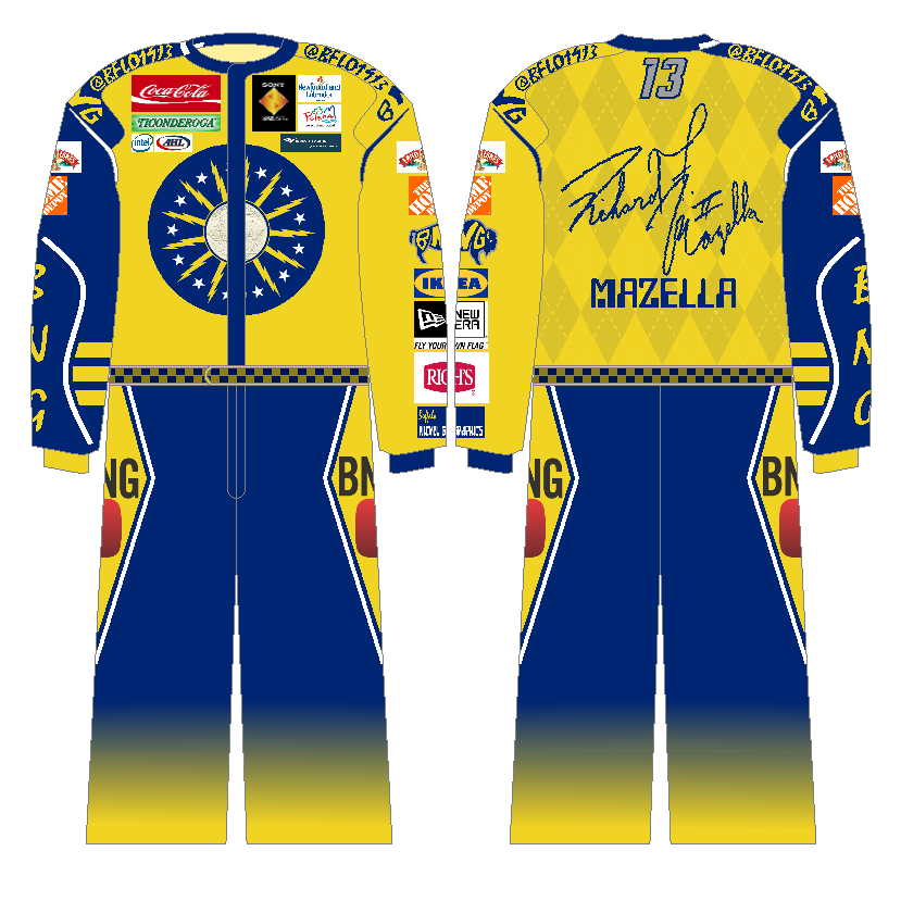
The above is what I decided my racing uniform would consist of. Let me explain this a little because it isn't quite as it appears. The main area is yellow with purple checkered diamonds and both sleeves are the opposite (purple with yellow). The brown collar is significant to identifying the main colors as complimentary and creating the brown color. This template actually comes from a BNG favorite site maintained by Rob "Mero" Meredith. In any event, I will be looking forward to the finish of today's race (in my Anaheim Mighty Ducks jersey, bearing the same colors as Espinoza's uniform - and even the same color distribution). Enjoy the show, and go California Chrome!

-Ricky

06 June 2014

The Parliamentary Blues Rock

The Parliamentary Blues Rock was a song by a musical group known as the Prime Ministers . . . not true, it's all fictional. But the two concepts that give us the title are not. Phil is continuing his so far entertaining series and we do indeed find Ottawa and St. Louis in our midst.


This one is definitely different. This takes on a pre-modern MLS feel say before 2006 when more teams started to put sponsors over their chest instead of team logos. But I must say, the O needs to go, not that I don't love it. However, I always have to give props to Canadian Tire (the money, Sandy McTire, etc . . .). The only other thing that could use a touch up is the font - it's a computer font and not one meant for jerseys of any kind.


Well now, this one could work very well. In fact I think that the pinstriping is the best part. The collar helps add a little more color too. We have run into a small couple setbacks. The not looking part of the number six is a little bit too far extended and the six and zero do not have their spaces where they need to be - and that is problematic.The socks are almost en point, but the blue stripes should be slightly thicker for good measure.

Considering the second game of this Stanley Cup Final is afoot (tomorrow), we should be preparing ourselves for it. That's what the above is somewhat supposed to be and tomorrow's post to go along with it. Then there's the NBA's Finals (game two) on Sunday. But I don't know how many have as much interest in that - after all, Lord Stanley's Cup is the hardest trophy in North American sports.

-Ricky

05 June 2014

Turnpike Liberty

The title got some help from the unofficial nicknames of the 2009 World Series. You can read up on that here as I don't have enough energy to type it at the moment. You'll find it just before the game one recap. I remember first reading about the then in planning Barclays Center sometime in 2007 or '08 and wondering with minimal renderings of its finished product. In part, that was sparked by my pursuing sport management.


The championship stripes appear to be the most prominent thing here though I imagine that's not quite what Phil was looking for. The slight extra orange over the white complement each other well. It may just be me, but it appears the font is a little squished.  If there's a way to thicken it a little then give it a go.


This is a Flyers logo I'm unfamiliar with (real or fabricated). While I may need a number outline, I'm more concerned about the collar which I'd like to see color but it may not be satisfying even then if it's orange. I notice the lack of black on the socks, which if not on top put another stripe in the middle of the white one.

What really intrigues me is how the move to Barclays Center will affect the team's branding and image - at least for the concept if it does. In any event, they'd better not mess it up like their most recent third jersey. Oh well, another pair from Phil will find its way here soon.

-Ricky

04 June 2014

Transcontinental Tales

The below is but a mere coincidence. When I was picking out which uniforms to be posted, it was before the Kings won and it was before I knew when game one was (which I thought was going to be yesterday). I only saw game 7 on the schedule as it pertains to the Third Jersey HoF. Let's give them a glance.


While I will never approve of the black white and silver color scheme, Phil makes it work. But If we're going to include silver, I need to see more of it. Cuffs and collar are what I had in mind and maybe even the numbers, keeping a thin white outline. I can only imagine if just the purple would do to this, let a lone if the gold was in there a bit too and the black is gone but then it would be a throwback . . .


Well, I know MLS teams have done it, but they hold the key to this design - the yoke. Okay, MLS teams tend to use the tri-stripe yoke, but the classic Rangers yoke applied wouldn't be bad (though it doesn't reflect the home jersey). This is fine as is however. The whole thing says Rangers hockey except maybe striping on the socks, but again isn't necessary.

This would make a good trophy match for a soccer game, two well dressed clubs I'd imagine. Speaking of hardware, the Arsenal Ladies team helped the club win the FA Cup double (both the men's and women's first teams winning said trophy's tournament). But now we turn to the first game of the Stanley Cup Final for which HJC is having a live chat which I (finally) plan on participating. Until then, happy hockey!

-Ricky

03 June 2014

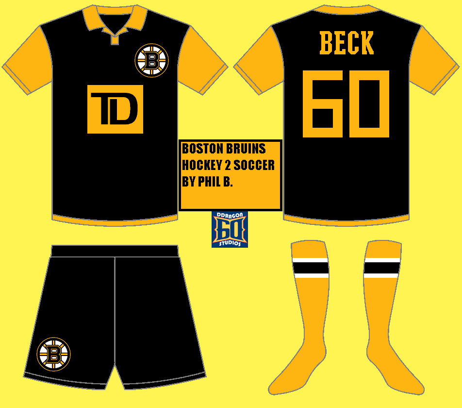
Wild Phil Beck

Another two of Phil B.'s concepts are to be shared today, and you get to see them! BNG appears to be a hip happening place with a couple page visits from the Northern Marianas Islands within the past week. That seems random, but hey who cares, I'd be glad to welcome them into our viewership. But let's see what Phil has for us today!


Well . . . there's enough forest green here. There could be a little more harvest gold, but this makes sense. I would like to see a double number outline, but that's just my preference. Even a little more iron range red wouldn't be bad. Just something to break the green up a little more.


Enlarging the stripes; now there's a thought! This is ideal for the Leafs - with some exceptions. Since Air Canada's primary colors are red and white, I wouldn't change that though I understand why it was done. Also, turn the collar white.This jersey doesn't feel like it would be without it given it is an original six team.

-Ricky
Creative Commons License
This work is licensed under a Creative Commons Attribution-NonCommercial-NoDerivs 3.0 Unported License.