23 November 2017

Bingle Bells, Bingle All the Way

After explaining the pronunciation of the BNGLHoF abbreviation, I thought of the upcoming holiday that follows today's. This particular induction is both a Thanksgiving and "Kwanzachristmukkah" of sorts. Another year of firsts in this class and certainly more modern that previous classes.


Though not featured, this year's KHL All-Star Game brings multiple leagues of competitive ice hockey to the tableand the touch up of the Detroit Lions brings our first NFL logo into the fold. Superbowl XXXII is the first of its kind to feature in an induction class. Though not the first collegiate team, San Diego State University's Aztecs changed their logo due to criticism over Native American portrayals that were disputed (where haven't we heard that?) and resulted in this rebrand. As a part of their rebrand to signify the move from the ECHL to the AHL, the Charlotte Checkers established a new era with a snazzy alternate to top of the primary with a warning flag included to signify their parent club of the Carolina Hurricanes. Plenty of talking points here, but all worthy entrants in this year's BNGLHoF class.

-Ricky

21 November 2017

KSG at Special-K Stadium

Remember that Aussie Rules c]design team of mine? Well I'm trying to slightly up my pre-season game. This idea came from another participant in the competition so I decided to disclose with the competition our plans for "redevelopment" along with ticket packages.


Of course, a sponsorship deal had to be put in place for promotional purposes. And, the first home game had to have a schedule photo magnet giveaway. The latter, I know I am the first in the seven year history of the reserves or the primary levels of the competition.

-Ricky

19 November 2017

It's Finally Here...!

After realizing that I never put up my finished Aussie rules jumper template looking back at the VRFC post from last month, I am bringing it to you now. It will be complete with side panel and a long-sleeved option for those who wish.


Some day, I may add different types of collars to this, but I've always been a V-neck guy so that was the base model. This is technically the third version of the template, but only the first officially published. Feel free to use it for your ideas.

-Ricky

28 October 2017

Raising the Seal-ing

The National Lacrosse League has a new man aboard to expand the sport. Joey Tsai of Alibaba fame is bringing lacrosse to San Diego. But it wasn't until the last several days that the brand was unveiled. I give you the Seals (Well my version of them anyway).


I was trying to go off of what Projoy has done in the past. I also added new things to make this seem somewhat unique to the team. This wasn't terribly challenging, though I felt that I could have done more if a good version of the alternate logo surfaced. In any event, I managed fine.

-Ricky

18 October 2017

Return of the Convocation

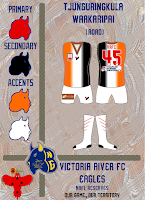
As I saw fit, I made various arrangements for a Aussie Rules design league I'm competing in. If you remember the Victoria River Eagles, that is the focus. I needed a new set of jumpers for the new season. I have kept two from the previous season (2014/15). The new home was the former clash and now featuring new numbers while the old home is now the heritage kit with the club song added to the front. New Jumpers have been added to meet requirements.


The names of each jumper are indicative of relevant words or phrases from the local indigenous  language of the Northern Territory. I decided to redo the branding sheet so that it was more in line with the other work.

-Ricky

06 September 2017

Havin' a Time, Where the Brier Is the B'y!

The BNG MSP is certainly not lacking quality content as today we revisit several items from my visit to St. John's in March for the Tim Hortons Brier. Included are two local newspapers with an edition of the Curling News plus a few Tankard Times (one signed by Mike McEwen's Team Manitoba), a signed team Manitoba photo, a photo of an Albertan representation) a Brier media guide an airline ticket to St John's from Pearson International (YYZ), a poster of Brad Gushue (winning skip from host Newfoundland and Labrador, and tickets from earlier draws of the tournament.


Finally the winning province got their glory after being among Canada's best men's sides for years. The Party went into the wee hours of the morning on George Street where Gushue had promised to bring the Brier Tankard if they'd won. From George Street to the freak windstorm on the day before, it was certainly an event they'll talk about forever in the Great White North.

-Ricky

16 July 2017

Great Scotties, That was Brilliant!

Some may recall my adventures a quick trip across the border to Canada  in February of this year. I grabbed some things from the Scotties in St. Catharine's for the BNG MPS. The Museum of Play and Sport has other items in it, but I'm featuring these today.


While I did attend a draw earlier in the week, everything in the museum is from the fantastic gold medal game between Michelle Englot's Manitoba and champions Ontario represented by Rachel Homan. I have the day after's local paper in addition to various versions of the daily Scottie publication and signed clapper placards (if that's what they're called) from various Manitoba and Ontario players with a ticket from the gold medal game and official team pictures from both sides respectively signed. I'm already having withdrawal and wish we could get the same venue and excitement every year!

-Ricky

26 June 2017

Bisons in a Winter Classic

At the request of a manager at one of my places of employment, I created a set of what that would be. One of which could also be used at the 2018 Winter Classic. I subsequently entered it for the 2017 HJC Open tournament round robin stage.


Also, I have been working on those new Adidas templates, and it will prominently feature the most appropriate team, Vegas, for my first time use. But this set before that and the results of the HJC Ope precede.

-Ricky

20 June 2017

Tonight's the Night, Tomorrow's the Day

As has been highly anticipated, the NHL and Adidas will fully reveal the brand new uniforms for each of the thirty-one teams while the Expansion Draft will be officially finalized by tomorrow. while I intend to absorb the most up to date Adidas template in full. I put together my Vegas Golden Knights as per the rules of the expansion draft. Courtesy of our friends at Cap Friendly, you can do so too if you wanted - the hard work is done for you and you can go ahead and choose your players. You can view my compilation below.


I tried to find value buys mixed in with veterans and salary cap eaters. As it worked out, the team would have just over eight million dollars to work with for post-entry draft trades and free-agent pickups, pending potential trades of players picked up in said expansion draft. There was special consideration to balance primary atatcking positions at five per (six at left wing) with two more attackers and defensemen than the requirement. But the entry draft in and of itself could turn this team upside down in just a matter of days unlike the results of past expansion drafts. Only the short time left will tell.

-Ricky

18 June 2017

Another MBD Alt Look

Welcome back to BNG as the final installment of the Mount Buller series has arrived. I present the "Bloody Mary/Murder" jumper. Another plain set, but going on the Demons name seemed to be under thought of by the clubs previous designers. If you look closely enough at what I did to alter the logo from the original, there is red where there would have normally be blue (black). However, to drive home the point of the logo selection, I filled those negative spaces into blood and voila.


Then again, It would be ironic if the Blood Rule would come into effect. If a player is bleeding injured without visible traces other than the red part of the jumper before it becomes oxygenated substantially, would the blood rule be able to be called?  It would be an interesting scenario if it ever presented itself. I hope you have found intrigue in the new footy/basketball template if anything at all. This series was merely out of a request that turned into possibility.

-Ricky

17 June 2017

The Other MBD Alt Look

I would discuss the actual alternate, however we defined in the primary of the series it is merely a heritage Melbourne jumper. And with that,we have another variant of the accustomed wide v but with another hockey inspired alternate - this from the Calgary Flames horse head jersey.


Again, rather plain and traditional from the jumper itself without the logo and sponsors, but it also was up for introduction. I knew it would not have the same effect as that of a hockey sweater but wanted to give it a go anyway. Meanwhile, one more tomorrow to round up.

-Ricky

16 June 2017

The Other MBD Road Look

Hi there - take a look into the road uniform that kind of wasn't in the continuing Mount Buller series. Here we have the facing front partial version of the logo. Instead of just plain white, I decided to use the mountain ridge/eyebrow of the skull as a sublimation with the negative space on the skull of the eyes and nose as the primary design feature. Aside from that, it is actually a very basic kit.


I didn't want to go to far out as the logo already somewhat does that. In place of the founding year on the top of the back are the clubs official initials. Sponsors are as you were from the rest and upcoming. Nothing spectacular, but when you have several jumpers for one team, you can only go with a limited amount, so this was the road that got scrapped.

-Ricky

15 June 2017

Induct-A-Panther

Alright friends, it’s that time of year again - the day after game 7 of the Stanley Cup Finals. So we've discovered the champions of the NHL. While the hockey world may dread the day after, it is not the end of the hockey season here at BNG. The name and logo of this hall-of-fame was changed last year to reflect the introduction of uniforms. Thus it has been expanded for this year and now includes other sports beyond hockey. I am pleased to introduce that as previously announced, we are going to open up different wings of this hall. The first of those will be in two months. August 15 will be the induction date which means I will need the nominees in by July 20. Accepted nominees will then be eligible for three weeks to be voted upon before polls close.


This year, no jersey was even nominated other than those on the ballot already. However, with more jerseys up for nomination, others currently on the ballot will now be subject to a new stipulation. Beyond seven years, a jersey will be taken off the nominee ballot for three years until it can be revisited, and like a parole hearing will only reappear after a certain number of years (three in this case). This means the six remaining may only be on the ballot for next year or they will not be eligible for three years and will so be documented as such. Now to the fun portion of the program... One jersey nominee did get removed from that list to bring it to six.


Our Buffalo Nickel Graphics Alternate Jersey Hall of Fame Class of 2017 will include the following NHL uniform: the Florida Panthers navy alternate from the 1998/99 through 2002/03 seasons. In 2003, this Florida Panthers jersey was promoted to become the full-time home choice, with the exception of the stick being removed from the logo to accommodate the home whites. The former road reds then had the stick added to the crest to signify it as the alternate. In its final season, the nameplate went from arched to straight before the Reebok changeover introducing the "Bettman stripes" to replace the diagonals. For the 2005/06 season, the names on the back of the entire set were straightened from being previously arched. That version of that navy would last just one more season with the introduction of Reebok's new uniforms league-wide. No matter the logo, this jersey shows that both preferences can change and also that any strong uniform can get promoted to the big time.

That brings the AJHof's total to 19 inductees. once the August induction is announced, they will be found here and will further on be inducted as normally scheduled. Be sure to check back on the Halls of Fame tab for updates on the Logo Hall of Fame as well as next year's AJHoF nominees. We look forward to maintaining that page with this year's changes.

-Ricky

14 June 2017

The Other MBD Home Look

Hi all, here is the third installment of the Mount Buller series. it was the second option I had planned for this club. Compared to the preferred choice, this is half and half with a sublimated logo and navy instead of red shorts.


I had wanted to have an option to play on the traditional kit that I planned to use as an alternate and turn it into one of those with a couple of chevrons separating the two "halves" but it turned out to look like it was just further down with just one white chevron. It was the more traditional and probably safer approach of the two.

-Ricky

13 June 2017

The MBD Home Look

Welcome to our continuing coverage of Mt. Buller Demons Football Club FFC. Hope everyone has been somewhat curious of the previous post regarding the MBDFFC. Since this is the first individual jumper to feature, I will provide some background into what's going on here that wasn't covered in the original.

As is understood of the club, it is one of the original two franchises left in the SFA, which established in 2001. Target and Virgin have been running gags as sponsors, to which I gave a new one in Red Bull. However, the sleeves make the jumpers look a little like gymnastics uniforms, but you don't see long sleeves for most matches in the first place so it would really be a non-issue. That sums up this one, basic. For more, keep checking in throughout the coming week for the rest of the set.

-Ricky

12 June 2017

THE Mount Buller Demons

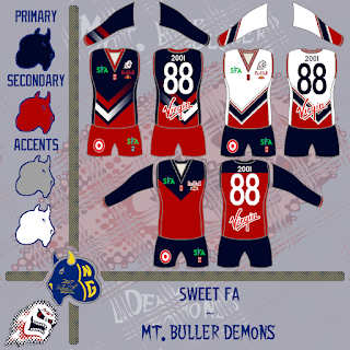
Every now and again you may have found me putting something up for the Coney Island Warriors for a fantasy Aussie rules banter-based league now and again. Well one of the other teams in this league is looking for a rebrand. I decided to put in my two cents. While the league is much like high school sports where many teams use logos from preexisting pro/semipro/amateur clubs, I so did the same by introducing a variant of the Casper Ghosts logo of Minor League Baseball (The Pioneer League, I think). Thus, I came up with several renderings. then I realized I didn't have the most up to date logo for the league to put on the uniforms, so I updated and reposted to this forum inquiry on Big Footy individually. Here were the initial results with the individuals to follow in later posts.


Also, you may have noticed the prospective July 2017 version of the presentation template. I was testing it on this Big Footy forum just for the optics. I liked the diamonds, but it was a faded look. I know I didn't use it too much, but unique was what I was going for... You might recognize the home and road as the Vancouver Canucks original alternate and Washington Capitals home and road all from the 90s. These come as polar opposite to the alternate traditional looking Melbourne Demons (AFL) heritage jumper. The checkmark design itself is not foreign to the AFL team in Melbourne, who used checks in previous clash jumpers. The team from Mount Buller in the Sweet FA (SFA, of Big Footy) has had a similar jumper to the alternate previously - see the link to the thread above. This is also using the most recent of my footy jumper/basketball template adapted for sleeves given the socks are still a work in progress better than their original form. I will have that up sooner or later, but it was originally based on Fernando Moreno's (S2dio) hockey template which I traced in part and made alterations to and (eventually) ditched the shading effects.

-Ricky

11 June 2017

Opening the Open Again

Greetings to you near and far. On Friday we saw the logo phase of this year's HJC Open draw to a close to be put up for vote. I did put in a submission for it this year and turned out something like this:


I discovered that, not having seen anyone else's entries until after I submitted mine, that someone else also went with the style of banner I used. Bummer! But this is a traditional look for me based on last years submissions. I had wanted to create a look similar to that of what the MLS uses, but could come up with a hybrid at best. But the most innovative one I saw was submitted at the same time as me in which it is basically a neon light "open" sign variant. Neat-o keen-o. Get ready to look forward to the days ahead for a series.

-Ricky

05 June 2017

Testing, 1, 2, 3...

Greetings sports fans! So we've seen a lot of the modified Aussie rules jumper template recently and wanted to go back to it very quickly. You may remember my initial go at it from between Thanksgiving 2015 and the beginning of last year. Well I (finally) got back to it and made alterations. The next step will be to continue fixing the socks and try adding different manufacturers collars (Nike, Adidas, Puma, etc...). In the short, I used the Arizona Coyotes as a sample for the template before I thought of adding sleeves to the template.


I took my desertscape recreation and applied it here but with rows of the alternate logo fading the closer it gets to the top of the jumper. I also wished to ad the crest from the old alternate into the desertscape to add to the back underneath where the sponsor would go as well as provide a logo above the chest sponsor on the front. The change was that you can no longer see inside the cuffs on the front view of the template. In the Mt. Buller samples, I made the shorts less baggy and had the jumper look more slim on the sides in addition to adding sleeves. The sleeves in that case also doubled to replace the socks that are still under remodeling. All in all it was a success full start to improving the template on the whole.

-Ricky

19 May 2017

Borrowing Ideas

I happened to recall a couple graphics used by the Sportslogos folks for the most recent Baseball Hall of Fame class and thought to tweak it to my needs. However these aren't really needs, I just was trying to test my memory of my involvement with soccer as a player. This process returned my to trading cards. All of this spurring from my first time playing organized soccer in some years (to help a friend, really, but it would have been nice to play of course. So the team Erie County FC is a new team in the new 3rd Division of the Buffalo District Soccer League for adult competition. It was this that made me consider that it has been quite a while since playing the outdoor form of the sport. So I then gave this a go.


All in all, picking up where I left off has been a little challenging from a stamina standpoint. Conditioning isn't what it was but still present and tactical processes are still on the sharp end. But it has been six and a half years since I have played on a full-length field. This shows how the demands of a referee are less than many positions within the BDSL. That said, just something different to put up here.

-Ricky

06 May 2017

"Aud-íos"

Thursday, July 16, 2009 was the date the following artifacts were recovered. Within two weeks after final demolition of Buffalo's Memorial Auditorium, these fragments of "Aud" structure were retrieved from behind the fence using a paint stick and pulled from under a loose section of fencing on the north side of the grounds. The original photo of me retrieving the items has unfortunately been compromised.


During it's time as a sports venue, the Aud hosted professional indoor lacrosse and indoor soccer as well as the former Buffalo Braves of the NBA and local collegiate basketball among the four local NCAA Division I programs (SUNY at Buffalo, Canisius College, Niagara U, and St. Bonaventure U). More to come on the special collections of the BNG Museum for Sport and Play!

05 May 2017

We Are the V

Who would have thought that today would be something more than Cinco de Mayo? Although one could say today is like the Fourth of July as American Independence Day where the celebration is actually a few days off. While falling on the first aforementioned holiday was pure coincidence, it was no fluke where I wanted to take this. Though not completely in the original form I had envisioned, much positive has come from this venture. And Whilst we are in a festive mood, I am pleased to announce the brand new BNG Museum for Sport and Play. The first such item(s) will be introduced tomorrow. To be honest, it feels like it was forever ago that I decided to do this. I didn't know anything about blogging either (I picked that up really quickly). While those are true, when things had changed from the end of the second year on, the time has picked up immensely. Of course it helps when someone other than myself cares about this (you folks, the Nickelonians), but also that I have had the continued interest in keeping this running for all of us, though not in the form I'd necessarily hope for. May we all eat, drink, and be merry today and every day so that we can be enlightened in our efforts. Here's to five wonderful years and the start of a sixth!

Best Regards,                  
Richard F. (Ricky) Mazella II

19 March 2017

Go Time

As part of the trohpy catalogue for my fantasy hockey league, I didn't want to use any old ESPN generated image. And while I thought about a photo from a trophy-making company, I decided to stick with one of the best trophies in sports: I'll let you see which one in particular for yourself in a second. I am expecting to cap of the season with a win to decide whether it is I or my opponent who gets our version of the President's Trophy. I am up 85 points and appear to be in control, barring a miracle to reverse the result.


Yes, the Calder Cup is the tankard in question. The Brier Tankard and the Philip Anschutz Trophy (aka MLS Cup) both contend in this category just to name some. As it were, this was not chosen because it is a hockey trophy, but rather the multi-tiered-ness that the other two do not have pronounced. I'm looking forward to all of this, having won 12 of my last 13, so that is great news.

07 March 2017

#PowerUp!

The following is a submission for the Australian Association of Basketball competition run by NM_Mitchell on Big Footy. The rules were as follows:
You are to design 3 or 4 uniform combinations, home, road, alternate and an optional second alternate. 
Your home kit must be primarily white. 
Your road kit must not be primarily white. 
Your alternate kit may not be related to charity, sponsors or any other theme. It is strictly an alternate kit. You must tell me how often you would like to wear this kit(s), it (they) must be worn at least twice (each), 51% of home games must be in home uniforms, and 51% of road games must be in road uniforms. You can also decide if it's (they're) only used in home games, road games, inter-conference games, or whatever you'd like.
You must design a home court to be used in a once-off round. 
Sponsor logos are optional, however, will be restricted to the same standards the NBA will be next year, a small manufacturer logo on the left facing breast, and a small sponsor on the right facing breast. 
League logo does not have to be on the kits. 
Kits must consist of a jersey and shorts. 
Shooting sleeves and jersey sleeves are optional. 
You must have a logo, however, it does not have to be original.
  • All kits are due by the 26th of March before midnight Melbourne time. Anything later than that risks losing points or being left out altogether.


So with that in mind, I did what I felt necessary to my bid for the Launceston ThunderSalmon. Launceston is known for both hydroelectricity and salmon, hence the name. Because many shades of salmon are between red and pink, I felt navy blue would be the best complimentary color with gold/yellow accents. Naturally, the logo had to be original since there is no such thing as a "thunder salmon" known to exist. As visible, we had our pre-release trailer.


I tried a new basketball template (one that I personally hadn't used before) since I've been looking for a friendly version that wasn't the one archived on this site. The court in particular was fun. Then again, the court is always the best element of basketball concepts, so take it as you will. anyway. Have fun taking this in.

-Ricky

26 January 2017

A Purple Eagle's Nest

It's 11 o'clock, do you know where your graphic designers are? Slightly earlier than this site has been used to, but I got to thinking. Niagara University's Dwyer Arena doesn't get too much love at center ice other than sponsor changes and when the World Juniors came there in 2011. And what has been there has been rather lackluster, simply the logo in a centered position with the area above the center circle reading "DWYER ARENA" literally in all caps. Pretty disappointing if you ask me, except now it reflects the team's play as well.


Here we go, a new and fresh look. Just what the doctor ordered. As we would now be seeing, we pulled a double logo - which in and of itself is nothing out of the ordinary for many teams. The big draw here is the rest of this behemoth. The arena name and location are in the team's uniform font, a match to the NHL's Vancouver Canucks. But the big draw is at the red line. The design consists of it's primary athletic conference, the Metro Atlantic AC (rather than Atlantic Hockey, it's hockey conference). It would show a touch of elegance to a respectable facility in the sport for which it services.

-Ricky

24 January 2017

Little Red Riding Hood's Lumberjack

Right on schedule! The next jersey to be added to the BNG closet has arrived. This one is better than the last one and was one that I was able to see in person. In fact, when this team started out, they earned an all star game the following year and those were basically copies of the original except with a hollow star replacing the hollow circle where the front numbers on this uniform go. Fromer MLS striker and current ESPN analyst Alejandro Moreno would say something along the lines of "you know it, and you love it," it is indeed the jersey of the Portland Lumberjax.


I could have done without their choice of number, but at least the color and outline pattern worked well to negate some of that effect. This sleek, futuristic approach was well received in the league and if that wasn't enough, they modeled a jersey after the logo! I've got nothing bad to say further except for maybe adding gold cuffs to the sleeves, but it is fine as is. That seems to be it in the short term, but I do have a short list of what to get next and they could be around the corner.

-Ricky

22 January 2017

Get Stung!

May the jerseys keep coming in - and there's one I'm expecting for the near future. This came in on Saturday, and boy does it spell "has potential, reeks mid-to-late 2000s Arizona sports jersey" all over it. The logo itself actually is solid, though I think this designer did the Philadelphia Wings re-brand about the time just before Columbus moved to Arizona because the lacrosse stick looks like an exact match.\ This particular shade of sand appears to be the same as that of it's hockey counterpart, but doesn't look as good as I would figure it might for a desert team, unfortunately, maybe a different shade could help pull that off.


Now for the good, this is among the most recent jerseys for the team, which means "STING" is replaced by "ARIZONA" and is a welcome sight since the team had established its moniker by that time. Also, I really like the shoulder yoke extending down the sleeves. Those remind me of one Rochester Knighthawks jersey I keep talking about... That said, my next jersey will arrive by next weekend, so be prepared!

-Ricky
Creative Commons License
This work is licensed under a Creative Commons Attribution-NonCommercial-NoDerivs 3.0 Unported License.