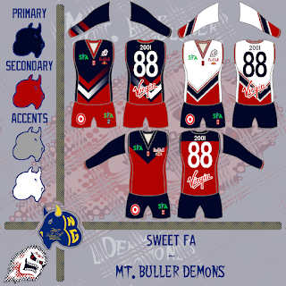
Every now and again you may have found me putting something up for the Coney Island Warriors for a fantasy Aussie rules banter-based league now and again. Well one of the other teams in this league is looking for a rebrand. I decided to put in my two cents. While the league is much like high school sports where many teams use logos from preexisting pro/semipro/amateur clubs, I so did the same by introducing a variant of the Casper Ghosts logo of Minor League Baseball (The Pioneer League, I think). Thus, I came up with several renderings. then I realized I didn't have the most up to date logo for the league to put on the uniforms, so I updated and reposted to this forum inquiry on Big Footy individually. Here were the initial results with the individuals to follow in later posts.
Also, you may have noticed the prospective July 2017 version of the presentation template. I was testing it on this Big Footy forum just for the optics. I liked the diamonds, but it was a faded look. I know I didn't use it too much, but unique was what I was going for... You might recognize the home and road as the Vancouver Canucks original alternate and Washington Capitals home and road all from the 90s. These come as polar opposite to the alternate traditional looking Melbourne Demons (AFL) heritage jumper. The checkmark design itself is not foreign to the AFL team in Melbourne, who used checks in previous clash jumpers. The team from Mount Buller in the Sweet FA (SFA, of Big Footy) has had a similar jumper to the alternate previously - see the link to the thread above. This is also using the most recent of my footy jumper/basketball template adapted for sleeves given the socks are still a work in progress better than their original form. I will have that up sooner or later, but it was originally based on Fernando Moreno's (S2dio) hockey template which I traced in part and made alterations to and (eventually) ditched the shading effects.
-Ricky


No comments:
Post a Comment