31 May 2014

HCI: (The Final) Post XVIII

*** The following is my post from a different site, please visit hockeyconceptideas.blogspot.com for the article. ***

. . . Thank You and Good Night, Elvis Has Left the Building!

It is with regret that we must for the moment leave you from the Blogger-sphere. Thank you for allowing me onto your screens over the past six months. It has been wonderful to have your support of HCI during that span and beyond. We all have appreciated it very much and hope you keep submitting to the blog's e-mail, which will be accepting submissions for our new Instagram page. My blog BNG can fill your reading pleasure, but also you can find other blogs at my site as well. Please make your final purchases and proceed to the checkout counters.


Remember, this is not goodbye for us here at HCI but rather the start of the next chapter. We still have our new Instagram account and who knows - we may be posting here again regularly. But only time will tell. "Stay calm, be brave, wait for the signs."

With Highest Regards,

-Richard F. (Ricky) Mazella II
Proud Founder and Owner of Buffalo Nickel Graphics

30 May 2014

Motor City Mayhem

Does this idea look familiar, Nickelonians? It should if you've been with us for a while. You may remmber a pair of revivals to that old Rochester Knighthawks alternate. Speaking of whom, they lost a Saturday ago and I hope they don't rebound tomorrow to win the series (and championship for the third straight year).  Anyway, I decided to apply a similar scheme for the Red Wings.


Detroit has never had a third jersey not used for a special event. Nor have they ever used black. I wanted the accenture to be for this jersey only and if they had an alternate, it would be too similar to the home jersey. I had originally considered arched font over numbers but quickly scratched that idea. I also wanted to add striping, again to distinguish it as an alternate. That covers this jersey well enough. A very interesting week is ahead as next Saturday will mark the first time in a year that I may actually have an exclusive BNG post on Saturday. Stay tuned for more.

-Ricky

29 May 2014

Kings of New York

The following is a feature presentation . . . sort of. This one you may recall as being a part of a Lady Liberty set I did last year. I just took that and made minor changes to it.


The bottom white strip was thinned to become symmetrical to the top. That's the only change I really made to it. The template sheet just adds to it a little. The Rangers are a team that can still look old-school with their new school logo but refuses to experiment with it, despite the logo's popularity. In the meantime, I'll be on their bandwagon for the rest of the playoffs - as I have been since the Ducks got beaten. I just want to see Hank get a ring.

-Ricky

28 May 2014

Will They Use This Yet?!

As the title implies, I am surprised the Canadiens have not used a blue jersey copycat of their home and roads (sans the white part of the cuffs). I sure as much would like to see it happen soon. This is done as a part of my new Third Jersey series.


Like I said it's not anything special, but let's admit, you couldn't tell the Habs have never worn such a jersey if you knew nothing (or very little) about hockey. I did an almost exact replica I have not looked at since I posted it over two years ago and just redid the jersey with probably a few changes and on a different template. I would've switched the white and red in the numbers, but I was going off the red home jersey for those. That being said, this became the final product.

-Ricky

27 May 2014

I is for Indigenous

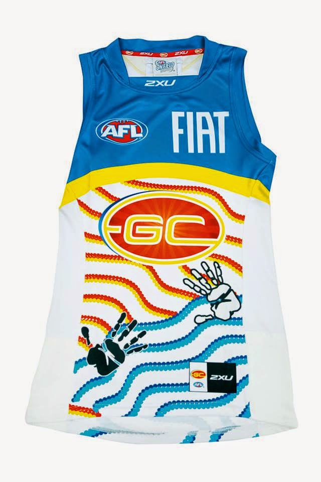
This year's Indigenous round jumpers for the Australian Footy League have been released and you'll get to vote for your favorite! Browse the gallery below and make your decision We have ranked the jerseys from best to worst and the results are in. Jerseys go from left to right then top to bottom.

1. BL  2. SYD  3. NMFC  4. GWS  5. ADEL  6. HAW  7. FRE  8. PORT,
9. GCFC  10. STK  11. CARL  12. COLL  13. WB 
14. ESS  15. RICH  16. GEEL  17. MELB  18. WCE

                                   ADEL                                    BL                                CARL

                                    COLL                                ESS                                   FRE

                                    GCFC                              GEEL                                 GWS

                                     HAW                               MELB                               NMFC

                                    PORT                               RICH                                  STK

                                    SYD                                    WB                                  WCE

There will be a poll available for a while on the side of the page, so get to it while you can!

-Ricky

25 May 2014

You Could Die Quacking

Buenos dias, Nickelonians! (I'm hoping that will catch on soon, but probably not) Glad to write you again this fine Sunday. In fact, my aunt was proposed to sometime after Friday's publishing (and you know I prefer not to make edits on BNG at least). So there is cause for some happiness in the family at the moment . Elsewhere in my life, I was feeling a Ducks concept to be made. Remember Jake88's concept for the Ducks a month or so back from one of my HCI posts? That's what got me thinking. And quite honestly, I think I might like it better than my Hawai'ian Ducks jersey. If I could turn these all into customized jerseys would be really neat, but I'm guessing really expensive too. Have a look at this set for now.


I took care of the biggest problem of all - or at least complaint: orange. I present to you an orange home jersey. I also brought back a revised version of a short-lived alternate. For that, I would have liked to keep the numbers inside the sleeve striping but it didn't work out the way I would've liked it to. For models, I took three of my favorite (current) Ducks who all happen to be defensemen - Selanne doesn't count because he is now officially retired as of last week. I really wanted to use the "OC" patch as the crest for an alternate, but it simply isn't strong enough to be more than a patch. I also included the appropriate equipment that would go along with it.

In addition to my aunt's engagement, the party that my mom was apparently throwing at that lakefront property for later today (the one which I painted that Angels stencil down the road from Lucille Ball's house) has two pre-existing celebrations. The first is the same aunt's dog's first birthday (I'll pass - but have to go anyway {thanks mom, whose birthday was Friday}) and the one year anniversary for the divorce of another relative (I'll pass - but have to go anyway). The latter in itself was because everyone in the family hated the husband who clearly won't be joining us. Talk about drama in the family. Maybe I'll paint more in that room - Arsenal perhaps just since I root for them and they have the same color scheme as the Angels. Something to look forward to I suppose - just as you have the next post to look forward to. Until then it's bye for now.

-Ricky

24 May 2014

HCI: Post XXVII

*** The following is my post from a different site, please visit hockeyconceptideas.blogspot.com for the article. ***

Friday: Six Months Gone By

Those aforementioned changes in previous posts by various HCI writers are indeed coming. While we can't give the green light yet, I would like to reflect on the last half a year of blogging for HCI (which began six months ago this coming Thursday as well as today being the blog's 250th post. I also failed to mention that last week was my first full year of writing for any blog as I had started writing for HJC the day after (Saturday the 17th, but last year). Even though I had left HJC on November 22nd, Caden and the staff welcomed me with open arms and I started the following week here. I even got to celebrate my birthday by writing a post (rather than reading one). Twenty-seven posts (and weeks) later, I'm still here to promote the good will of the blog. While I don't know how long this format will keep up, it is likely you will hear from someone soon.

Philadelphia Flyers

Submitted by: Bradley DeBode

Let's in the mean-time discuss how ingenious this concept from Bradley is! Not the best one ever necessarily, but certainly creative and authentic. Another black uniform is certainly doable but I would like to see the alternate roundel in place of the Flyers logo. Because this is an alternate, I would like to see orange numbers with white rather than the current white with orange. If we're going to go with the nameplate, go orange there while keeping the black font. Finally either switch the striping color layout or the number color layout to match the other along the sleeves. Personally I'd prefer changing the numbers to match the striping. Still not a bad idea here though.

Happy 250th post!

I'm really looking forward to the future of HCI, I hope you do to. You all have been waiting a fairly long time for it, and while I can't be sure of when it will be, I can tell you it will be drastic. In the mean time, considering the post count in recent weeks, BNG is picking up. Head on over to fill your need - just keep checking in here considering the changes to come.

-Ricky

23 May 2014

What About the Tigers?

Heard of "lions and tigers and bears, oh my?" Well it's really Lions and Tigers and Bears. Richmond never had anything to do with the Brisbane/Fitzroy merger, but Fitzroy was heavily involved in moving to Brisbane in 1986 before the Bears were granted expansion there. I Personally liked the cerise wide-v jumpers thus it came up with the deign below.


This well combines the aforementioned cerise jumpers while keeping the club's current colors and mascot. All sponsors are current to the 2014 season even. The kit manufacturer is up to date as well. Sit back and enjoy this one a bit. Except it doesn't say Brisbane Bears~Australian Football League next to the logo in the "team" section. This one's for mom - happy birthday!

-Ricky

22 May 2014

"Come Visit Me On the Island"

Hi friends, hoping you're enjoying some quality hockey so far this round. The title for today is derived from a professor of mine who's office is separated from the rest of my department, which in a way has become a theme of his. I'd like to welcome Phil B. HJC regular and founder of DDragon60 Studios with his first contributions here! His site has been added to our "Friends Of" tab so check his site out after today's post. One of his concepts that he submitted for here made one of my HCI posts from a few weeks a ago. You can see that here. Speaking of Islanders alternate, there was another idea that Phil submitted to us on the matter.


Well as conservative as this seems it has a little flair to it. The thin orange stripe along the sleeve is subtle but still somewhat noticeable. The chrome logo has been de-chromed and it looks pretty good compared to other dechromatized versions. Hey, this one works for me. You'll be seeing more of Phil's work within the week, so keep posted for more!

-Ricky

20 May 2014

Not Another Indigenous North Jumper

Remember my "draw-up" for last year's indigenous round? Well low and behold this year's is upon us. The Indigenous Round in the Australian Football League is not too far away. The roo footprint on the back is what my boys from North Melbourne came up with. I simply modified it a little and added everything else accordingly.


I wanted the roo print to be more prominent than it was on the real jumper, which is significantly more subtle other than the main one on the front. That one is one of only a few released before the actual week leading up to Round 9. Speaking of which, all of them will be up here in time for the end of the round for you to vote on your favorite.

-Ricky

18 May 2014

Vene, Vidi, Vici!

This last design is a part of my resent batch of designs for the intramural shirts I created for  Springfield College's campus recreation department. The lion I figured needed to stay on at least one shirt, but needed a new script on it than just "IM Champs" to be seen. Again, I changed the original numbering to the MLS font but kept the Maple Leafs lettering for "Fall".


Julius Cæsar is well known for his quote "Vene, Vidi, Vici!" Literally 'I came, I saw, I conquered' for those unfamiliar with it. It would only be fitting that this be selected to represent the shirt. But I cannot imagine that this version did not get the signature campus rec logo on it - oops.

-Ricky

17 May 2014

HCI: Post XXVI

*** The following is my post from a different site, please visit hockeyconceptideas.blogspot.com for the article. ***

Friday:  From Purple Eagles to Foxes and Back

The official announcement came and went fairly quickly and without much if any detail several months back. The HCIHL's Skopje Foxes have split into two teams with one facet staying in Macedonia in the upstart Balkan Hockey League and the other moving to Buffalo who will represent the franchise in the HCIHL. The official announcement of their home venue(s) were selected as the regular home will be at Niagara University's Dwyer Arena and having select games held at the yet to be completed HarborCenter in the downtown area, the new hockey home of Canisius College (who previously played at Buffalo State College's arena.

The Ice

The boards

End to End (TV broadcast)

This is what is expected in the coming months . . . The new uniforms have been well prepared, and had been officially released on the team's page on the league website. While many of you may have noticed that I have decided the team not use the primary logo on the uniforms, I wanted to use logos that actually look like they belong on a uniform. But I am excited to see the next season of the league with all the other changes about it. Landrov Air will also be the official league airline, servicing all team destinations (notice their main sponsorship section along the boards). That will have to be it from me for now, but it's time to #PaintItOrange so I leave you with one final word for the weekend: quack!

-Ricky

16 May 2014

Return of the Camo Shirt

This design is a part of my resent batch of designs for the intramural shirts I created for  Springfield College's campus recreation department. At SC, camo in school colors is very popular. when I presented all of the shirts to my boss, we agreed due to camouflage being expensive but sill likable that it should be used for flag football only. This was heavily altered too. I decided that now having access to the new MLS font, I'd use those numbers.


This one is definitely a showstopper, catching attention to itself right away. One of my favorites to put together as working with camo was not as hard as I thought. The trick is to make it yourself rather than using a generator or using a template to color in. Give it a go yourself if you're daring enough and see how it goes.

-Ricky

15 May 2014

The Return of Survivor

This design is a part of my resent batch of designs for the intramural shirts I created for  Springfield College's campus recreation department. This one I have really liked. I somewhere surfing the web found a blank survivor logo template when looking for ideas to come up with a shirt a year or so ago and decided it would be great to experiment with. I knew I had the "Survivant" matching font for the rest of the shirt. I then took to Paint.Net and used the sketch feature to render Blake Arena, the campus' 2,000 seat basketball and volleyball facility (not the original basketball court or arena). And the sun I included just looked cool. Thus I got my creation.


Because it wasn't selected in that grouping of designs, I decided to bring it back updated. For a team to be called "sole survivors" was just too good an opportunity to pass up. The only big change I made was that the shirt become gray from white.

-Ricky

14 May 2014

The Return of Ol' Claw Eyes

This design is a part of my resent batch of designs for the intramural shirts I created for  Springfield College's campus recreation department. This one you may actually recall . . . it is an interpretation of the Ottawa Lynx. I replaced the baseball with the school emblem - the YMCA triangle in a circle on which the school was originally founded upon. Springfield, MA is the birthplace of basketball (at the college) and the YMCA (originally the YMCA Training School, c. 1885). In recent years, the athletics program renamed the athletics nickname to "Pride" sometime between 1995 and '96.


This in turn ties in a lot of history with the shirt. The campus rec  logo that is actually the athletics logo with "campus recreation in block shadow letters below it. I have always liked the logo on the lower back, but keeps getting placed on one of the shoulders - usually the left.

-Ricky

13 May 2014

National Springfield

Today is the start of a mini-series of my resent batch of designs for the intramural shirts I created for  Springfield College's campus recreation department. The first was inspired by the MLB's Washington Nationals and their IL (AAA) affiliate Syracuse Chiefs.

This one is simple and thus needs no explanation. It comes from the DC alternate logo used by the Nats which has been used by the Chiefs on occasion. Oddly enough, Springfield was also nicknamed the Chiefs starting circa the 1930s until sometime between 1995 and '96.

-Ricky

10 May 2014

HCI: Post XXIV

*** The following is my post from a different site, please visit hockeyconceptideas.blogspot.com for the article. ***

Friday: Land of the Other Rising Sun

No concepts, not a problem. Happy to write you again this fine Friday. I pulled something out of the BNG archives a midst my Ducks beating the Kings last night. As we go forward, I am glad to give the concept a polishing off from about seventeen months or so ago. This was before I knew about the goings of how this arena thing would work in Skopje.


So the big thing is that the logo is actually discolored and I had a difficult time brightening it. As for the arena, the exterior was only to cover the already existing ice which is adjacent to the actual arena. Not only that but they did have an open air dome put over it. Fine. As for the actual jerseys, I adjusted to the area of competition and used the KHL inspired template.

What's wrong with this picture? This is old, not yours, and a review of my own work. Please, I beg you to send in your work! Now I know that we've slowed down here a bit, but for me it's the joy of someone finding my work on a site is ecstatic. I would hope you feel the same. Until (probably) the next round of the playoffs, happy hockey and wish your mothers a hearty Happy Mom's Day.

-Ricky

05 May 2014

A Cinco de Mayo Birthday

It's an exciting day here at BNG, celebrating this day two years ago when we launched our site (shoot the confetti, pop the champagne)! Let's dig into today's content. These concept are going to go on Big Footy's forum - more specifically the merger thread.


The first of the two is with the name West Coast Power. I thought Perth Power might sound better, but it doesn't really matter. To the back went the SANFL bars to prevent the clash jumper from appearing to be bland. I took typical Port themed designs slapping the current Eagles colors. I have always wanted to see the West Coast use the orange much more, so this provided yet another opportunity.


The second in the pair allowed me to make a terrible color selection with an ancient looking design and turn it into something more appealing with new colors. I'm referring to the home kit on the left, but I had some difficulty trying to put a clash jumper together. All in all, I found a way to add a little more color than just black in it.

After all that fun let's relax and celebrate some more, then it will be back to work for me at least. Remember, third jersey inauguration will be held on the date after Game seven of the Stanley Cup Finals so stay tuned for the confirmed date! Until later, my talented readers . . .

-Ricky

03 May 2014

HCI: Post XXIII

*** The following is my post from a different site, please visit hockeyconceptideas.blogspot.com for the article. ***

Friday: The Lighthouse is Working

Second round ahoy, HCI readers! One game is in the books and what a doozie it was. The Canadiens won it in two overtimes and took the first lead of the series. My Ducks go at it tomorrow, while the remaining two series start tonight. Until then, let's view a concept.

New York Islanders
Submission by: DDragon60 Studios (Phil Beck)

Phil has brought us a home and road of the first ever Islanders alternate (which was orange) and my gosh does it look gorgeous. If the alternate were brought back, c'est magnefique! The rest of the equipment and uniform look very solid to boot. I really appreciate that the Stadium Series logo is no more then a shoulder patch logo here.

While I'd love to stay and chat, it imply cannot be. Until next time, I bid you good hockey!

-Ricky
Creative Commons License
This work is licensed under a Creative Commons Attribution-NonCommercial-NoDerivs 3.0 Unported License.