31 December 2013

Stadium Series: NYC (24-7-365)

As I back jockey for my dad for a New Year's Eve party later, who needs help with his updated music library, I will be doing what I do best - write and draw on index cards and roll non-six-sided dice to re-write the history of various sports leagues. In the mean time, New York should be a pretty hip happening place as the new ball will drop at midnight. I'd rather do what I did here and give a go at the Stadium Series jerseys for the games in the Bronx.


The Rangers are the visiting team for both games. I think that the Devils should because they are out of state compared to the others.  Anyway, all three teams have had something from the past reappear on their jersey in some way. What a good way to start with "Lady Liberty." You may recall that I added her to a new set for the Rangers towards the middle of the summer.This is similar to the red alternate I included in it.The Islanders not only have the "championship stripes" on the arms, but it also includes a new aluminum silver outline within the limits of the logo (an idea taken from the Sabres). The championship stripes can be the intended white and orange or the possible navy and white. Finally, New Jersey has its forest green again, but the black hasn't left either. While it's not on the jersey, it still plays an important role as the color of the pants to break up that overly flamboyant color scheme (the red more than the white or forest green) for the pants. Who wears white pants anyway, how about white skates (other than a team owned by Charlie O. Finley)?  Well that pretty much covers everyone. While it's no my mind, I am in the middle of bidding for a blank Lady Liberty jersey, which I mad the opening minimum bid of $50 (USD) and am hoping will stay put (yeah, right).

Speaking of New York, neither football coach at Metlife Stadium will be losing their jobs this year, asbothe have been retained for at least one more season. Dan Coughlin will stay with the Giants, while Rex Ryan's remarks about his potential firing are now false. Elsewhere in the world, If anyone reading is interested in taking ownership of a team, there is a team for sale in HCI's Hockey League. A GM or Director of Hockey Operations positions are aavailable. Both are the same except the GM will need to run a team website/social media and create the team uniforms. DHOs can do that too, but it is not required. I highly suggest you check them out. In the mean time, we'll see you next year!

-Ricky

30 December 2013

Stadium Series: LA

The whole series actually took me less time than I had figured, so I am very pleased with the results. Though not perfect because of the means of the template, I cannot be overly disappointed with how things turned out. I was going to do the Winter and Heritage Classic uniforms but I am probably going to refrain from the former. As for the latter, I'm undecided. This mini-series was a lot of fun to do, lets check one of them out right now!


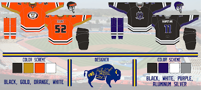
This one was the easiest. You will notice that there is no chrome in these designs, even though I like the chrome, they just don't belong on jerseys. In addition, all of the jerseys will have mesh underarms. How about the Ducks elongated roundel shoulder patch? I've promoted that as a crest logo and retained the Orange County patch from the actual jerseys for the shoulder yoke. In its competitor, I brought back the purple for the Freeway neighbors. For me, the silver is not enough of an accent color to support the black and white. I also brought back the shield logo to the crest design. How do you think I fared the task?

I am not too pleased with what I saw on Saturday night at the Sabres Store. While I got to go through the various NHL, Bandits, and (Rochester) Americans jerseys, they bumped the price of Bandits uniforms up two dollars and an additional ten on Sabres named jerseys. Now I don't buy jerseys from there except that blank NLL East All-Star one and there are two local places (one Bandits store, one other store) that have the best deals in town. But I saw other jerseys/templates for the first time in person. These include the Sabres cape, the IIHF jerseys (RUS/CAN/USA), the Flames third, and the practice uniforms (in this case, Sabres camo). They don't have all of the teams home and/or away. But they also showed the Bots alternate for the first time. But hey, I at least can get another look before I go to school a week from Friday when the Bandits host the Toronto Rock.

-Ricky

29 December 2013

The Buffalo Arsenal Club

Two years ago, I wanted to be a part of gathering a group of Arsenal FC supporters to become an annex of Arsenal America. Somebody beat me to it last year. But I am in this season and I have even been asked to come up with an alternate logo for our division. I've started to do that today. These are what I came up with.


While I am recovering from a Bandits loss and preparing for the final Bills game of the season, I've finished my Stadium Series collection! Those will all be up this week.

-Ricky

28 December 2013

HCI: Post V

*** The following is my post from a different site, please visit hockeyconceptideas.blogspot.com for the article. ***

Friday: Back in Banditland

While I'm excited for the start of box lacrosse season tomorrow night, I have hockey business (like this post) to tend to. But if you ever get to go to a game, I recommend it - especially in Buffalo or Colorado who have the best fans in their respective divisions. I'll be going tomorrow night and I prepared some concepts for that (you'll know where to find them). I am also in the process of getting stadium series jerseys underway with the new template. Those will be here sooner rather than later.

Creighton competition ballot closes S-a-t-u-r-d-a-y night!

2014 HCIHL Frozen Face-off
Submitted by: Matt McElroy

Boy would I like to have my team participate in this if it is continued. Matt here gives us different shades of blue and gold for the Rivermen, which now look more like team Sweden, but it looks good - much better than at least the current alternate which to me appears bland for an alternate. Now the Stags on the other hand find disfavor with me. It's not because they are well ahead in the league. It's not because they're from Hamilton, and it's certainly not because Matt is a Ducks fan (correct me if I'm wrong). It's that wordmark most of all, but also the mismatching amount of stripes and the odd pants stripe. Even the number font doesn't look like it should be on a jersey.
I do like the color, but most of it doesn't make sense. If it weren't his team, it would be easier to say 'I wonder what Matt McElroy would do' but we can't do that. I honestly have no suggestions as to how to fix it. I really want to so that we can say that there is hope. Speaking of hope, that's Matt as he is good at making things better whether he gives someone input or changes it himself. I may not like that one much but it has potential and the Evansville kit looks sharp.


Submitted by: Matt McElroy
Let's move onto another of Matt's objet d'art. This time he takes us to the Rock we know better as the Prudential Center. I think this would look even better in the green the team used to use, but this is a very good start. A double yoke outline and tri-stripe design really highlight the other elements really well. The only thing that might need immediate attention is the helmet, which should be red because I feel it blends in too much with the yoke. They would be green in the case of that color being used over black. Still, nicely done.

Creighton competition ballot closes S-a-t-u-r-d-a-y night!

Before I go, it's time to do something that I forgot to tell you about with the chaos of exams and whatnot. The Ricky Points System (RPS) has arrived! {applause, please} Glad it didn't show up yet, because I made changes appropriately to make it more suitable. The criteria are as follows:
  • 10 - Receives a perfect score from the old rubric. (it's really hard to do, that's why it 's worth so much)
  • 4 - Hand-drawn/heavily genetically altered work (of premium quality, not low grade)
  • 2 - "Ricky-esque" in design (not that I like concepts that look like mine - I'm pretty tacky with my wardrobe after all)
  • 1 - Personal preference

* * * Negative points will be added as the converse of the above {except 2 point rating which is replaced with unoriginality and 4 point rating which is poor in electronic graphic quality only}. However, you cannot be in the negative or at zero upon receiving negative points. Contest winners are subject to points (6,7,8 - cum laude, magna cum laude, and summa cum laude) if they reach a minimum on the rubric - provided I have not yet surveyed that concept. * * *

Now let's get caught up, shall we? Matt McElroy's Columbus concept from  two weeks ago almost cracked the the safe with the rubric missing by 4 points. However, the RPS point he earned was primarily the result of the boldness of that concept. Not including execution, any person can get at least one personal preference point for getting a perfect score in a particular category (boldness/conservativeness {whichever it leans towards}, color, impression/appearance, originality, and presentation {I'm big with food presentation, so I include it}). I would award Matt (again) at least one point for the Evansville uniform, but it is only part of a concept and is therefore not eligible. Many others have come close, but only one has succeeded. Enjoy your (for now) lone point as you can lose it and others can gain ahead. Make friendly competition of it if you want or something, the points really don't matter. This is not a concept or concept artist rating either. Just sporadic points being dispersed around. If necessary, just shoot comments or questions around in the comments section - remember, it's in good fun. With that, I bid you a good weekend and happy hockey!

-Ricky

27 December 2013

. . . To the Box Box Box, Wooooooooo!

There are places where you will hear the following: (Hey #__ )"Take. A. Seat!" in Colorado, "Get. In. The. Box!" in Minnesota, All of that is true, but if you want a truly unique experience, wait 'til you get to Buffalo.


The box chant with Chris "Swennie" Swenson announcing the penalty(ies) to follow is a familiar staple in Banditland and recently followed by Marilyn Manson's Beautiful People. Over the years, the costumes may have changed, but the PA announcer and four season ticket holders have not!

For the individual match-up, the NLL has put a press release. This will be the 56th all-time regular season meeting. The Bandits have never had more league wins than Philadelphia. They've been within six for the past few seasons, but are now down to two wins at 174-120 (not including 20-14 in the playoffs) in 22 seasons compared to the Wings  176-158 (not including 16-11 in the playoffs) in 27 seasons. Buffalo leads 29-26 is the rivalry between the league's oldest two clubs, while both teams doing better at home 18-12 (30) for Buffalo and 14-11 (25) for Philly. Buffalo has even played two more games against Rochester who are three years younger than the Bandits. But in the early years (pre-Knighthawks) the Wings and Bandits were in opposite divisions of three teams and an eight game regular season. Before 1996, Philadelphia was the rival of every team in the league due to their physical aggression - everyone hated them.

The Bandits home uniform by: Projoy (official player jersey)

The playoffs are even more spectacular. Buffalo has won three of four meetings in the championship game for the North America Cup. While the Bandits lead the playoffs 4-3, they are up 3-2 at home, with the teams tied at one win in Philadelphia. Note that in 1995 the "host" Wings had to play the game in Buffalo not because of a scheduling conflict, but due to a league attendance rule which forfeited the game's venue if they had a smaller season attendance of the competing clubs. When the teams met in the Championship a season prior, they both sought a third ring - three straight and (in-a-row) against Philly. The championship game part of the rivalry was fizzled out by Rochester who played both teams once (Philly in 1995 and Buffalo in 1997) after that the Knighthawks budded a rivalry with the incoming Toronto Rock meeting in 1999, 2000, and 2003.
Philly would beat Toronto in 2001, Toronto won in 2002 over the Albany Attack (now Vancouver Stealth) and 2005 over the Arizona Sting, Buffalo lost in 2004 and 2006 to Calgary and Colorado respectively in addition to beating the Portland Lumberjax in 2008, and Rochester beat Arizona in 2007. Since then, the Stealth while in Washington (state) created a championship game rivalry with Toronto (2010 & 2011), following their loss as Albany in 2002. Rochester has beaten the Edmonton Rush then Washington, both by a goal. That puts a total of six for Philly and Toronto while the Knighthawks are now tied at four with the Bandits.

The Wings road uniform by: Projoy (official player jersey)

Now that I've sort of bored you , let's get to the innovative part - my creations! After that, check out this report card from the 2012 preseason and this dormant blog for other informarion.


This is the Buffalo uniform I'm doing. The Bandits were far from the first team to have an alternate uniform. However, they have had good ones. It was surprising that they came out with on at all when the firs debuted against the Rock at home on 14 FEB 2009 when they won 25-10 over their QEW rivals. That got replaced by the Anniversary jersey in 2011 for the one season. Neither have returned since. I'm not completely dissatisfied with their current set, but I sure miss the old stuff (you can find that in the closet above in the tabs)! I decided to go simple, while keeping the font and new championship stripes at the front of the collar. I made some alterations along the way too - I added a side-panel gradient to incorporate the purple-blue shade which I'd like to see just a little more of as we had with the new uniforms. The gradient is common in modern NLL attire. The colored nameplate was done to both make it look a little different and to break up the black on white font - not the best idea, but again . . . it's an alternate.


Philadelphia has had some pretty spiffy jerseys too. They've had a red (only as alternates) and a green before. And then there is the twitter handle jersey. As gimmicky as that was, I liked them for the color. Problem is without the Twitter handles, the jersey wouldn't make sense for that team or really any team other than maybe Rochester. This one serves as a combination of eras for this team rich with jersey history. The grey with black yoke was used in the c. 1989?-1996? I want to say. Except the red wasn't prevalent at that time. The 7 pinstripes in the number has been used in other uniform striping. The "Philadelphia" on the inside of the collar was never used but "Wings" was featured on both sides of the front collar towards the middle in the mid-2000s. Philly has panels that are in multi-color gradient and I did the same here, continuing to differentiate from the early '90s jersey. The multicolored stitching has been another modern feature on NLL jerseys these days . . . I've included those here as well. The numbers that the NHL's Nashville Predators use also have been used by the Wings for some time now. I replaced the indents of their logo used inside the outline for the stripes to do something different. It's been a few seasons now that the numbers have been colored in solid.

Back to the grind, tomorrow. We will indeed be posting at HCI shortly. Don't forget that your concepts are welcome for submission, just remember to keep the good nature of them. In the mean time, I'll be off to Banditland tomorrow!

-Ricky

26 December 2013

The Return of Robo-Penguin (on Boxing Day)

Our first order of business today is to send our Boxing Day greetings to our readers from the participating jurisdictions. Now that that is taken care of, I welcome you to another BNG Thursday. I'm not sure about the content of Saturday as it appears we have the day to ourselves on HCI, so there may actually be something on here from BNG. But you should know by tomorrow.


As you may recall, a modern version of this was done by Alan and displayed on Tuesday. As it is appropriate to the era, the piping is no more and the chest stripe takes place of the colored panels. The arm striping is straightened and the yoke has changed color. I don't know how I feel about the pants (I know it's what they currently use), but hey - it could be much, much worse. Although you can see the transitions of the gradient, they wouldn't actually turn out that way, but I know PDN can do a smooth transition. In any event, O wouldn't change a thing other than maybe the sock striping possibly matching it to the yoke.

Remember, tomorrow is Banditland day, so be prepared for additional information (sorry if it gets a little lengthy). 

25 December 2013

. . . And to All a Good Night

I'm making today short and brief other than one of Alan's next two concepts. He tells me that both of these are a "year later" from the previous. let's get to it!


I see that the Avs  have 'improved' over the year. The vertical piping and side panels are gone which means the steel blue is a little less prominent. That's the major difference in addition to the yoke being broken up from being sleeve-length and the resulting half striping is extended on the rest of the sleeves. Minor things include the additional stripe in the collar in particular. All is much better than the previous Avs concept.

All in all, a cold concept for a cold day in Buffalo. On behalf of the entire staff of BNG, we wish you the most joyous and celebratory holiday season wherever you may be.

-Ricky

24 December 2013

Robot Meets Penguin

It's almost Christmas Eve and almost all of the snow has melted in Buffalo . . . I recall two green Christmases in my lifetime, but a light coating of snow is expected sometime later today. I am posting this early solely because of the nature of the traditions of who is going to who's house for the feast. I myself am still being asked to help because we have that many people coming to us in the Mazella household. I will do the same tomorrow, but slightly later.

This is probably how the "Robo-penguin came to be, except without the Edge and without the Vegas gold. The striping doesn't quite fit the bill either, but it's still sort of close. But that's what Alan has in store for his final concept in the most recent set of them he has sent in. I have also prepared to present something that was a last minute decision . . . my Creighton Bluejays concept from the HCI competition last week (voting is going on there, by the way). Usually it would be posted first, but I will use it here before anyone gets to trick-or-treat it on me (I know, I'm late for Halloween).


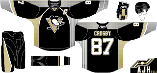
As much as I hate Cross-bee and I want to cross him out of hockey completely, I would've liked to see him in a robo-penguin type uniform. This is the second closest we get if the Pittsburghers decide to bring the old ones back. Just as the Canadiens and Avs concepts within the last week, I'd prefer the removal of the piping and I'm not a fan of the curved arm stripes. Honestly, I miss the chest stripe (no surprise). But I do like that the design of said stripe has been transferred to the rest of the jersey. I don't know how to help this other than change the rest of the equipment and clothing around. Being such a 90s inspired design, it's hard to come up with improvements for one of it's more successfully themed sweaters.


The one thing with this that I couldn't fully figure out was how to do the road jersey, mostly because I didn't know how to do the numbers. I still don't have much of an idea with "blue" and with "blue 2" I now wish I only did a single thicker white outline. Too bad I've submitted it . . . nothing I cant fix to send in elsewhere. But hey, I like this a lot better than the previous font. While the logo is modern and pulled a UConn, that at least wasn't that bad and they had a mascot that actually looked like the logo (as opposed to UConn). Speaking of, as a person who lives part time in UConn territory, I have gotten negative reviews (from one better friend in particular) who can stand it. I said 'it has to happen sometime." Even the Yankees and Canadiens it'll have to happen sometime. Back to Omaha, Creighton is doing well in athletics again, so the change for that reason at least should be welcomed, though word on the street is they want the old Billy to come back for the most part.

With midweek looming near, I am just about completely gulfed into indoor lacrosse season as the Buffalo Bandits season and home opener against the Wings of Philadelphia this Saturday. See something regarding them on Friday! This is the first time in several seasons the league has begun play before the new year, the last time was the '07 season when I was listening to Buffalo lose to the now-defunct Portland Lumberjax hand the Thieves their first loss in history on a road opener. I still haven't gotten the thieves moniker to stick around here (or referring to 'the den of thieves' - we call it Banditland, not that there's anything wrong with that) The place will certainly be rocking, as a new head coach and notable new players take the stage along with the same player who's suited up every season and the same PA man who's done the same - it'll be one fun night in Banditland.

Season's Greetings,
-Ricky

23 December 2013

A Leafy Winter Day

Today, I give you what I believe to be Alan's most logical and realistic designs of the most recent six while tomorrow's is more ideal. It has almost everything you have from a Maple Laughs sweater (eh?). Just kidding, but seriously, when have they won Lord Stanley's Cup lately? Sorry Leafs fans, but it's true. A pity for a team that has had some iconic jerseys, and entertaining ones too (thank you Harold Ballard).


If there's one thing I've  liked about any Leafs jersey, it's gotta be the striping. Totally TO, isn't it? While I don't fancy the logo, I like it better than the one they'll be using at the Winter Classic in just over a week. The font itself is also Toronto oriented.. I'm not too keen on the colored cuffs, but it is fairly minor in amount, particularly on the home blues. The road whites wouldn't be bad in full blue cuffs but the home wouldn't in white. A blue yoke could also happen or do both together, but without them is still a good option.

As I alluded to before we have one more concept tomorrow from Alan. After that, I have nothing in my inbox waiting to be posted. That means you could have your own concept on a post by itself (tell me that's cool, right?). Don't think about it too long and don't second guess yourself. In case you aren't yet aware vote for my Creighton University concept over at HCI! It runs until the end of the week, but don't delay and vote today. Much obliged, I'll be back tomorrow.

-Ricky

22 December 2013

Ice Storm?

The Northtowns of Buffalo are still mostly out of power due to a severe ice storm from last night. There could be worse things than that though. Could you imagine being stuck in an avalanche if you haven't been unfortunate enough - for the holidays? I've heard of it almost happening at a ski resort once. Anyway, while were on the subject, let's switch over to a Avs concept by Alan John Herbert of HJA.


This set reminds me a little like Buffalo's new "cape" except this is bicolored. With the piping, it doesn't look that good as maybe initially thought. It actually kinda looks 90s Stars. My conclusion would be to remove the arm stripes and continue the hem design onto the side panels rather than coloring them completely. As for the gloves, they just look like a checkered flag. This doesn't usually happen with Alan, but I noticed that the back of the road white collar is black and not steel blue. And (while not necessary) the road white helmet could share the black helmet with the home colors.

Tomorrow I will be going to a bar(Mes Que, after Barcelona's motto "mes que un club") on Hertel Ave. in the city that is the home for soccer in Buffalo. It only opened just last year and not only is it an Arsenal heavy crowd, but I think the owner is a Gunners fan too. But there are a good amount of fans from the other teams and leagues two. I've been once, it's a pretty good time for soccer. Alan meanwhile has two more concepts coming in the near future.

-Ricky

21 December 2013

HCI: Post IV

*** The following is my post from a different site, please visit hockeyconceptideas.blogspot.com for the article. ***

Friday: Deja Who?

For one thing, we know all of these artists as writers of the blog at some point in time. Another thing we know is that Jake88's concept was from a series he did a few months ago.

Creighton Comp entries due S-a-t-u-r-d-a-y night!

Tampereen Ilves
Submitted by: Jake88
This particular one I remember, but not whether it was one I reviewed at HJC. I think it was the day after one of them, but I'm not 100% certain. I like this idea, but I'm not exactly sure how the logo is supposed to look like a lynx . . . but it's passable I guess, definitely not on Jake88. As many of you may have figured out by now, I love when he is able to fill out his glove template in multi-color. Everything, and I mean everything matches. The only thing that I might do revolves around the pants and helmet switch the color of one of those items to black and I'll be okay. You can even do the helmet for one uniform and the pants for the other.

Edmonton Oilers
Submitted by: Caden Patafie

To be honest, I'm intrigued with this. While I don't like the lack of an accent color (on the logo for sure), I do like that the logo includes the traditional Oilers word-mark inside the oil drop. The font itself is okay, but I don't know if the Blues/Predators template is what I'd use for this. Definitely add at least one accent color like a white or even the copper and/or red from the Bettman era stripe days.The piping helps a lot here, but only because of the other placement of orange in the jersey. You can keep this template if it can be made look at least decent with a minimum of one accent color, then I'm cool with it. Otherwise, ditch it for maybe Philly's template.

Washington Capitals
Submitted by: Justin Sulpico

This says traditional black and gold Caps all over it. This uniform was only ever produced in black. The black was introduced as an alternate for 1997/98 and got promoted to full time road set in 2000/01 and switches to home for 2005/06 with the post-lockout era beginning. The idea and the execution are spot on. These have been slightly changed to Justin's liking compared to the jersey the black version of this replaced. I like the black numbers better than the white from the actual one, but as much as I like the hem striping and its spacing, I think that the white between the black and gold should be removed thus making the hem slightly shorter.

Creighton Comp entries due S-a-t-u-r-d-a-y night!

In the mean-time, I was in Philadelphia this past week for the NCAA Division I men's soccer championship. There I went to the Phillies team store - the only one of the three open. The last three days have recapped my trip and yesterday goes more in depth on the uniform apparel at the shop. But more importantly and in other news, Teemu Selanne is back on the score sheet! His first goal in I think 25 or so games. I leave you with this lovely holiday reminder from Sabres p-x-p man Rick Jeanneret: "'Tis the season, fa-la-la-la-la-la-LaFontaine!"

-Ricky

20 December 2013

Yakball to the Rescue

It's refreshing to see non hockey jersey stuff sent in. But so much has been going on in the hockey concept blogging world in addition to me dealing with finals week that it has been hard to ignore the things that have been going on. We'll start without hockey for now.


Here is our first yakball concept not from Jake88 or myself. This is from Caden from first time DI men's soccer winners Notre Dame. Ignore the electric green, that is how I altered Jake88's template for PDN users. I I like the stripe on the colored uniform but I would ditch the shorts and use just the one pair. The font is alright and the half and half sleeves really baffle me. I like the colored part but not the white. In addition, I can't see it being just one color or having regular striping. Given that, you have to leave them as is.


Great color balance, I like the increased amount of black used here. The stripe design looks more art deco than Native American, but I would try regular striping in this case anyway. Interesting choice for a shoulder patch, but I don't feel it's a suitable one. The other roundel with the paw in it would probably work at least somewhat better compared to my preference the state and sun logo.I never liked this number font, but it's what the team has used with this branding. On the pants, the middle stripe could be black, to compliment the yoke a little better.


While Caden was introducing content for the HCIHL website, he decided to give my trading card template a go. He also is trying to get a league-wide series going by position. They would be in the form of those two dollar packs you'd see near the check-out at a store. I then decided to give a 'Macedonian" print edition which the first series will be released based on the beginning of the season. Series two and three will be released on a date to be determined. This card seems a little simple (in font anyway) and I'm guessing that "Hallin" is the 'manufacturer' of the cards. This is without any inside information which I didn't ask about before posting.


-Ricky

19 December 2013

It's Always Sunny in Philadelphia: Part III

I mentioned that I was at the Citizens Bank Park shop, that was primarily because the other two (Wells Fargo Center and Lincoln Financial Field) shops were not open. But Either way, I knew I had to take the opportunity I had to get a look at the uniform stuff on display/sale. This was what I found.


That last photo was really interesting. A pretzel and Italian themed shirt didn't quite come across me. My question was what about (at least) Union and (possibly) Wings themed shirts. There was a small but available Union related merchandise, but not the Wings which both take as much of this city's sport passion. But you can't please all of the people all of the time, I guess.

-Ricky

18 December 2013

It's Always Sunny in Philadelphia: Part II

Let's go over the way transportation went about. My normal ride did not want to have to shovel in the weather (which wasn't that bad at all compared to Buffalo) so I had called a cab (well in advance). It didn't show up by 6:15 when I cancelled it, along with the reservation for the 6:30 Amtrak that I had reserved the next train at 7:30. The night security guard leaves at quarter to 7 and was nice enough to offer a lift. As it gets time to board, me and a middle-aged couple board the train and as we are just being seated, smoke exhaust is coming from somewhere in that car. after we were moved to the next car almost immediately, we were told to exit within the following five minutes and to board an adjacent train conveniently available. We left no more than ten minutes late and arrived in New Haven, CT for the transfer, which arrived and left on-time for Philly. I slept the entire trip both trains until it was time to "de-train."

I left a little later than I would have liked from the ballpark store after a minor delay with the register (an item wouldn't scan for some five minutes) to the soccer match. The ride outside of the city limits from the stadiums was difficult as minimal transportation is available. I got to the my seat a little less than ten minutes late. Sans tip, the 18 mile cab ride was an $80 round trip fare.


Generally speaking, I find the designs on the upholstery of bus seats entertaining. In fact, one of the newly promoted supervisors was wearing a tie I joked 'could be the design of the seats on a charter bus.' This was actually the Peter Pan that I rode home from New York City. In fact, Peter Pan is headquartered in Springfield, MA. It was also that bus' final stop for the night.


After the festivities at PPL park in Chester finished around ten after 5, I had to immediately leave to go home. I saw a cab in front that shied me away (assuming that he had a hire already reserved). I then called the three other numbers I had for a cab. The first didn't answer, the second said it would be an hour and a half, and the third needed a full address, for which I couldn't provide them a zip code. I made it all the way to a traffic intersection where I asked a traffic cop for the nearest public transportation. He said either walk several blocks or go to the only nearby public bus stop a block away. I chose the latter and I got there circa 5:20, then others that wished to take the bus arrived after me, but it (apparently) never came (possibly due to game traffic). That meant i would miss my 6PM bus home.

I decided to take the former at roughly quarter to 6 where a group of Maryland students stopped to offer me a ride with them as I was to walk by, thinking that I was going back to College Park, MD with them (boy, would I love to). I thanked them, told them I was heading the opposite way, they left and I turned around to head back where I came. I think another  car tried to offer me but they left when they saw me cross the intersection where the cop stood earlier (now gone). That was a long seven minute walk, it seemed like fifteen at least. I waited for the next bus, which appeared to arrive at 6:33. I took the bus to Hannah's Casino where i was told the Cabbies like to hang out for willing patrons. I got off a tad to early not knowing there was a stop about a half mile away from it. I then walked from that stop to the casino and hopped in the taxi. When we arrived at the Greyhound platform, I found out two things, one I shouldn't have printed my ticket double-sided and two that it would be a $20 fee for changing after the 6PM left. I wasn't charged when I had to change an Amtrak like that once (I printed the wrong half of the ticket for Thanksgiving last month). The rides themselves were alright, but still - CHAOTIC, no?

After all that, I spend a decent amount more than I anticipated, but at least the funding was there. Unfortunately, it didn't leave me with much left. No matter, I didn't get mugged and I somehow made it back to my campus. All in a day's work - literally.

-Ricky
Creative Commons License
This work is licensed under a Creative Commons Attribution-NonCommercial-NoDerivs 3.0 Unported License.