05 June 2012

One Month Down, Many More to Go!

Today, BNG   has survived the first month of operations and doesn't seem to be doing too badly at all. Thanks for your continued support! Don't forget to send in any concepts that you might have. Need a template? Visit the templates tab at the top of the page or click the link in this sentence. But to send those concepts, in you have to e-mail your concepts to bngraphics2012@aol.com, using your e-mail service provider.

Anyway, Part 5 is due for my AFL re-brand series.

Explore the roar!
Go long for Geelong!

Seven Swans a swimming?
Well, last section is tomorrow when Adelaide, Greater Western Sydney, and Hawthorn take the limelight. Until then, bye-bye for now!

-Ricky

04 June 2012

Hooray for Tuesday!

Time for Part IV on my exclusive AFL Rebranding!

Bombs away!
The suns of the Gold Coast sky!
Victory is for the birds!
 Well, tomorrow we'll see the fifth installment of this series. But I will see you soon.

-Ricky

03 June 2012

In the Still of the Night . . . Well, Sort Of

I know I am late, and I apologize, but I was at the lakefront property in Chautauqua, NY the my folks and I own to continue renovations. I will be painting "my room" in angels dark red (courtesy of The Home Depot) and navy floor with a white baseboard, prior to all, I plan on pencil stenciling the Halos logo free hand, before filling that in and painting the walls.

Anyway, the third round of my AFL collection is the main topic of conversation today!


Guernsey                                    Clash
The only team that Carlton knows!

"Devilishly clever!"
United Power workers of Australia.
Tomorrow should have some more entertaining jumpers - perhaps. That's all folks!

-Ricky

02 June 2012

More Footy For You!

As promised, Part II of VI in the Australian Football Guernsey Re-design is here today! The selection of what appears, by the way, is in random order. Every day, the three concepts will then be alphabetized. Don't forget to feel free to give your hand at AFL jerseys by grabbing the templates from the self-named tab above and e-mailing it to us here at BNG!

A Magpie in the sky!

Ships, ahoy!


Explore the roar!

I have a "medium-sized" project coming your way very soon. I should have it completed in time for Thursday's post. In the mean time, to you I will have to bid adieu!

-Ricky

01 June 2012

First Day of June!

Here we are, in the dawn of a new month, and working on bowling and auto racing templates. Meanwhile the BNG 2.0" rab has been added to give us a jersey look - definately hockey-esque as far as the primary logo is, though I prefer the alternate considering I made them both. anyway, give it a gander.

Home                        Road

Alternate


Below I have three AFL (footy, not arena in this case) concepts in my AFL set being showcased today! I am also going to show a concept I came on for the defunct Melbourne University FC team based on the current jumpers of Port Adelaide.

The Shinboner's delight.

A stairway to heaven?

The dog pound?
Melbourne University FC primary and clash jumpers

Well that's the final content for today, Part II of VI is tomorrow. Hasta la vista!

-Ricky

31 May 2012

Are You Ready for Some Football?!

The first of football templates are here, just as the basketball ones from yesterday, this is recolored. This time, the source is from our plas at the Paint User's Paradise 2.0 on CCSLC. Here you are:

American football template.

As usual, when there is a new concept up, there is a first design to display the features of the template, usually using my favorite team in that sport. The following Bills design is intended as a home jersey, the ensuing home and alternates will follow tomorrow.

The first ever "Red" Bills jersey.

The only thing was I wasn't at home again as you'll notice the striping on the helmet side view. Also I couild have replaced the white on the face mask used for the shade of blue on the helmet. That will do for now, I have to get going on the rest of these for tomorrow. Sayonara!

-Ricky

30 May 2012

Basketball or Bust!

Hiya, I've upgraded a basketball jersey template to my liking and voilá, here it is:

My adaptation of a hoops jersey.


Football template(s) will be next - I hope. We'll get back to Basketball in a sec. Anyway, HJC saw a milestone occur yesterday - the first ever perfect rating under Ryan Haslett's new critiquing system. It was achieved by Justin Cox with the following entry.

A capital idea.

Back to the hardwood, I designed a new Pacers set because I don't like how the NBA has faint gray vertical dotted stripes on all of their jerseys now. However, the stripes the Pacers used to have, particularly the yellow third were pretty sweet.

Triple stripe jersey.

Single stripe jersey
The yellow alternate.

I had a lot of fun with this, so expect some more later. Until the next concept . . .

-Ricky

29 May 2012

Blue Jay Way in the U.S. of Eh?

IN accordance with yesterday or my trip, this has nothing to do with either . . . I was on Chris Creamer's Sports Logos surfing for a  non-hockey crossbrand to do and i felt the "new-look" Jays were the perfect guinea pig for it. Although I did feel that I might need to redo it since I'm at my grandparent's place again! But for now, It looks decent and presentable.

A second team in Toronto?

We still don't know if any rumors of Toronto (or Hamilton) are true, however it's highly doubtful due to the strong Sabres and Leafs fan territory in Southern Ontario. Either way, I think we all know that the Next city to get a pro team will be Québec City with the talks of a potential new arena. That's all I have today . . . à tout à l'heure!

-Ricky

28 May 2012

An Idea from Ikea

   Hello all! My "Toronchester" excursion led to this post today, after an exciting stop at U/Toronto's Varsity Centre (and the ROM - Royal Ontario Museum), I headed off to Toronto F.C 's home - BMO Field. In person, I had only ever seen it from the Gardiner Expressway (and of course on TV) until today. I always thought it was a small capacity, well maintained stadium - which it is. However, the stadium gift shop is inside of Gate 5, the ticket/info offices were all closed, and you could hardly see the interior. In fact, you could probably see more the way I usually do when I'm in town: passing it on the Gardiner. Oh well, eh?

   Anyway, it was nevertheless a great way to relax following a graduation at Keuka College in Rochester then a wedding in Toronto. As a result of all the driving, my folks and I stayed the night leading up to this wonderful "vacation day." We left Toronto for Buffalo right after the visit to BMO Field, but that included a stop at Ikea on the way  in Burlington as opposed to the location in nearby North York. There I saw their uniform polos which look similar to the jersey below, except the colored stripes were much thinner, still larger than the white stripes between each. Therefore, there were more of the whole set of stripes around this yellow polo shirt. Not to mention the shirts were single colored last time I went to any Ikea.

The "Ikea" jersey.
It had been awhile since my last visit across the border as we used to cross more often. These instances were most notable for family functions or shopping when the exchange rate was very inexpensive (anywhere up to 2004. It should be more because I'm into curling as much as I am. However it has been difficult to go seeing as I'm a college student now who isn't home and the curling clubs close for the summer. Well it's time to go for today, auf wiedersehen!


-Ricky

27 May 2012

Strolling in the Park One Day . . .

You should have noticed the improvements on the site within the past week. We are now Twitter and Facebook accessible, I have added various tabs to keep you busy, The "NHL Third Jersey Hall of Fame will be inducting on the 14th of June, and much more! You can translate the page to the language easiest for you if you aren't a native English speaker.  I just wanted to make you aware! Don't forget to send in any ideas you have to us and comment on posts to voice your opinion!

I made a change due to a request by Ryan from HJC:
Revised
I'm not home at all today, so this will have to do. Mondays post will be later on in the day. Au revoir!

-Ricky

26 May 2012

The Highlight Factory

It might not be pretty, but Atlanta will get a third team for the 2012-16 season. At least according to commissioner Craig Harnett it is. If you haven't realized, this is written from the perspective of the Islanders expressed interest to leave Uniondale. I did ultimately decide that Atlanta was the way to go - and if your read the bottom of the concept, you'll see why.

The Islanders, due to relocation from the Island, change the team nickname as well.

This idea is unveiled as a combination of Atlanta's hockey past and future. The colors are similar to those of the Atlanta/Calgary Flames and "ATLANTA" runs down the side of the opposite sleeve than the original versions of the turbo blue Thrasher jerseys. But yet it still has it's own identity. I didn't realize the Flames thing until working on yesterdays pre-concepts and then decided to make it more Atlanta-esque add the "ATLANTA" down the right instead of left. As far as futuristic (more-so a "C-Kings look") look is concerned, I took Pittsburgh Penguins striping and added that . . . could this striping have worked for Vancouver (with exception of the "ATLANTA" sleeve)? Maybe that's something for me to think about.

Well, love it or hate it, there she is - my Islanders relocation concept. Don't forget to tell me what you think by clicking on "Comments" below. If you have any ideas and want to send them in, e-mail us at BNGraphics and we'll post as expeditely as possible. Remember different channels equals different audiences, different audiences equals more views, so make yourself known!  Bye for nhow.

-Ricky

25 May 2012

Cotton Kings Prevail?

Sorry, had to be early today since my day will be changing on an hourly basis. But I do have home and roads, though I considered a yellow/gold alternate, which is still in base planning.

Home                              Road

Kind of reminiscent of the Flames, no? The C-Kings don't look bad here. All thanks to Eli Whitney, the original cotton king, for inspiration? Not quite. More-so the Thrasher fans throwing old jerseys on the ice in Nashville as far as the relocation part is concerned. The Wheat Kings nickname seems to be embraced in Brandon, MB of the WHL very well . . . Anyway I'll be back tomorrow!

-Ricky

24 May 2012

Gandma's House

As you may have noticed, I am not at my normal computer, as the title suggests. Therefore I do not have access to my concepts or programs. When it's done, I'm sending in my NY Islanders Relocation concepts, for the current contest on HJC! In the mean time, you guys are getting a look at some of the ideas. Not all are final products for location and or nicknames.

The first pair are visible below:

Atlanta gets a third team.

or

Inspired by Fort Knox.
Bye for now!

-Ricky

23 May 2012

Mom's Birthday!

Congrats to HJC on the unveiling of their (produced) jerseys today!

The first batch of HJC's jerseys have arrived!
I have intentions of ordering one of these myself, until then, I will keep dreaming. It Looks much better than "in development" to be honest, prior to that, I was very opposed to the crest logo. But this certainly looks better then when it was drawn up!

My rendering of what should have been the HJC official Jersey.

I submitted the above a few months ago, when the design contest was afoot. I was the first of few entries to feature a "red" jersey.the striping here was inspired by the stripe on the crest logo above in the actual jersey. as much as we typically don't like circle logos on hockey jersey's, I feel that this type of striping adds character to this crest logo. The striping was also intended to be a hybrid between Montréal's traditional striping and the striping from the 1997/98-2002/03 red Senators jerseys.

Meanwhile, Weber State (finally) brought a new look to their athletics program! It looks much better than the old one. It was decent when superimposed, but since detail often wasn't visible from afar, it wasn't as impressive. But this was definitely a great step forward, and into the future.

Sorry to be disappointing in regards to new content, but I had to take the day off since my poor mom had her eye scratched by a contact last night so she's been home on her birthday today.

Happy birthday, mom!

See yinz later.

-Ricky

22 May 2012

An Hour and Twenty Minutes Later

Much to my dismay, I didn't post when I planned to today getting caught up in my "casual reading." For the record, I'm trying to post between 11:30 AM and 2:30 PM so that everyone within my immediate audience (-8:00 GMT to +1:00 GMT) which gives me between 8:30AM PST/PDT and 8:30PM CET/CEST. Hopefully you haven't forgotten to send me any concepts you may have to submit - don't forget to include your name when sending your very first concept to BNG. If you want to explore a bit more, check out the other tabs on BNG!

Anyway, I promised a continuation of the "Un-Arsenalization" project in which I have added elements form the other emblems of the Barclay's Premier League's "Big 4" clubs. I decided to take on the Manchester United spoof of Arsenal. In the overall set of logos, Man U has the best of the conversions of the other clubs in my opinion.

A triumph of Arsenal spirit.
Well, I best be off fot today, as I need to work on a project for the near future . . . à bientôt


-Ricky

21 May 2012

All About the Arsenal

The Arsenal Football Club (C'mon you Gunners!) of the Barclay's Premier League soccer recently unveiled their new home kits for the 2012-13 season! You can give the site a gander here.

(L to R) Theo Walcott, Lukas Podolski, Mikel Arteta
These  are inspired by Herbert Chapman, who from 1925 until his death in 1934, managed the club and in now enshrined alongside Thierry Henry and Tony Adams outside Emirates Stadium. Arsenal are my favorite English side in soccer, and as I was looking for a site I hadn't been in a while on Google image search I came across this:

I'd love to give credit to the original artist, but the article it was linked to removed the image.

It gave me the idea for the next few posts as I present you concepts based on these drawings. The Arsenal logo in Column 1, Row 3 will be featured today.

Stealing Liverpool's identity!
The runner set should remind you of the days when O2 was the sponsor (2005-06 version). As far as the keeper set, there has always been a kit in some shade of green, though never this bright. That'll do for now - see ya!

-Ricky

20 May 2012

Battle of the NLL Concepts

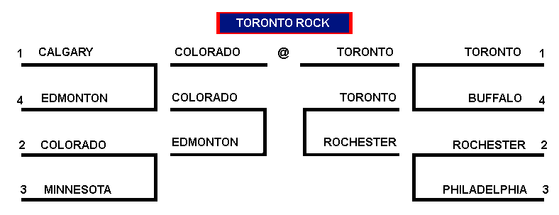
I decided to put the concepts together to decide the best one.  Teams were seeded by this year's playoffs. I actually didn't have much trouble in determining, as I knew not all of them were "stellar" as I would have hoped. The First round match-ups are as follows:

Edmonton Rush @ Calgary Roughnecks


Buffalo Bandits @ Toronto Rock


Minnesota Swarm @ Colorado Mammoth


Philadelphia Wings @ Rochester Knighthawks

The next round saw the following pairings:

East Division Final - Rochester @ Toroonto

West Division Final - Edmonton @ Colorado

The championship was between Colorado and Toronto.

Mammoth @ Rock for the championship

Bracket overview

A simple post for today, in terms of wordage, but many photos today (twice as many from yesterday). Later gators!

-Ricky
Creative Commons License
This work is licensed under a Creative Commons Attribution-NonCommercial-NoDerivs 3.0 Unported License.