30 November 2012

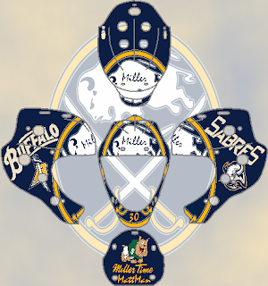
Better Than the Infamous and Unused Blues Jersey?

I didn't mind that jersey from 1996 that was never worn, as a matter of fact not only do I like it, I don't know why so many people had an issue with it and/or what's so bad about it. Comment's are welcome at the blog's e-mail address (bngraphics2012@aol.com). Anyway, I hope the mask is as good as I first thought it was.


I wanted to originally combine past and present, which wound up not happening as the only present items are a revamped script to accommodate the rest of the mask and the current alternate logo on the back panel. If I didn't have to shrink the blue notes, it would look decent, but that does seem to take away from the concept.

Tomorrow is Saturday and the first of December.  We also prepare to begin the eighth month of this blog's operation. As we prepare for changes, possibly some for the new year, we ask for your suggestions of what you have liked (or not liked) about what you have seen here at BNG so far.

-Ricky

29 November 2012

Savage Feather

Even though Jonas Hiller was equipped with his new mask in anticipation of the 2012-13 season, I wanted to see what else I could do for goalie masks for anyone or anything.


Not my best work, but it has potential. The big task was Wild Wing - incorporate him in as much as possible. but the gradient does not help, bronze on gold wouldn't look nice, nor would a nearly invisible orange stick on orange background.

-Ricky

28 November 2012

Why is it Always the Platypus?

Something dawned on me that we could market masks towards the younger hockey goalies, so I figured that since it is a popular feature on other clothing articles, let's slap Perry the Platypus on a hockey mask.


Maybe we lower the eyes and bill a tad so we can add his hat as "Agent P." Hey, it could happen . . .

-Ricky

27 November 2012

Miller Time For Matt Man

To read the story of Ryan Miller's mask, click this link.

I wanted to give Ryan Miller a new mask, a minor downgrade, but it does have less going on. It is still Sabres oriented but I did retain the Matt Man, Miller Time tribute on the back of the helmet.


I wanted this to be as current as possible, however I did retain the "goat head" logo and shrank it. The bulldog for the tribute is not the same, but that detail is irrelevant.

-Ricky

26 November 2012

The Legend Behind the Mask

Many great goalies have worn a mask, and some others haven't. But I'll tell you, it's all about the look more than the feel and comfort and safety. We have a template for you the will be available on the templates page as a handy resource!

Original (with red bars) courtesy of www.goaliestore.com

Tomorrow begins a four part goalie mask series starting with Ryan Miller of the Buffalo Sabres. Even though has has a cool mask as is, I wanted to do one anyway.

-Ricky

25 November 2012

A Grand Event

To not coincide from the conference finals of the concept tournament, I wanted to leave the Logo Hall of Fame induction ceremony for today's post. The nominees were announced on Halloween of this year. Congratulations to the inaugural class of the Buffalo Nickel Graphics Logo Hall of Fame!


-Ricky

24 November 2012

The Home of the Basketball Braves

I wanted to bring back the glory of Buffalo Braves basketball. In the corridors of what once stood as Buffalo's Memorial Auditorium, Van Miller called all the games on WGR 550. Some clips are available at the Staff Announcer website with various games played in Buffalo. It was a great time to go to the Aud both the NBA's Braves and NHL's Buffalo Sabres got to call "The Aud" their home in 1970. In the likeness of Bob McAdoo and Randy Smith, the Braves saw the likes of playoff losses all to the Boston Celtics in the mid 70s and ultimately left for San Diego. I've mentioned this in detail here before and it infuriates me to discuss it so I won't reiterate.


-Ricky

23 November 2012

Finally, a Final

This is it folks, the cream of the crop. We're going to break this down game by game.


     W2 Portland Trail Blazers                E1 Charlotte Bobcats

Game 1: POR Road @ CHR Home
Game 2: POR Alternate @ CHR Home
Game 3: CHR Road @ POR Home
Game 4: CHR Alternate @ POR Home
x-Game 5: POR Alternate @ CHR Alternate
x-Game 6: CHR Road @ POR Alternate
x-Game 7: POR Road @ CHR Alternate

Portland wins in 7 Games
That's a wrap, a great weekend of events is in store for me yet despite uncertainty for post topics.

-Ricky

22 November 2012

NBA's Finest (for the Conference Finals)

We've narrowed it down to the best two teams in each conference. Let's see who took home the right tow qualify for the final match up.

            
   1 New Orleans Hornets                         1 Charlotte Bobcats


   2 Portland Trail Blazers                        3 New York Knicks

It's gonna be close . . .

-Ricky

21 November 2012

And Then There Were Eight

Ding! It's time to see who advanced to the Conference Semis and who will face off against who.

            
   1 New Orleans Hornets                         1 Charlotte Bobcats

            
   4 Los Angeles Clippers                           5 Boston Celtics

            
   2 Portland Trail Blazers                    2 Cleveland Cavaliers

            
   3 Golden State Warriors                         3 New York Knicks


This is actually pretty exciting! I'm looking forward to how this turns out.

-Ricky

20 November 2012

NBA Jersey Playoffs

As promised, the next few days will be each round of the NBA playoffs as it pertains to my custom jerseys. A team will either win due to overall concepts not home vs. road as alternates are subject to be worn for any game. However, it will be factored in, which include home vs. home, road vs. road, alternate vs. alternate, home vs. road, home vs. alternate, road vs. alternate.  This will eb the case until the final, where each of the above scenarios will occur unless the mock series does not reach seven games (the "if necessary games" will be displayed anyway).

            
   8 Utah Jazz                                  8 Philadelphia 76ers
            
   1 New Orleans Hornets                         1 Charlotte Bobcats


   5 Houston Rockets                                5 Boston Celtics 
            
   4 Los Angeles Clippers                          4 Toronto Raptors


7 Denver Nuggets                                   7 Milwaukee Bucks
            
2 Portland Trail Blazers                       2 Cleveland Cavaliers


6 Sacramento Kings                                   6 Chicago Bulls
            
3 Golden State Warriors                            3 New York Knicks

We're set to go. This is going to be a great postseason to determine. There are many sets that appeal to me compared to some of the ones that didn't make it here. We'll crown a winner on Friday!

-Ricky

19 November 2012

Missing the Bar

So this particular portion of my rating the NBA set will revolve around the teams that would not qualify to postseason play based on their uniforms provided by me. I will do this for my Aussie football set soon also. The team in the ninth (9th) position will top the list. You will be able to determine divisional positioning from there.

The East:

9. Detroit Pistons

Quite frankly, I can't stand this set, but it's somehow the best of the rest.

10.  Atlanta Hawks

A little more flair than the Sixers, that's why the Hawks missed the cut.


11. Indiana Pacers


It's stinks to be the only team with blue and gold in this conference, it's a decent s.

12. Washington Wizards

The numbers being from the wrong era and a modern font not being available drags this good set down.

13.  Brooklyn Nets

Jay-Z can't just go with black and white,  didn't we learn that from the Spurs?

14. Orlando Magic


This blue is too powder-y for my liking.

15. Miami Heat
The shade of red is the demise in this set.


The West:

9. Oklahoma City Thunder


If the alternate was yellow might suffice, I didn't realize that this shade orange doesn't look so good after all.


10. Minnesota Timberwolves

Are we trying to copy the Magic? What was wrong with the original 80s colors?


11. Los Angeles Lakers


The white kills the set whereas as the purple is lacking on the alternate.


12. Phoenix Suns


Big mistake by the suns, keep purple as a primary color.

13. Dallas Mavericks

Can we have a true black color and a real "Mavericks" script, is it that hard

14. Memphis Grizzlies


The Grizzlies need to better incorporate the gold and perhaps replace the light shade of blue with something else.

15. San Antonio Spurs


The team has need a complete re-branding since I can remember.

Well, you can also tell who is in the playoffs. You will see the first rounders tomorrow.

-Ricky

Creative Commons License
This work is licensed under a Creative Commons Attribution-NonCommercial-NoDerivs 3.0 Unported License.