
*** The following is my post from a different site, please visit www.hockeyjerseyconcepts.com for the article. ***
Friday: Later Than Expected
Hi guys, Blogger decided not to like me and got rid of the original post. But this one will probably be better so enjoy!


Friday: Later Than Expected
Hi guys, Blogger decided not to like me and got rid of the original post. But this one will probably be better so enjoy!
------------------------------------
COTW Aug 12-18 vote (ends tonight @ 11:59pm Eastern)
Hawthorne entries (due tonight @ 11:59pm Eastern)
------------------------------------
Quebec Nordiques (HockeyConceptIdeas)

This one is a little too plain for me and it doesn't appear that the logo on the chest is the same size in both jerseys. Anyone notice the unused Nordiques logo shoulder patches? An 8 out of 10.
Seattle Metropolitans (MichaelG.)

I think this shade of green may be too bright, but I like the red even though it is popular among teams. I;m split on whether the two stripes should be separated slightly from each other or not. A 7.5 out of 10
Ottawa Senators (Nikesh)
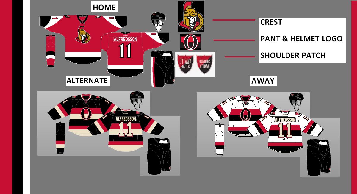
I don't know if I would like to see the alternate promoted to an home and road set. While they do look presentable, I'm not ready for it yet. An 8.5 out of 10.
Dallas Stars (Ryan)

El capitan gives us what I think would make a great alternate. The grey could go elsewhere on the jersey, but I would have to figure that out yet. An 8 out of 10.
Team USA (Stephen T)

Stephen has found my soft spot for a red USA jersey. The white one looks plain but matches perfectly. Not much else to say. 9 out of 10.
Edmonton Oilers (Tom)

Anyone remember this logo? I do and I liked it, though it was little used to my knowledge. No complaints here. I have always liked Edmonton's alternate logos better anyway. A 9 out of 10.
Pre-season hockey isn't too far away, so I'm more excited by the day!
-Ricky

No comments:
Post a Comment