03 August 2013

HJC: Post XI

*** The following is my post from a different site, please visit www.hockeyjerseyconcepts.com for the article. ***

Friday: Riding the Waves

"Little high, Little low" HJC readers! I'm back after the chaos of last week and on the up and up. I have a concept I would like you all to take a look at and give your two cents on. That concept will round out today's post.

-------------------------------------------------------------

Included is one unusual deadline (you can figure out which one). Please consider them.

COTW July 22-28 vote (ends tonight @ 11:59pm EDT)
HJC Open Finals voting (ends Sunday @ 6pm Eastern)

-------------------------------------------------------------

Carolina Lightning (Coby)


This is probably his best concept yet, as Coby depicts a pee-wee team from the Carolinas. This even goes against my dislike of this template, but he has done almost everything right. The striping is the main concern. Stripes generally shouldn't cover the template outline and also every arm stripe should cover the entire width of the sleeve up to the outlines but not past. That is still a hug improvement from old striping applications of Coby's. The only other thing is that the extended yoke means the name should be in the lower portion of it and the top of the numbers a little bit higher up from their current position. The logo is kind of dull to me, but it's pee-wee hockey. Overall, 8 out of 10.

Univ. of New Orleans (Dylan W.)


This one to me is just plain ol' unaapealing. It's both the distribution of the white and the alternate version of the logo. Everything is well executed, but I just can't see a place for this jersey. My rubric gives me a 7.5 out of 10.

Montréal Maroons (Michael G.)


The simplicity of this is uncanny, very appropriate for such a defunct team. So far, this is one of my two front-runners in this concept series that Michael has provided us. Everything just matches so perfectly that it seems like a lost art in hockey jersey design. I kind of wish my college had sweaters like this. A 9 out of 10.

Seattle Warriors (Felix)


Not colors, nickname, or logo we generally associate with hockey in Seattle. But Felix tackles the logo and color scheme of the now defunct NFL Europe's Cologne Centurions. My big concern I guess is the piping, which I don't personally mind when done correctly. However, the jerseys don't match. Either it's both or neither - and if there will be both, then the piping shouldn't extend below the hem striping. I would also suggest removing only half the yoke outline in either style (keeping either the ends or the center, both joined at the piping). The black stripes may want to be thicker, but that's relatively minor. Fighting for a thumbs up from Caesar, an 8 out of 10.

Toronto Maple Leafs (Frank)


As I have been mentioned before, I do not like this Leafs logo compared to the one on the alternate. Even though I don't like it, it can be the alternate providing a white version of the real alternate as a road uniform. With the striping I'd prefer either all wide or all thin stripes and add more on the pants to match. An 8.5 out of 10.

Oakland Seals (Michael G.)


If Chuck O. Finley was the owner of this team, why did he lighten the colors to differentiate them from the baseball club yet have them wear white skates? Here the colors get even lighter and that further makes a mockery of the Seals franchise. The striping, the numbers and name, the yoke, the logos - they're all well placed, but these colors have a psychedelic feel to them. A 7.5 out of 10.

Toronto Blue Jays (Kyle)


As much as I love these, one thing troubles me - the alternate. The white it appears is intended to keep the jersey predominantly light in color. I have an issue with the mismatching sleeve and hem stripes I also like to see a much more different and/or simple pattern. As far as color, I think (as Toronto teams have) worked the double blue quite well historically speaking - even now with the CFL's Argonauts; therefore I would switch the uses of white and blue around. I would even add a "Canada Day jersey" just as they've been doing. An 8.5 out of 10.

Univ.of Hawai'i (Dylan W.)


I've been waiting for the unofficially nicknamed "Rainbow Wahine" to have a unique design to their image and likeness. To the first time of my awareness, Dylan has provided that. The black stripe could be a tad thicker, but that really has no bearing on the overall concept. By the way, they are again the Rainbow Warriors as of the first of July 2013. A 9.5 out of 10 and my nomination for Concept of the Week.

Anaheim Ducks (Stephen T.)


Whether they are Ducks or Mighty Ducks my team can look good in such a template I despise. I would like to see the diagonal stripe on the hem return as it was truly unique to the franchise, but this striping works just as well if not better. As for the Finnish Flash, he may have another year or more left in him. Properly using a duck call results in a 9 out of 10.

-------------------------------------------------------------

New York Islanders (Ricky . . . yes me)


I know there isn't any equipment, but that information is part of my template. I created seven of such by using the mix and match feature provided by Ryan. I did the same with the Buffalo Destroyers jersey for the HJC Open this year. I figured that for the Isles' "fish-sticks" logo, wavy everything was appropriate. You'll take notice the sleeve striping matches the sequence of waves in the logo, as does the yoke.

I took the Buffa-slug body and mixed it with the Bruins hem, regular Reebok sleeves, the collar from the Leafs' Winter Classic sweater, and the Blackhawks' cuffs. The reason I laid back on the equipment is primarily because it is distracting enough as is with everything that is going on. The font is called "4th and Inches" which was chosen more for the numbers than the lettering. Tell me what you think in the comments, I eagerly await for your highly valued opinions!

-------------------------------------------------------------

That wraps up another Friday installment of HJC. Don't forget about your reminders and remember: you're work is always in the eye of the beholder.

-Ricky

27 July 2013

HJC Post: Celebrity Shot

     Just so that you guys know, I didn't actually post yesterday and haven't been able to get a head start on my HJC posts the past few weeks. But a relative passed away earlier this week as I mentioned and I was left to have several schedule changes yesterday. DBro Alexander, our regular Wednesday columnist at HJC was kind enough to cover for me.

*** The following is my post from a different site, please visit www.hockeyjerseyconcepts.com for the article. ***

Friday: Better Late Than Never

Hey guys, it's me Ricky, and welcome to.... nah just kidding. It's me, Your favorite Wednesday writer, Dylan A. We don't know where Ricky is so someone had to post for today, and seeing as how I've had my fair share of late days, it's only fair I chip in and post on Ricky's behalf.

We have one COTW vote and the Semi Finals for the HJC Open.....So don't forget to vote, and that's obvious...

COTW July 15-21 vote (ends Friday @ 11:59pm Eastern)
HJC Open Semi-Finals voting (ends Sunday @ 6pm Eastern)

And now onto the concepts!

Calgary Flames Concept - (Caleb F.)
Pretty simple design for the Flames from Caleb. After seeing some of the busy nonsense they've been wearing for awhile, I, and hopefully everyone else, is hoping a simple redesign, like this, is in their near future. It'd be nice to see the back of the jerseys and theTV numbers look odd. I'd put them in the normal spot down the arm.

Rating: 7/10


Seattle Metropolitans WIHL Concept - (Dylan W.) 
I like when our artists start series or fake leagues, and Mr. Wonka has a really good one going so far. I really like the work he's done with the logos. I'm not so sure about the wavy circles but still though, the hockey sticks going up into the needle is great! The jerseys are also very well done. I'm glad he stayed away from using the wavy lines in the jersey design.

Rating: 9/10 COTW NOM from one Dylan to another!


Montreal Canadiens Alternate Jersey Concept - (Frank C.)
Frank gives the Habs a blue jersey, something I wouldn't be opposed to seeing. It's different seeing the leaf on the front, which I would feel should be left off the front of the jersey unless it were red. Too close to the Leafs for my taste.

Rating: 7.5/10


Washington Capitals Concept - (Jack H.)
Jack gives the Caps a new set of jerseys sans vertical arm stripes. Actually now that I look at it, the jersey designs look to be based off of the current socks. The white stripe on the red should be thicker though. I'd rather the set look like the white jersey. The red jersey looks rather boring.

Rating: 7.5/10


Acadie-Bathurst Titan (QMJHL) Concept - (Jake88)
It appears that our friend Jake has moved out of Europe and moved onto the Q. It's interesting to see the horned template without its horns. The yoke is especially interesting. I can't say I like it though. The rest of the striping is good though, I'd leave the yoke blank.

Rating: 7/10


As it starts storming pretty good in my neck of the woods I need to get this post done quick so I can post it before my power goes out of something!

Ottawa 67's (OHL) Concept - (Kyle C.)
We have another juniors concept, but this time it's the 67's! Big and bold. That's what these jerseys are all about. The O in the logo is big and bold, so the striping is too! I really like it, especially the squared off yokes. It fits in well with the logo and it's angled on the corners. 

Rating:8.5/10


Buffalo Sabres New Alternate Concept - (Stephane S.)
Stephane has a guess as to what the new Sabres alternate will look like, or at least what he wants it to look like. It's definitely interesting with the white arm bands. The different colored collar and the yoke going under the collar are really interesting and something I'm looking forward to seeing.

Rating: 7/10


Ottawa Senators Concept - (Tyler G. - HJC.)
We'll end today's post with a concept from HJC's own, Tyler. Tyler returns the Sens to something very simple, and reminiscent of their early jerseys, something that would be nice to actually see happen. I love the use of the 2D logo and the "O" on the shoulders. It'd be nice if the "O" was white on the red jersey to stick out better. 

Rating: 8/10

23 July 2013

Very Brief, Indeed

I'm not getting anything ready for today as I have learned that a relative of mine has passed away. I will have content for tomorrow instead.

-Ricky

20 July 2013

HJC Post X

*** The following is my post from a different site, please visit www.hockeyjerseyconcepts.com for the article. ***

Friday: Tomb of the Unknown Ricky

EDIT by Ricky: *Sorry for the slight delay of today's post, my Blogger account went haywire, fortunately it wasn't anything serious.

It's been unbearably hot and humid in Buffalo, the second hottest city in the month of July so far. Boston is the only hotter city with 10 days (at least) over 90 degrees and Buffalo with four. Anyway, I'm back to share more concepts with you and maybe we'll see Sabres third concepts rolling in. While my hometown team is changing things up, it appears there isn't too much else going on. In that case, today's concepts will hold some significance to the off-season for me. Before we get to them though, the HJC Open is at full steam - go check it out!

--------------------------------------------------------

The regular feature of reminders are available for you below.

2nd Quarter Vote (ends Friday @ 11:59pm Eastern)
COTW July 8-14 vote (ends Friday @ 11:59pm Eastern)
HJC Open Round 2 voting (ends Sunday @ 6pm Eastern)

--------------------------------------------------------

Team USA (Coby S.)


Coby takes a different and more simple approach to American hockey. I'm not 100% on it, but I don't hate it if appropriate stitching were shown and fixing the pixelation issues, this can show more potential than it already has has. I like the effort in the idea, but a 5 out of 10.

Adler Mannheim (Jake88)


Jake has moved onto a DEL series for the German hockey clubs. The Blue Jay-esqu number font is what first caught my attention. It matches the striping quite well to the logo. I feel like something is missing but it isn't really. A 9 out of 10.

Pheonix Coyotes (Kyle C.)


Though they won't be renamed the Arizona Coyotes until 2014/15, that would be a good time to sort of re-brand the club a little. This would be a great way to do so. The large stripe could maybe use a design, but beggars can't be choosers. An 8.5 out of 10.

Mississauga Steelheads (Brandon C.)


This one is really intriguing to me, it appears as though this design could belong to anyone with those colors - the Syracuse Crunch in particular. But I do like it. Maybe an accompanying kit would be nice. Nothing much to say, it's an 8.5 out of 10.

Dusseldorfer EG (Jake88)


These look as if though they were inspired by old team Germany jerseys.But the yellow is a good fit to add some accenture, I feel it helps this color scheme. These series of Jake 88's make everything so ordinary but likable. An 8 out of 10.

Toronto Maple Leafs (Kyle N)


First things first, I hate this logo with a passion and bad logos are the Leafs specialty before 1966 with me. Despite some of the jersey features, it does somewhat appear to be a somewhat classic jersey and would be Winter Classic/Outdoor Series acceptable. But change the logo and I'm good to go! An 8 out of 10.

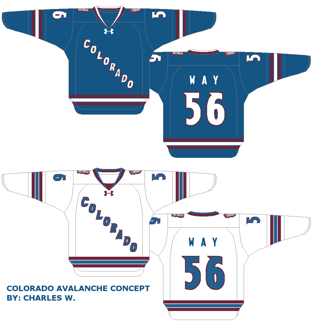
Colorado Avalanche (Charles W.)

The striping's good and the script is good, but I would like to sees pace between the number and it's outline on the white with a double outline on the color uniform. My distaste of this template hasn't changed, but this concept suits it a little better than usual. A 7.5 out of 10.

 Carleton Place Canadians (JCR Graphix)


This provides an interesting distribution of these particular colors. I don't think any of the provided logos are strong enough as primary logos, I'm afraid. Else-wise, It's a solid concept that differentiates itself from other teams with this exact or similar color schemes. A 9 out of 10.

--------------------------------------------------------

That's it for me this week. Looking forward to the next time we discuss more hockey jersey concepts. Bye for now!

-Ricky

13 July 2013

HJC Post IX

*** The following is my post from a different site, please visit www.hockeyjerseyconcepts.com for the article. ***

Friday: Festivals in Buffalo, Hockey Everywhere Else

This week there are several festivals in my neck of the woods, but that doesn't mean that we're not following hockey news with the major off-season dates behind us. Tell that to Ilya Kovalchuck who is retiring from the NHL supposedly to go to home Russia to be with family. Anyway, 'tis the season of the HJC Open. All reminders, as necessary, have been placed below.

--------------------------------------------------------

COTY-June vote (ends tonight @ 11:59pm Eastern)
COTW July 1-7 vote (ends tonight @ 11:59pm Eastern)
HJC Open Round 1 voting (ends Sunday @ 6pm Eastern)

*HJC Open votes will be cast on the contest page

--------------------------------------------------------

Chicago Blackhawks (Dylan W.)
     {These are two separate Winter Classic concepts}


I'm going to look at these together, but will still earn separate reviews. I can't like any of it as I cannot associate the Hawks without any placement of red. Also I don't think these would pass as Winter Classic jerseys either. However, I do see good "Black Ice" merchandise, but the whites have no place in anything for me. The difference in the two concepts is the striping pattern. I prefer the chest stripes since there are too many on the hem and sleeve striping for such a classic (original) team.The one on top has a value of a 5.5 out of 10 and the one below it a 7 out of 10.

EHC Black Wings Linz (Jake88)


Jake88 returns this week with a new series covering the Austrian League. This is something I would really like to see it on a jersey in the NHL where it applies . . . not necessarily this particular stitching pattern, but that would work too. Maybe a thin black/white stripe to separate the two other stripes on the socks belonging to the appropriate jersey. A solid 8.5 out of 10.

HC TWK Innsbruck (Jake88)


I really appreciate the fact that Jake 88 has taken time to cover European hockey regardless of how they've turned out. this is no different I see a lot of different teams this one could used for but it still has its own sort of identity I'm not sure how to explain that notion. I'd like to see the yoke a different shape, but that is a minor thing in this case. A 9 out of 10 and a CotW nomination from me.

Buffalo Sabres (Michael G.)


Striping's good, yokes are good (if outlines are added), equipment except for gloves are good. Crest logo is passable but would prefer the 40th anniversary script. Name should be solid darker color on road white, kill the slug an replace it with the "sabre in a  B," and the gloves should be one solid color. Not bad overall, but not necessarily preferred - an 8 out of 10.

Toronto Maple Leafs (Charles)


I like what's trying to be done, but it reminds me of those 90s MLB futuristic jerseys. I also believe that this isn't the right template to do them on. Else-wise we have a good looking uniform for an 8 out of 10.

Dallas Stars (Randall)


Has anyone's opinion on the new look changed now that there has been time to let it sink in? This one seems similar to many of the concepts I have seen but paying close attention, it is on a very basic template. I like that green and not black is the focus of the home green. Unfortunately nothing stands out I think maybe a change in striping pattern may help with that. A 7.5 out of 10.

Utica Comets (Justin S.)

Appropriate considering the affiliate, however, this isn't overdone so much that it screams Canucks at you. The only thing is that I cannot figure how to change the top portion of the sleeve towards the cuffs. I feel like it needs something. Maybe green? I really haven't the faintest idea. An 8.5 out of 10.

--------------------------------------------------------

I am still figuring out how to get my creativity going with the mix and match downloadable. I have been having a lot of fun with it though. Don't be afraid to give it a try it could be the next step to making improved concepts, I know it's helped me. Keep sending us your stuff. That's why I'm writing - to be amazed by your masterpieces and of course it's okay if you don't. But regardless my critique there will always be someone to be in awe of your imagination! Have a wonderful weekend!

-Ricky

06 July 2013

HJC Post VIII

*** The following is my post from a different site, please visit www.hockeyjerseyconcepts.com for the article. ***

Friday: Trades, Free Agency, and the Rumor Mull

Howdy all you HJC readers, hope our American friends enjoyed their Independence Day celebrations. Today is the real start of the offseason for me as it directly impacts the following season. So what about this Peverley/Seguin (et al) for Eriksson (et al) trade or about Alfredsson testing the FA market? Interesting(, eh?) for yesterday and earlier today among other things. This is a very favorable scenario for my home town club in Buffalo to perhaps provide slightly easier competition and my beloved Ducks benefit because the realignment now takes the Stars out of our division. However, I sit here still wishing the Ducks had Bobby Ryan. No matter it's only just begun, just as this post which needs to now be moving along.

--------------------------------------------------------

There is only one reminder from me this week, and you can find that below.

COTW June 24-30 vote (ends Friday @ 11:59pm Eastern)

--------------------------------------------------------

Stadium Series (Dylan W.)


     One bit of inside info for this one. There was a group of people from the Twin Cities area at a Buffalo Bisons game a few years ago that were big on the North Stars. They all made me aware that they and the city wants nothing to do with and don't speak of that franchise (North Stars) anymore and that's why they embrace the Wild in the manner that they do. For that, I don't think they'd like to see this jersey even though there is a team in Minnesota again.
     While I don't like the jersey anyway because all I see is a modified Wild logo on a North Stars jersey, I never liked that the North Stars used gold, green, then black rather than green, gold, then black. The Blackhawks jersey is fine and have no issues with it. Just one question - why is the retro template being used when the Winter Classic Alumni jerseys use a modern template? I thought I remember seeing that in the games. A 7.5 out of 10.

Everett Silvertips (Dylan W.)

This one I like much more of the tow submissions from Dylan today. Switching to this alternate logo as primary is the main focus as it appears to be the cause for the mountainous hem. However it is also very reminiscent of Mount St. Mary's of (NCAA Division I) and the NBA's Denver Nuggets in some fashion. Regardless, this is the best color scheme it goes with between those teams and the Silvertips, nice work. A 9 out of 10 overall.

Regina Pats (Caleb)


I've realized that it is this particular shade of blue that is visually deceiving me as it pertains to the Regina Pats. The most interesting about this one to me is the cut-off of the yoke outline and thus isn't a full outline. If not for the striping, it probably wouldn't fit many other uniforms. The number on the colored uniform is slightly too large with good TV numbers but the home white has a good primary number with too small TV numbers. But hey, at least they're there. Overall an 8 out of 10.

Lethbridge Hurricanes (Coby)


Okay, Coby has seen some improvements with this concept. But there will still be some things that he can pick up that can really bring out his style of sport graphic design. The logo is well over-sized, but I like where it is going. You can see that it was taken from the current Carolina alternate as visible by the pixelated outline to the lower left. He also uses it as a basis for their hem stripe pattern. I'm curious as to the significance of that random red bar. The number and NOB are good too, but just as the logo are over-sized.  I'd like to see the stitch marks where applicable, particularly in regards to the collar which is partially covered. Also the next tutorial I would give a look at would be TV numbers, but Coby is taking it one step at a time and makes me look forward to his progress. A storm warning shows a 5 out of 10, but it is strengthening.

PSG Zlin (Jake88)


Since last we met, Jake88 was working on the Finnish SM-liiga, but has finished that and moved onto the Czech Extraliga. I know why it was done but I don't think I agree on the sock and pant stripe choice, I would try to give a five stripe pattern to match the striping closest to but not including the collar. Else-wise, stellar job - an 8.5 out of 10.

HC Verva Litvinov (Jake88)


There is one team in particular this reminds me of Borussia Dortmund of soccer's German Bundesliga. The only difference other than sport and country is that Verva's logo has much more color balance. That significantly helps the concept. The only thing I'd like to see change is to transport the striping from the pants to everything else, even the shoulders (despite being curved) as opposed to the single stripe on everything. A 9 out of 10 for this one.

Portland Rosebuds (Bobby P.)


For-though this team would play at the Rose Garden (presumably), I'm not so sure about the baby blue. That color has significance to the city, but I would try green as both colors come from the city's flag. Christmas colors aren't very typical and wound up in disfavor among the Devils organization who trashed that scheme in the 90s. The biggest thing is not that, however, the "P" to me looks like an asymmetrical letter "T" instead. Every rose has it's thorn, a 7.5 out of 10.

2014 Stadium Series (Derek)


I thought of turning this particular Canucks logo into the same color scheme a long time ago, but i have never actually put it onto a jersey. But to match the logo, I'd like to see two green stripes. Next, an Ottawa logo - in vintage white? Sounds crazy, but it actually appears to be a rustic gold to me. The logo can sneak away with it but not the name and NOB. Perhaps we could use the sock arrangement as vertical striping for the pants then copy it to replace the sock as is now. An 8.5 out of 10.

Lethbridge Hurricanes (William B.)


Whenever this style hem stripe is applied, I can't resist my head shake of disapproval. If this kind of striping is used, I prefer the rest of the hem remain the same color as the jersey. However, there is also the matter of mismatching striping, which is also a peeve of mine. Also if you are going to have a yoke outline, i'd prefer it not to blend in like this one and go white instead of navy.  This storm warning indicates a 7 out of 10.

Brampton Beast (Ryan-HJC)


El Capitan rounds up our daily concepts ant this one I'm undecided on. That is primarily because of the sleeves. Maybe I would turn the yoke to red, as I'd like to see more of it in both sweaters. |Everything else is where it needs to be for my liking. Even with the red, it wouldn't change very much. An 8 out of 10, plain and simple (sort of).

--------------------------------------------------------

Now the only thing I have to do left is continue to prepare my opening round concept for the HJC Open. Enjoy the weekend and happy FA Frenzy!

-Ricky

29 June 2013

HJC Post VII

*** The following is my post from a different site, please visit www.hockeyjerseyconcepts.com for the article. ***

Friday: It's a Mad, Mad, Mad, Mad, Friday

While I am still disgusted over how bad the AHL Finals game I went to in Syracuse was, I have been working on a project I would like to display here soon, but it is also a ways away. In the meantime I'm still posting here and at BNG (which has been slow) and I welcomed a new blog promoting school spirit on my campus this week. Today, twelve concepts to amaze you with along with one Madmen entry. Your reminders are also listed below.

COTW June 17-23 vote (ends tonight @ 11:59pm Eastern time)
Logo Comp Top 2 voting (ends tonight @ 11:59pm Eastern time)
"Madmen" entries due (tomorrow @ 11:59pm Eastern time)

--------------------------------------------------------

Madmen Entry:
Derek H.

--------------------------------------------------------

Dallas Stars (Stephen T.)


This would be a good way not to use gold beyond the logo. The white uniforms are fantastic, the black uniform needs only one thing color reversal. In this case,  that means striping as I feel the primary stripe should be green and surrounded in white or keep the primary stripe white, switch the inside black to green and switch the outside to white. However, taking the latter suggestion may require you to adopt the same  pattern for the road whites. The Nike SWIFT template make this team look a little more elegant, gracing with style an 8.5 out of 10.

US National Hockey Team (Gerard)

Gerard has given us what appears to be the start of an international series with two of those today. This one is pretty good, except I don't know that this script is the best one of theirs to use for this jersey design, while it make more sense then the old glory logo. That one would be overkill but this one is too bland it appears to me. A 9 out of 10.

Hamilton Tigers (Bobby P.)


In his Ideal NHL series, Bobby is also taking teams from the past - which I think it's great that he isn't limiting himself to just current teams. This one is spot on except I think I would like to see the helmets reversed or just black (to match the pants). I find it interesting that Steven Stamkos plays for them. Clawing out a 9.5 out of 10.

Idaho Steelheads (Mike S.)


I like this one, it could even pass for the Minnesota Timberwolves if someone did an NBA crossover. Nothing overly exciting, nothing at all terrible either. Welding together an 8 out of 10.

Tampereen Ilves (Jake88)


Continuing with his SM-liiga series, Jake 88 provides us with an interesting striping pattern, similar to ones we've seen on Carolina Hurricane jerseys. He makes it work here and will you look at that funky design on the gloves. An 8.5 out of 10.

Regina Pats (Dylan W.)


Dylan  sticks with the WHL and this one doesn't completely excite me the extra swoosh from the s on the logo make it appear larger than it is. In fact, it almost looks like a wannabe New England Patriots copycat. That grainy blue is back but it looks better, maybe the red is complimenting it better. The NOB and TV numbers are good, but the main numbers are a tad large. The striping is fantastic! An 8 out of 10.

Manchester United FC (Pajo94)


Okay, the logos are over-sized especially with their proximity to the hem striping. I wouldn't recommend using this font, or for that matter, any general computer fonts for the NOB and numbers. And knowing Premier League football the way I do, I'm curious about the alternate as it looks to be more an Aston Villa shirt because of the yoke and middle stripes on the sleeves. The rest of it I get. A 7 out of 10 here.

2014 Stadium Series (Tristan P.)


While I continue to figure out the best way to name individual stadium series concepts, this one has been a common match-up. I understand the reasoning for the color of the Rangers gloves, but it's unnecessary. In fact I have always preferred this shade of blue better than that of the current shade. For the Isles I might reverse the order of the orange and white; else-wise, I'm happy with it. An 8 out of 10.

Tampa Bay Lightning Saturday Night Classic (Jets96)


I have always liked the number font and gusset striping and you can't go wrong with the bolt on the pants.While I'm not fond of the blue cuffs or white part of the sleeves with matching hem design, this one still turned out to be alright. The blue, white, and sliver don't look good on the socks in that orientation either. Perhaps we could also see a blue yoke with a white outline. Just thoughts. Lightning struck with an 8 out of 10.

Lethbridge Hurricanes (Dylan W.)


The team in Lethbridge has disappointed me with their new logo. While it has improved in modernness, it lacks everything else and quite frankly, I detest it with a passion. However, Dylan has turned a negative into a positive by implementing the logo in the striping which embraces the futuristic look. I never have liked numbers being that close to hem striping, but this one is actually where it should be as it is the hem striping that alters appearance. An 8.5 out of 10.

Seattle Metropolitans (Bobby P.)

Here Bobby gives the Metros a new look leaving the traditional tricolor hoops in compliance with generic modern jersey ideas (say the 70s-90s).This one is good but I think a yoke could be needed to break up the green on said colored jersey.red with white outline perhaps. An 8.5 out of 10.

Lahden Pelicans (Jake88)


Another in Jake88's SM-liiga series. As I mentioned, I am not generally fond of such fonts, however it is appropriate as it matches the logo script quite well. I'm even okay with the piping because it adds to the colored jersey. The gold seems out of place, but there is so little of it that it only becomes a minor concern. An 8 out of 10.

Sweden National Hockey Team (Gerard)

We all know that the three crowns are a must when a Sweden concept comes about. My only question here is why the hem and arm stripes don't match. I prefer the triple yellow and would like to see them transferred onto the pants and socks. I'm still undecided if the blue jerseys should use a yellow or blue helmet (leaning towards yellow). An 8.5 out of 10.

--------------------------------------------------------

Well, I would like to accomplish more to send in for you to dissect but me refereeing in Niagara Falls this weekend prevents me from doing so. Keep your eyes peeled for them if and when they show up. Enjoy your weekend!

-Ricky
Creative Commons License
This work is licensed under a Creative Commons Attribution-NonCommercial-NoDerivs 3.0 Unported License.