
*** The following is my post from a different site, please visit www.hockeyjerseyconcepts.com for the article. ***
Friday: Tomb of the Unknown Ricky
EDIT by Ricky: *Sorry for the slight delay of today's post, my Blogger account went haywire, fortunately it wasn't anything serious.
It's been unbearably hot and humid in Buffalo, the second hottest city in the month of July so far. Boston is the only hotter city with 10 days (at least) over 90 degrees and Buffalo with four. Anyway, I'm back to share more concepts with you and maybe we'll see Sabres third concepts rolling in. While my hometown team is changing things up, it appears there isn't too much else going on. In that case, today's concepts will hold some significance to the off-season for me. Before we get to them though, the HJC Open is at full steam - go check it out!
The regular feature of reminders are available for you below.

.png)

.png)
.png)
.png)

-ActualConceptForLeague.png)
Friday: Tomb of the Unknown Ricky
EDIT by Ricky: *Sorry for the slight delay of today's post, my Blogger account went haywire, fortunately it wasn't anything serious.
It's been unbearably hot and humid in Buffalo, the second hottest city in the month of July so far. Boston is the only hotter city with 10 days (at least) over 90 degrees and Buffalo with four. Anyway, I'm back to share more concepts with you and maybe we'll see Sabres third concepts rolling in. While my hometown team is changing things up, it appears there isn't too much else going on. In that case, today's concepts will hold some significance to the off-season for me. Before we get to them though, the HJC Open is at full steam - go check it out!
--------------------------------------------------------
The regular feature of reminders are available for you below.
2nd Quarter Vote (ends Friday @ 11:59pm Eastern)
COTW July 8-14 vote (ends Friday @ 11:59pm Eastern)
HJC Open Round 2 voting (ends Sunday @ 6pm Eastern)
--------------------------------------------------------
Team USA (Coby S.)

Coby takes a different and more simple approach to American hockey. I'm not 100% on it, but I don't hate it if appropriate stitching were shown and fixing the pixelation issues, this can show more potential than it already has has. I like the effort in the idea, but a 5 out of 10.
Adler Mannheim (Jake88)
.png)
Jake has moved onto a DEL series for the German hockey clubs. The Blue Jay-esqu number font is what first caught my attention. It matches the striping quite well to the logo. I feel like something is missing but it isn't really. A 9 out of 10.
Pheonix Coyotes (Kyle C.)

Though they won't be renamed the Arizona Coyotes until 2014/15, that would be a good time to sort of re-brand the club a little. This would be a great way to do so. The large stripe could maybe use a design, but beggars can't be choosers. An 8.5 out of 10.
Mississauga Steelheads (Brandon C.)
.png)
This one is really intriguing to me, it appears as though this design could belong to anyone with those colors - the Syracuse Crunch in particular. But I do like it. Maybe an accompanying kit would be nice. Nothing much to say, it's an 8.5 out of 10.
Dusseldorfer EG (Jake88)
.png)
These look as if though they were inspired by old team Germany jerseys.But the yellow is a good fit to add some accenture, I feel it helps this color scheme. These series of Jake 88's make everything so ordinary but likable. An 8 out of 10.
Toronto Maple Leafs (Kyle N)
.png)
First things first, I hate this logo with a passion and bad logos are the Leafs specialty before 1966 with me. Despite some of the jersey features, it does somewhat appear to be a somewhat classic jersey and would be Winter Classic/Outdoor Series acceptable. But change the logo and I'm good to go! An 8 out of 10.
Colorado Avalanche (Charles W.)
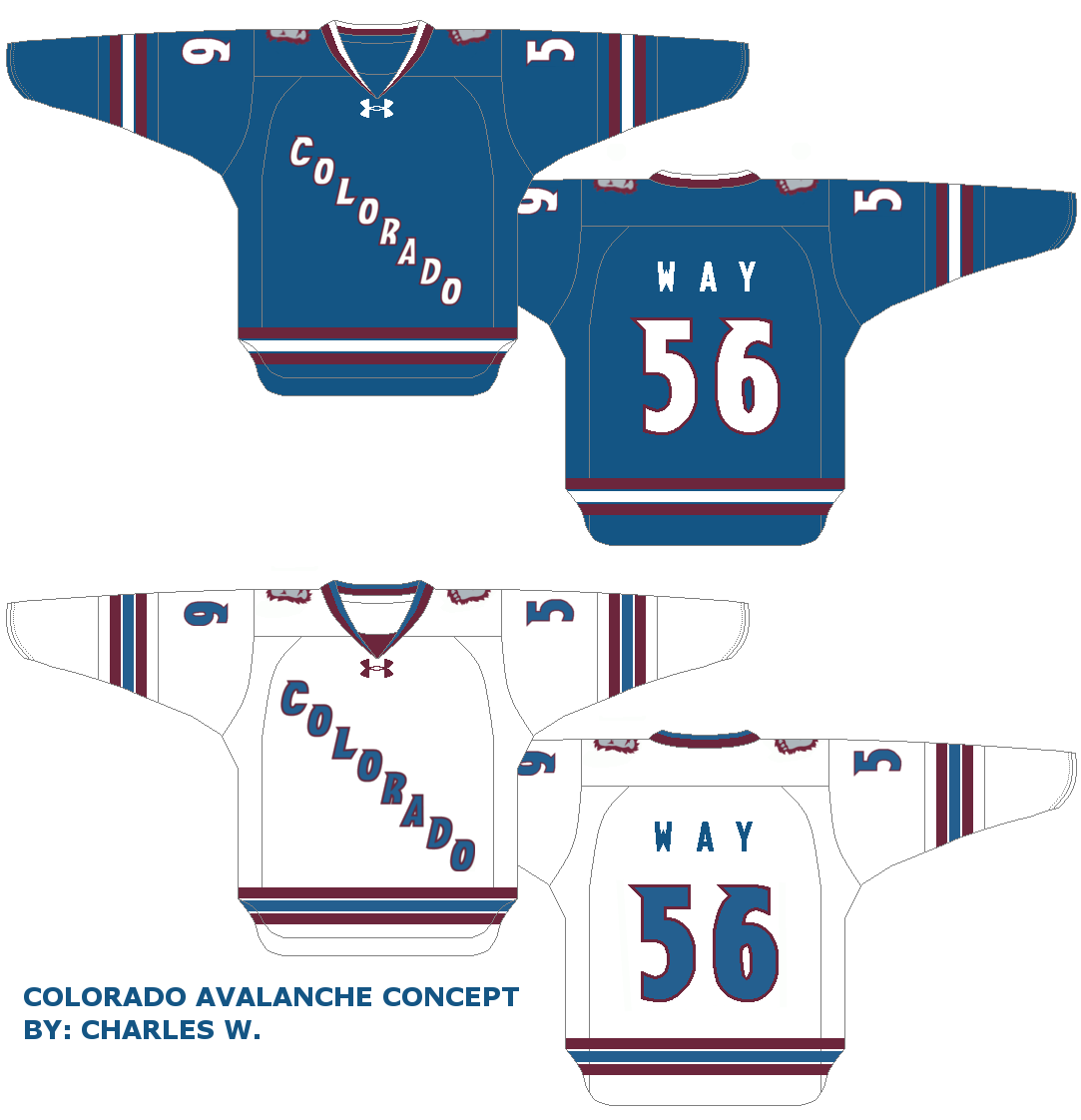
The striping's good and the script is good, but I would like to sees pace between the number and it's outline on the white with a double outline on the color uniform. My distaste of this template hasn't changed, but this concept suits it a little better than usual. A 7.5 out of 10.
Carleton Place Canadians (JCR Graphix)
-ActualConceptForLeague.png)
This provides an interesting distribution of these particular colors. I don't think any of the provided logos are strong enough as primary logos, I'm afraid. Else-wise, It's a solid concept that differentiates itself from other teams with this exact or similar color schemes. A 9 out of 10.
--------------------------------------------------------
That's it for me this week. Looking forward to the next time we discuss more hockey jersey concepts. Bye for now!
-Ricky

No comments:
Post a Comment