05 May 2022

A Hop, Skip, and a Jump Through Time

 I don't know how we got here, but the fact is: we got here. When I started, I was 20. A sophomore in college spring semester. As the years passed, I discovered in the same way that the big leaguers that are Sportslogos' Chris Creamer and HJC's Ryan Haslett how much of effort it would take with added responsibilities for only starting out as a hobby. Both have gone in a different direction while keeping pace to some degree with how they started. Things here aren't really any different. We added the MSP to have a documented archive of random events (hundreds of baseball scorecards not the least of which). I know the most recent five years hasn't been particularly as vibrant as when we started, but there are like many of you plenty of things diverting attention. Fast forward to today. I can say that a lot has changed and too much to note. I'm well to the extent of what I can control (that hasn't changed). But the experiences along the way have been extraordinary to say the least. We all dealt with the pandemic in the middle of it on top of everything. And just like that, we're at our tenth anniversary.

For those of you that have been around from the start, thanks for giving consideration to someone who was probably ahead of himself at the idea of such an undertaking. For the rest, I am equally excited that you've been able to share in this experience. I also have specific people that require thanks. To Ryan Haslett and Caden Patafie for allowing me to share my time at their sites as a writer. To our "impromptu" staff of Barry Ebua, Chuck Lane, and Brad Bauman. To those of you that gave submissions for observation, the regulars not the least of which. I've been able to even meet some of my colleagues in the design blogging world. Cheers to ten years and with hope to revive some life into this thing, have a day fam, have a day indeed! 


Best,                                                                       

Ricky Mazella                                                  

13 November 2019

Last Dance with Mary Jane?

Indiana is the subject of my first experiment with the WNBA template.


Not too out of the ordinary, but I was playing around a little with various things in this process. Hoping to use this again soon.

04 August 2019

Wayne Huizinga's Follies

By now, long removed from the days in which he owned the then-Florida Marlins, entrepreneur Wayne Huizinga is long gone - and his successor Jeffrey Loria not too far behind. With the Derek Jeter-era look of the now-Miami Marlins come mixed reviews. The extension of the Clevelander (or whatever it's supposed to be) in replacement of that ugly home run gimmick is a double bonus. The new identity though is middle of the road. Love the logo, not so much the color scheme. This was the scheme originally up for consideration during the expansion phase for the club in 1991. It was hip then. Now hardly although it is appropriate along the "modern" theme a lot of businesses are going for these days. I tried the look on both of the previous color swatches while fiddling around the green with the original teal black and orange.
  
I do like how the Loria-era look worked here, but wasn't sure that it would translate nearly as easily. So off I went with the teal. Imagine how awesome this would look if it were the NFL's Dolphins logo. The Marlins have change the look from very detailed to abstract in 2011. They pulled a Dolphins by quasi-updating the logo for this year much the way the Dolphins did earlier in the decade instead of the Dolphins being a little more bold.


I reverted the name back to the Florida locale in the anticipation that Tampa Bay may leave the market given the situation at the Trop. I thus had to create the location script on the jersey from the current "Miami" and "Marlins" scripts.With minor alterations to the home and road, I am using the originals in both cases. I was always really disappointed in the club for not wearing their teal batting practice jerseys regularly and also for their lack of using the accent orange (a complaint I have of many teams who don't utilize all of their accents in some fashion). I did also create the template for this project myself, so that felt gratifying. But I am going to tinker with it to see if it can be improved.

01 August 2019

Crunching Together and Idea

As I have been known, I'm always on the search for a good logo (hence the BNGLHoF). This is probably the pinnacle of the indoor soccer ranks. I then thought about what it might be like if some of the indoor soccer teams translated to the NLL. Cleveland had a slight identity crisis with their soccer teams. The original team was named the Force in the old MISL When the NPSL was formed and the MISL on its way down, I believe they still held the rights, leading to the Crunch brand. the original logo was very bland and original colors of red, black, and yellow. They then went to a new logo in the form of the one below (which I altered slightly to incorporate lacrosse). After a little while longer, the color scheme became purple, green, and yellow. The NPSL went under in 2001 and a new upstart league to the remaining teams from the ashes including the Crunch. Ahead of 2004, the team re-branded to the Force which took the now-lapsed copyright until the team folded following 2008. The team won three championships in the 90s and was arguable the most successful indoor soccer team of the decade to close out the century and the millenium.


A new BNG template is being rolled out with this concept. I took the purple and green era logo and incorporated the elements based on a current look NLL jersey. My updated crunch logo to fit the sport would be the same as the one introduced in the mid 90s. The NLL's Buffalo Bandits have had the same logo since 1996 after abandoning the original logo from their inaugural 1992, so this logo would fit in just fine. Unlike in soccer, lacrosse and almost all other sports with goalies does not have goalies wearing different colored uniforms. But Elma, NY native Otto Orf is sampled on the alternate which probably would be the goalie kit for a soccer concept. Personal acquaintance Hector Marinaro currently coaches at John Carroll University where he has been for some time now. Zoran Karic was one of the big names from the MISL that still excelled in Cleveland upon arrival. This was an excellent team, one I was fortunate to see during their 1999 championship run and on Orf's birthday at then-HSBC Arena in 2001.

-Ricky

27 May 2019

WNBAllin'

The following is a project I've been trying to work on for some time. As visible, the template is the most recent of the old WNBA uniforms noted by the league logo used.


I took great joy upon its completion, outdated though it now may be. It was a template that I had always liked and made some awkward color schemes bearable (we're looking at you, New York Liberty). Anyway, here it is!

14 June 2018

Flag Day, Flag Jersey

 We've all seen the American flag on a jersey in abstract form, haven't we? Or on numbers for that matter. I even did a Picasso job to try it myself... Most commonly, flags as shoulder patches or upper chest patches are the norm for jerseys. But I have never personally heard of an actual flag being imposed on the fabric of a jersey itself. That is until now, where I'm just discovering a Veteran's Day jersey worn by the Reading Royals. Behold!

Courtesy of : Hockey World

This seems a bit garish, but the franchise has been known for being bold with alternate uniforms. C'est la vie... Happy flag day, America!

07 June 2018

SuddenBreakingNews

Some of you may recall the horse of the same name mentioned in the title from a few throughbred racing cycles ago. However it is very relevant to the following information. We've expanded! At 11:45 PM EDT yesterday Jun 6, 2018 was the relocation of our Halls of Fame and Museum for Sport and Play. This project in reality only took fifteen minutes and was spawned in the last couple days.


As such, the tab near the top of the page will no longer link you to the sub  section of BNG but a completely different looking web-page in association with BNG. We felt this move necessary in the anticipation of other halls being prepared for a later time. You can also visit at bngmsp.blogspot.com, the official URL for this wing of BNG.

This comes days before this years alternate jersey class will be inducted on June 14th, a week from today's date. Will a uniform be selected into the hall this year? Find out how the selection committee will decide.

19 March 2018

Behind the Brand: Niagara Rapids

I've always had an affinity for the Norfolk Tides old cap logo of the waves crashing through the wooden boards creating an "N" wearing a ball cap. As such, I have used it for my fantasy baseball team. My first team became the Buffalo Rapids and eventually the Buffalo/Niagara Xpress, which has been documented in the past. But I had a look for this club should I decide to get a customized jersey made (without the logo)...


The jerseys feature my preference of a vested cutoff with sleeves as some of such combinations (Cincinnati, Arizona) have done so quite well. The home white and road gray blue-pinstriped vested cutoffs feature a collar yoke that extends alongside the buttons and either a black or blue shirt or jersey underneath it. The alternates are a combination of blue or black with minor red accentry to accompany. The team letter font is similar to that of Major League Baseball's Mariners, Diamondbacks, or the National Hockey League's former Atlanta Thrashers, while numbers have never actually been decided on.

14 January 2018

Chillin' in the Seychelles (I Wish)

A few years ago on the Big Footy forum was an Aussie rules design competition called the "Asia N' Africa League" which gets its name for the locations of bidding entries. I decided at that time my AAL entry would belong to the Seychelles. I then preceded to use local flora and fauna as well as infrastructure - my go to for choosing team monikers. I decided on the Tortoises of Seychelles being the official name. my entry was seemingly between substandard and average given that many of the six jumpers went all over the place trying to work with what I had had. Just a month ago, this was reintroduced under a different format with entries due before noon US Eastern tomorrow. For it, just a singular jumper was required and the kit maker and other sponsors were to be made up. The first is what I will consider the competing jumper to be as even the wave was asked to be removed.


At the advice of others from other competition boards, I dis-included my usual branding template. This jumper was originally an alternate from the first competition but of course many things are different. Most notably I used my own template as well as changed the numbers and replaced the country flag in place of the "SEY" abbreviation. While there are even more, those are relatively minor. It's too bad as of this post only six entries are actually ready and only two more are in progress, but it should still be a good event.

-Ricky

23 November 2017

Bingle Bells, Bingle All the Way

After explaining the pronunciation of the BNGLHoF abbreviation, I thought of the upcoming holiday that follows today's. This particular induction is both a Thanksgiving and "Kwanzachristmukkah" of sorts. Another year of firsts in this class and certainly more modern that previous classes.


Though not featured, this year's KHL All-Star Game brings multiple leagues of competitive ice hockey to the tableand the touch up of the Detroit Lions brings our first NFL logo into the fold. Superbowl XXXII is the first of its kind to feature in an induction class. Though not the first collegiate team, San Diego State University's Aztecs changed their logo due to criticism over Native American portrayals that were disputed (where haven't we heard that?) and resulted in this rebrand. As a part of their rebrand to signify the move from the ECHL to the AHL, the Charlotte Checkers established a new era with a snazzy alternate to top of the primary with a warning flag included to signify their parent club of the Carolina Hurricanes. Plenty of talking points here, but all worthy entrants in this year's BNGLHoF class.

-Ricky

21 November 2017

KSG at Special-K Stadium

Remember that Aussie Rules c]design team of mine? Well I'm trying to slightly up my pre-season game. This idea came from another participant in the competition so I decided to disclose with the competition our plans for "redevelopment" along with ticket packages.


Of course, a sponsorship deal had to be put in place for promotional purposes. And, the first home game had to have a schedule photo magnet giveaway. The latter, I know I am the first in the seven year history of the reserves or the primary levels of the competition.

-Ricky

19 November 2017

It's Finally Here...!

After realizing that I never put up my finished Aussie rules jumper template looking back at the VRFC post from last month, I am bringing it to you now. It will be complete with side panel and a long-sleeved option for those who wish.


Some day, I may add different types of collars to this, but I've always been a V-neck guy so that was the base model. This is technically the third version of the template, but only the first officially published. Feel free to use it for your ideas.

-Ricky

28 October 2017

Raising the Seal-ing

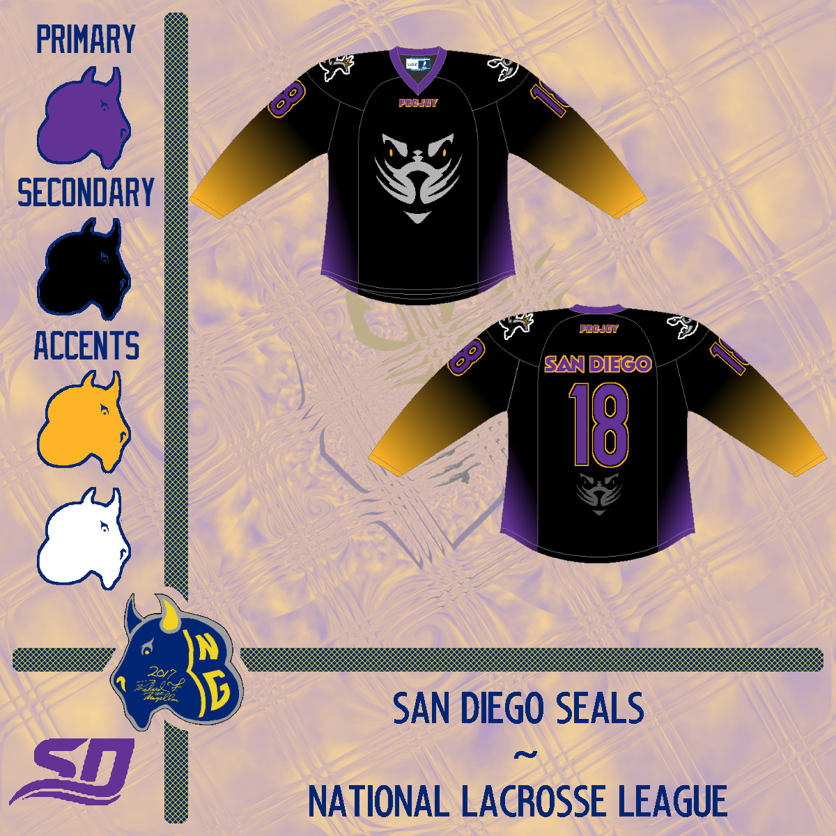
The National Lacrosse League has a new man aboard to expand the sport. Joey Tsai of Alibaba fame is bringing lacrosse to San Diego. But it wasn't until the last several days that the brand was unveiled. I give you the Seals (Well my version of them anyway).


I was trying to go off of what Projoy has done in the past. I also added new things to make this seem somewhat unique to the team. This wasn't terribly challenging, though I felt that I could have done more if a good version of the alternate logo surfaced. In any event, I managed fine.

-Ricky

18 October 2017

Return of the Convocation

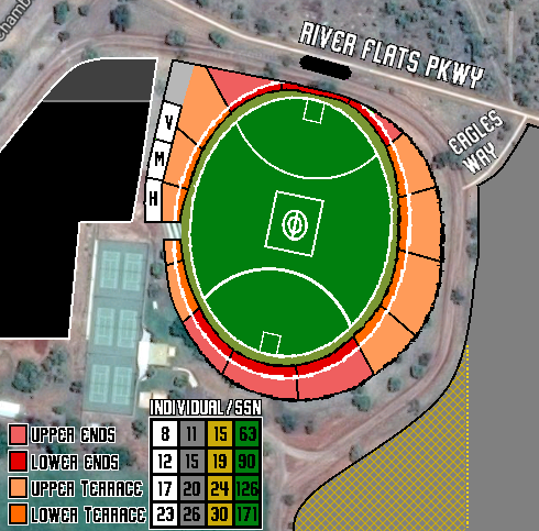
As I saw fit, I made various arrangements for a Aussie Rules design league I'm competing in. If you remember the Victoria River Eagles, that is the focus. I needed a new set of jumpers for the new season. I have kept two from the previous season (2014/15). The new home was the former clash and now featuring new numbers while the old home is now the heritage kit with the club song added to the front. New Jumpers have been added to meet requirements.


The names of each jumper are indicative of relevant words or phrases from the local indigenous  language of the Northern Territory. I decided to redo the branding sheet so that it was more in line with the other work.

-Ricky

06 September 2017

Havin' a Time, Where the Brier Is the B'y!

The BNG MSP is certainly not lacking quality content as today we revisit several items from my visit to St. John's in March for the Tim Hortons Brier. Included are two local newspapers with an edition of the Curling News plus a few Tankard Times (one signed by Mike McEwen's Team Manitoba), a signed team Manitoba photo, a photo of an Albertan representation) a Brier media guide an airline ticket to St John's from Pearson International (YYZ), a poster of Brad Gushue (winning skip from host Newfoundland and Labrador, and tickets from earlier draws of the tournament.


Finally the winning province got their glory after being among Canada's best men's sides for years. The Party went into the wee hours of the morning on George Street where Gushue had promised to bring the Brier Tankard if they'd won. From George Street to the freak windstorm on the day before, it was certainly an event they'll talk about forever in the Great White North.

-Ricky

16 July 2017

Great Scotties, That was Brilliant!

Some may recall my adventures a quick trip across the border to Canada  in February of this year. I grabbed some things from the Scotties in St. Catharine's for the BNG MPS. The Museum of Play and Sport has other items in it, but I'm featuring these today.


While I did attend a draw earlier in the week, everything in the museum is from the fantastic gold medal game between Michelle Englot's Manitoba and champions Ontario represented by Rachel Homan. I have the day after's local paper in addition to various versions of the daily Scottie publication and signed clapper placards (if that's what they're called) from various Manitoba and Ontario players with a ticket from the gold medal game and official team pictures from both sides respectively signed. I'm already having withdrawal and wish we could get the same venue and excitement every year!

-Ricky

26 June 2017

Bisons in a Winter Classic

At the request of a manager at one of my places of employment, I created a set of what that would be. One of which could also be used at the 2018 Winter Classic. I subsequently entered it for the 2017 HJC Open tournament round robin stage.


Also, I have been working on those new Adidas templates, and it will prominently feature the most appropriate team, Vegas, for my first time use. But this set before that and the results of the HJC Ope precede.

-Ricky

20 June 2017

Tonight's the Night, Tomorrow's the Day

As has been highly anticipated, the NHL and Adidas will fully reveal the brand new uniforms for each of the thirty-one teams while the Expansion Draft will be officially finalized by tomorrow. while I intend to absorb the most up to date Adidas template in full. I put together my Vegas Golden Knights as per the rules of the expansion draft. Courtesy of our friends at Cap Friendly, you can do so too if you wanted - the hard work is done for you and you can go ahead and choose your players. You can view my compilation below.


I tried to find value buys mixed in with veterans and salary cap eaters. As it worked out, the team would have just over eight million dollars to work with for post-entry draft trades and free-agent pickups, pending potential trades of players picked up in said expansion draft. There was special consideration to balance primary atatcking positions at five per (six at left wing) with two more attackers and defensemen than the requirement. But the entry draft in and of itself could turn this team upside down in just a matter of days unlike the results of past expansion drafts. Only the short time left will tell.

-Ricky

18 June 2017

Another MBD Alt Look

Welcome back to BNG as the final installment of the Mount Buller series has arrived. I present the "Bloody Mary/Murder" jumper. Another plain set, but going on the Demons name seemed to be under thought of by the clubs previous designers. If you look closely enough at what I did to alter the logo from the original, there is red where there would have normally be blue (black). However, to drive home the point of the logo selection, I filled those negative spaces into blood and voila.


Then again, It would be ironic if the Blood Rule would come into effect. If a player is bleeding injured without visible traces other than the red part of the jumper before it becomes oxygenated substantially, would the blood rule be able to be called?  It would be an interesting scenario if it ever presented itself. I hope you have found intrigue in the new footy/basketball template if anything at all. This series was merely out of a request that turned into possibility.

-Ricky

17 June 2017

The Other MBD Alt Look

I would discuss the actual alternate, however we defined in the primary of the series it is merely a heritage Melbourne jumper. And with that,we have another variant of the accustomed wide v but with another hockey inspired alternate - this from the Calgary Flames horse head jersey.


Again, rather plain and traditional from the jumper itself without the logo and sponsors, but it also was up for introduction. I knew it would not have the same effect as that of a hockey sweater but wanted to give it a go anyway. Meanwhile, one more tomorrow to round up.

-Ricky
Creative Commons License
This work is licensed under a Creative Commons Attribution-NonCommercial-NoDerivs 3.0 Unported License.