29 March 2014

HCI: Post XVIII

*** The following is my post from a different site, please visit hockeyconceptideas.blogspot.com for the article. ***

Friday: I Still Haven't Found What i'm Looking For

Big injuries, the longest shootout of the year, and everything in between, it sure has been one heck of a week in the NHL. Ricky here for yet another chat here at HCI and well, I never thought of two things: that the Sabres would be bad enough to get the first pick in the draft lottery and that Edmonton can do it again and still not make the playoffs. Forgive me if I seem to be in a little sour mood today, my Foxes are being trounced by 150 points or so to the league leaders - to think we beat them earlier in the season. Enough of my shortcomings, lets talk about concepts that we don't actually have!

Courtesy of : imgur.com via WGR 550 Buffalo
We don't have any concepts, which is disheartening, but I thought I'd share this cool jersey diagram/timeline that someone working the WGR 550 AM (Buffalo) Facebook page found on Imgur. I think it is one of the most clever things ever produced because everything is on one image. I imagine it was a lot of work, so I have to give the person credit for their patience. This also looks like something I would try to do, but didn't think of before. If you want a version to zoom into, go to GR's (slang station name) Facebook page, then click photos and click on the attached  link and you should be allowed to zoom in.

No concepts, no problem. However, that doesn't mean the staff and I can keep this up forever. We really love seeing the creativity that you all have. The specific design style you have. And above all, the faith you have in HCI in general. We are very thankful that you are a part of our HCI family and the best way to let us know that is by your contributions. As far has a jump start to your designs and who sees them, I refer to the New York state lottery slogan, "hey, you never know."

-Ricky

27 March 2014

Wile E. Coyote, Genius

As it has been an up week for hockey uniforms (or any uniform for that matter), I have another one on display here. Here's a look at my submission for HJC's roadrunner competition. I am bringing back the Montreal Roadrunners with a few modifications. I liked that logo a lot and my printer/scanner/fax machine is out of service at the moment.


As you can see the shade of blue in the hem stripe was used and you may be able to make out with a keen eye that that design comes from one of the Montréal Canadiens' 100th season logos. I wanted to replace the silver which reminded me of the tan color that the roadrunner has been for other teams nicknamed the same. I also wanted a template that looked like a bird's wingspan on the sleeves. And to top it all off, I found the MLS' new font. That was all in a day's work!

-Ricky

22 March 2014

HCI: Post XVII

*** The following is my post from a different site, please visit hockeyconceptideas.blogspot.com for the article. ***

Friday: Fear the Turtle

Greetings and salutations all across the fruited plain, Ricky Mazella here for another HJC Friday! It's tournament time here in Buffalo and my bracket (Fear the Turtle on ESPN) is doing better than normal at this point of the tournament. March Madness really has gotten mad downtown with Dayton's upset of Ohio State yesterday. Elsewhere, my Australian football team the North Melbourne Kangaroos have opened their season with a loss to the Essendon Bombers. My NLL east leading Buffalo Bandits take on the 10-0 Edmonton Rush, and Arsenal are playing a table topping clash with league-leading Chelsea just four points ahead in English soccer. That on top of more NCAAs tomorrow.

But what's more important right now is hockey. For the first time this calendar year, the Ducks don't lead the West and in the Pacific lost to the Sharks last night to fall behind them in the standings. Also, the Sabres snapped their season long seven game long losing streak against the Oilers last night. The Sabres are supposedly going to remove the interim tag from Ted Nolan's coaching position and make it permanent when the team gets back home next week. Onto a concept.

Submitted by: Nick Spiteri
I've gotta say, Nick really has a knack for great ideas. compared to mine from a few weeks ago, but this works just as well. Instead of flagging the heck out of it, he superimposed it. I have pictures hereherehere, and here that I found browsing around. I don't know that I like the arm yokes and hem stripes, but I can understand their purpose. The logo is a tad large but that happens with such an intense design over the rest of the jersey's body. All in all, a better fit than not.

That'll do it for me today. And by the way, last week's phantom post (for which I apologize) is available for viewing on HCI. I found a version of it as a draft as I was preparing it for Saturday (to give HCI extra exposure) over at BNG. That is now readily available for you (I pride myself on great customer service). Enjoy your weekend - come on you Gunners and let's go Bandits!

-Ricky

15 March 2014

HCI: Post XVI

*** The following is my post from a different site, please visit hockeyconceptideas.blogspot.com for the article. ***

Friday: At the Brickyard

The late post is never acceptable by my standards even in the event of a family emergency. To my credit I did have this both pre-written and (unknowingly) a draft for BNG Saturdays to promote HCI further. Unfortunately Blogger did not agree with me this yesterday. I do not anticipate this to be a regular occurrence, so please do not let it phase you. Now that I've straightened out my short-coming to you, we can get back to having fun!


There's a "Pairs Competition" over at HJC and well, I can't stand it. Normally I like their competitions, but this isn't one of them. However, what Caden and Jake88 of my subsidiary blog HCI have turned it into somewhat of the positive. The creativity is always appreciated here. I'm not sure how I feel about the accent colors being on the uniform but they needed to be included somewhere to evade the Phoenix Coyotes effect. I don't really have much else to say here because I'm at a loss for words. It would also cost me a position here if I put in a negative critique (just kidding). But overall, I don't see a major flaw - just where to put those secondary colors. And since I can't put them anywhere, their placement will have to suit me just fine.

Yet another Friday has come and gone. I can now move forward with my life and continue my HCI duties as normal. As for you guys: sit back, relax, and have a great hockey weekend!

-Ricky

08 March 2014

HCI: Post XV

*** The following is my post from a different site, please visit hockeyconceptideas.blogspot.com for the article. ***

Friday: The Winds of Change

Something big is coming to HCI! But we can't tell you anything just yet. Hang on to your seats because it's going to be one heck of a ride. Until then, I will continue as normal like I am supposed to. Welcome to another installment of HCI Fridays! I am glad to present your with another pair of concepts by some of our regular contributors, And my goodness, the NHL blew up with all those trades. The Sabres are receiving a D- for their efforts since they gave almost nobody a chance to do much by getting rid of the better players (mainly Halak of the HCIHL's Foxes and now NHL's Capitals {hello, you need a goalie, Buffalo!}). As for my Ducks, a mediocre C+. Speaking of pluses and minuses, they gave away the team's season-leading plus/minus getter and lose a scorer - something newly acquired Stephane Robidas is not. I liked Fasth, but he has been injured and we needed temporary cap room and we have three other goalies more than qualified. But enough of my trade problems, it's time for some concepts.

Philadelphia Flyers
Submitted by: K14 Koncepts

To be honest, I am very surprised something quite like this hasn't been developed by the Broad Streeters. I would however like to see the black cuffs remain on this jersey or at least thicken the striping a little bit. The Blue Jackets looking captain's crest is not enticing for me to be used, but I like very much where this is headed.

Irish Hockey League
Submitted by Nick Spiteri

Another one of Nick's rugby inspired kits. The balance of color is well attributed. The only thing I'm not 100% on is the hem stripe and if it should go all the way down to the bottom or be moved towards the bottom at the hem. The colored collars are a good choice to add some additional contrast.

With the trade deadline behind us, it will be interesting to see what happens going forward this season. I created two goalie masks on the St. Louis/Buffalo trade last week and hope those will be up here soon. Until then, it's just another start to the weekend.

-Ricky

02 March 2014

The Winds of Trade

It was only a matter of time before Ryan Miller got traded. The question was when and to whom. Clearly before the deadline and to a rather surprising partner. Miller will keep his colors as he leaves with former Sabres captain Steve Ott to the Gateway City. The Snow Capitol meanwhile will pick up Jaro Halak as well as Chris Stewart, prospect William Carrier, and two draft picks (1st/2nd round). This trade gave me an idea to do something I had not in a while: goalie masks. Let's start with the person we knew would be traded, Ryan Miller.


While you may think that this could also work for the former Peoria Rivermen, I added the notes for purposes of differentiation. The arch should also help with that a little though subtle. The Olympic rings on both sides symbolize Miller's two appearances in Vancouver and Sochi. The back panel has Miller's standard tribute with the Blues logo scattered all over.


For Halak, I sorta copied from a previous mask of his. By copied I mean took the idea and made necessary changes and the content keeps it somewhat original. The goalies on the left are now Sabres - Hasek, Crozier, and Barrasso to be exact. A stampeding herd over Niagara Falls is opposite the goalies. These are accompanied by other Sabres branding directly facing. The back plate like, Miller pays homage, but this to his homeland of Slovakia and with the title of the national anthem "Thunder over the Tatras" at the bottom.

We'll be getting back to the grind on Monday with the start of the new week. More snow is projected for New England heading into Monday morning. Between that and class, it will be another unusual start to the week.

-Ricky

01 March 2014

HCI: Post XIV

*** The following is my post from a different site, please visit hockeyconceptideas.blogspot.com for the article. ***

Friday: The Stephen Scheffel Show

Little high, Little low HCI readers! It's another Friday with me and I have a good amount of stuff today. Glad to have more than one concept today as compared to the last little while. Also, today is our 200th post here at HCI! A new jersey came in for me but not before two concepts from the same artist. let's get to those now.

Denver Broncos
Submitted by: Stephen T. Scheffel

The first of our two concepts is based on the NFL's Denver Broncos. The first thing to discuss is the logo. It takes one of the current alternates added to a different colored "D" with an outline. On the white uniform, I don't like the phantom yoke, it definitely needs color. As for the Orange uniform, the blue and white need to switch positions everywhere - the sleeves, the yoke, the hem, and the blue on the collar. As for the alternate, just color in the cuffs, but kudos for originality there.

Colorado Rockies
Submitted by: Stephen T. Scheffel
This wouldn't be a complete Rockies concept without some form of pinstriping. Stephen has done that here. I would think that the stripes should all run the same direction on the white uniform. Either remove the ones from the sleeves or apply them to the whole jersey. As for the other one, The pinstripes in the numbers are a little daunting and take them from the numbers and move them across the logo if I had to guess. I would much prefer see something similar to their purple alternates though.

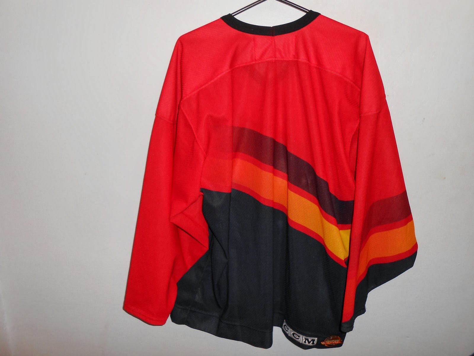
As I alluded to earlier, I made another jersey purchase last week and it just came in yesterday. That's because the Can Post takes a little longer than FedEx,UPS, or USPS. But that's okay, it still had a week just in case. But here it is, low and behold this Canucks jersey!

Photos courtesy of: Pro Sports Jerseys

I wen't a little out of my price range, but was still able to take it in for a profit. It was also the only one in my size and the only ones I had seen over the course of a good amount of time. In the mean time, my NBA leading Indian Pacers will be in town to take on the Celtics at TD Garden while the NHL's Bruins are away. The I managed free tickets to watch Hartford Hawks men's hoops against UMBC (coincidentally the same conference game I went to last year, go Terriers!)

As yet another weekend has come, enjoy your last day of February, that means Spring is around the corner. Or if you prefer, Spring started on Groundhog's Day. No matter, it will be a good weekend until the bad weather supposedly hits part of the Northeast into Monday morning. So make the most of the good weather.

-Ricky
Creative Commons License
This work is licensed under a Creative Commons Attribution-NonCommercial-NoDerivs 3.0 Unported License.