
*** The following is my post from a different site, please visit www.hockeyjerseyconcepts.com for the article. ***
Friday: Hockey Concepts in Storrs Now!
As I am pre-writing this post and at Gampel Pavilion of host UConn of Storrs, CT to watch St. Bonaventure women's basketball take on Monmouth for the Basketball Hall of Fame Classic. It should actually be by me in downtown Springfield, MA where the hall of fame actually is but the money is at the casino instead. Now that that mini rant is done, just one icy word that doesn't pertain to hockey. I want to congratulate the Norfolk (CT) Curling Club for re-opening it' doors this coming Sunday. I will be there to help open the two sheet facility myself. The week before Christmas in 2011, it had been set a blaze by arsen. Then exactly a year later, they began to rebuild the new one after donations. They just completed it within the last few weeks and it looks good with some memories of the past. As for that new Monarchs uniform, a sweater has been turned into a sweater - it's fantastic, a real hockey gem.
Words from the Laker Parchment -
Jokerit {Steve M.}

Edmonton Oilers {Kalin Z.}

Edmonton Oilers {Dylan W.}
Toronto Maple Leafs {Stephen T.}

Edmonton Oilers {Kalin Zok}

Friday: Hockey Concepts in Storrs Now!
As I am pre-writing this post and at Gampel Pavilion of host UConn of Storrs, CT to watch St. Bonaventure women's basketball take on Monmouth for the Basketball Hall of Fame Classic. It should actually be by me in downtown Springfield, MA where the hall of fame actually is but the money is at the casino instead. Now that that mini rant is done, just one icy word that doesn't pertain to hockey. I want to congratulate the Norfolk (CT) Curling Club for re-opening it' doors this coming Sunday. I will be there to help open the two sheet facility myself. The week before Christmas in 2011, it had been set a blaze by arsen. Then exactly a year later, they began to rebuild the new one after donations. They just completed it within the last few weeks and it looks good with some memories of the past. As for that new Monarchs uniform, a sweater has been turned into a sweater - it's fantastic, a real hockey gem.
+++*-^*-^*-^*-^*-^*-^*^-*^-*^-*^-*^-*^-*^-*+++
Words from the Laker Parchment -
Ryan 29: 16
{16}Voting is a way of life.
Jets 96: 1-2
{1}To vote is human {2}to be selected, divine.
{16}Voting is a way of life.
Jets 96: 1-2
{1}To vote is human {2}to be selected, divine.
COTY-October vote (ends Friday @ 11:59pm Eastern)
COTW Nov 4-10 vote (ends Friday @ 11:59pm Eastern)
Ergo keep calm and vote on!
+++*-^*-^*-^*-^*-^*-^*^-*^-*^-*^-*^-*^-*^-*+++
.png)

Jokerit {Jake88}
.png)
I
What I know: The checker is originally Jokerit's.
What I learned: The Nashville style checker patter looks better than both what Jokerit has now and in red instead of blue.
What I learned: The Nashville style checker patter looks better than both what Jokerit has now and in red instead of blue.
What I want to know: How the idea to use this checkering came to be.
A jestery look for a not so foolish team, an 8.5 out of 10.
2014 Stadium Series {Justin C.}

I saw this one first on his blog, then I realized that it was his third new post after that extended leave of absence. The Kings jersey is one that is appropriate considering that the ducks have already introduced an elliptical roundel logo. The kings bringing old and adapting to the current color scheme is sheer genius. We've seen similar but not the same for the Ducks, though this is the first in a while that I liked most at the time of print.
What I know: Tickets for this particular game have just gone on sale within the past 24 hours.
What I learned: The Kings should combine eras as seen above.
What I learned: The Kings should combine eras as seen above.
What I want to know: What inspired the "cross-Kings" design?
This is one we'll never get to see, but very worthy of a 9 out of 10 and a nomination by me for Concept of the Week.
Jokerit {Steve M.}

I feel that this could work with some minor changes. The striping could stay as is but a swap of colors may be an alternative.I'm surprised that the Cal-gary team hasn't done something similar just yet. Use solid red lettering for the NOB and the assistant's "A" as well. Then I'll be happy
What I know: The assistant's "A" was the primary in Atlanta.
What I learned: If using a red outline, larger is better and smaller should be solid in color.
What I learned: If using a red outline, larger is better and smaller should be solid in color.
What I want to know: why thin yellow jersey stripes separate the striping.
This one looks pretty good, but I'm on the fence of liking it or not; a 7.5 out of 10.
Edmonton Oilers {Kalin Z.}

A copper jersey - haven't seen one for the Oilers until now. It looks cool but at the same time I wouldn't want to see it on the ice. For one thing, the outline makes it hard to read Eberle's name (yas that's the NOB) same as the above lettering, stick to solid colored letters in this case.
What I know: Copper was actually in the Oilers most recently retired color scheme.
What I learned: Why they ditched said scheme.
What I learned: Why they ditched said scheme.
What I want to know: How difficult it was to include red in the jersey.
Dry wells and derricks again today, a 6.5 out of 10.
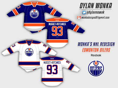
Edmonton Oilers {Dylan W.}

Sticking with the Oilers theme (coincidently) is the day before yesterday writer. I like these.One problem though - they remind me more of the Islanders than the Spoilers. It's not because of the color scheme being the same, but rather because it's too simple for the Oilers. That's primarily because of the lack of stripes but not the striping as a whole.
What I know: Edmonton and the Is-landers share the same colors.
What I learned: I like more stripes better than few for this team.
What I learned: I like more stripes better than few for this team.
What I want to know: Why the Oiler rig is dry today.
Texas tea is not abundant; a 7 out of 10.
Toronto Maple Leafs {Stephen T.}

The Maple Laughs are a team whose identity only got better as they aged, thus with age came wisdom. Striping on the other hand is variant on who designed the uniform. Then enter Harold Ballard the then new owner (circa the 1960s) of the last team to not have names on uniforms (c. 1970s). The only two things I've got are to switch the shoulder patch and add a thick blue stripe between the blue(home)/white (road) of the hem to at least somewhat match the sock striping.
What I know: Ballard is responsible for destroying Foster Hewitt's gondola, the name thing, and firing Roger Nielsen.
What I learned: This particular design make the template seem almost non-existant.
What I learned: This particular design make the template seem almost non-existant.
What I want to know: What if someone like Charlie O'Finley was their GM?
T is for Toronto, C is for a letter grade, a 7 out of 10.
Edmonton Oilers {Kalin Zok}

Compared to the other one, Kalin decides to keep the copper and ride, but adds a little used logo that I liked and incorporates the script into the hem. If I had to guess this is a home and road set whilst the one above is an alternate. The NOB is also slightly more legible here. If anything, the white would be an alternate, but this isn't professional soccer.
What I know: I miss the crest logo from the white uniform
What I learned: The blue looks much better than the copper one from earlier.
What I learned: The blue looks much better than the copper one from earlier.
What I want to know: Why the alternate logo?
Something might be coming after all, an 8 out of 10.
Chicago Blackhawks {JetsFan}
.png)
Chicago Blackhawks {JetsFan}
.png)
I like this despite some of the issues it has. But at the same time, Jets fan seems to be doing well considering it's only MS Paint. I'd like slightly thicker stripes. The two numbers side-by-side seem disproportionate to each other and the lettering of the NOB is a bit large.
What I know: Blackhawks and striping are virtually synonymous.
What I learned: This is pretty good for a concept using MS Paint.
What I learned: This is pretty good for a concept using MS Paint.
What I want to know: If the collar is white on purpose.
This was another theraputic concept, but could use changes; a 7.5 out of 10.
Portland Winterhawks {Antonio C.}
.png)
Portland Winterhawks {Antonio C.}
.png)
I think the logo is his own, but I like this better than what the team currently has. The stripe colors are beautifully arranged except for maybe the hem. The more I think about it it, the logo looks more like a gamecock or chanticleer. I like most that the green and gold are made more present here.
What I know: Portland's logo is to similar to the Blackhawks.
What I learned: gold and green together are better as accents than like the old Stars/North Stars look.
What I learned: gold and green together are better as accents than like the old Stars/North Stars look.
What I want to know: How the logo came about.
Flying away with an 8 out of 10.
Toronto Maple Leafs {Tom V.}

Toronto Maple Leafs {Tom V.}

I can't say I'm a fan. Again, simplicity is an issue - it's too simple for me. No font but rather the alternate leaf and no stripes. That definitely doesn't spell Toronto or scream Leafs all over it. This also seems surprisingly simple to be Tom's work too. Quite frankly, I'm practically in a state of shock! Maybe Ballard wanted to design this one but not get fined again for the name thing.
What I know: Toronto will never wear these.
What I learned: "Ballard concepts" do exist.
What I learned: "Ballard concepts" do exist.
What I want to know: Why so simple?
Simply put a 3 out of 10.
Carolina Hurricanes {JetsFan}

Carolina Hurricanes {JetsFan}

Stormy the Hog on a 'Canes jersey . . . now I've seen it all. Yes JetsFan, he has a name and is the team mascot. Why the team has a pig for a mascot, I'll never know. the baseball team in Winston-Salem used to be the Warthogs, but I would think the team might want to have an upright hurricane figure for a mascot. As far as the sweater itself, I don't really like anything but the color. Some of you may be surprised of my end result on this.
What I know: Carolina has a hog for a mascot.
What I learned: This is a new design I hope we never see on the ice.
What I learned: This is a new design I hope we never see on the ice.
What I want to know: How stormy is the highlight of this uniform.
Lots of factors went into this one for grading, a 6.5 out of 10.
Anaheim Ducks {Steve M.}

Anaheim Ducks {Steve M.}

Ahhh the eggplant . . . e-g-g-p-l-a-n-t, that's how I spell relief. It's the only thing helping this template. I'm glad I have one of these in my jersey collection! In fact, I wear it every time I know I'll be able to watch a Ducks game (so far almost every other game this season). At least it looks good, but I'm not completely thrilled with the shoulder patch. If anything, replace it with the elliptical roundel logo that serves as a shoulder patch on the current alternates.
What I know: I will never get bored of this schematic
What I learned: I don't like this template more than before.
What I learned: I don't like this template more than before.
What I want to know: How you got this to work on this template unless it's just because this is always going to be an epic design.
It may be a favorite of mine, but not an immediate bit of perfection; an 8.5 out of 10.
-Ricky
The Laker Parchment is never wrong, for you should heed it's teachings: V-O-T-E, V-O-T-E, go vote, go vote, go vote, Vote, VOTE, wooooooooo! Okay, I've had my fun for the day - sally forth!
-Ricky

No comments:
Post a Comment